Choosing the Right Visual Display for Your Data Insights
Data visualization empowers us to see and understand patterns that live within the data. However, choosing the optimal graph or chart to visualize your information requires thoughtful consideration. Selecting the visual display that will highlight the most impactful data stories requires us to understand options ranging from simple bar charts to intricate heat maps. This brings us to the fundamental question: what should you use to illustrate the data? This article will overview some key considerations when deciding how to best visualize your data for maximum impact.
What is data visualization
Data visualization refers to representing information, often numeric, through visual means like charts, graphs, and other graphics. It transforms complex data sets into easier-to-understand visualizations. In the broadest sense, it’s about making sense of data by placing it in a visual context, thus answering the crucial question: what should you use to illustrate the data? This approach highlights the stories that numbers tell in a way that’s intuitive and easy to grasp.
Importance of data visualization
Data visualization is critically important in today’s data-driven world for a few key reasons. For starters, it allows us to grasp complex data sets and identify patterns that would otherwise remain hidden in rows and columns of raw numbers. Our human brains process visual information extremely efficiently. We can quickly scan a well-constructed graph or chart and spot trends, outliers, and opportunities for further analysis. On the other hand, tables of numbers make most people’s eyes glaze over.
Additionally, data visualization makes data more engaging and impactful. A compelling data graphic grabs attention and drives the key insights home in a way that dry statistics simply cannot. When we see colorful charts and images, it sparks our interest and gets us actively thinking about the meaning behind the data. Choosing the right visual display can transform data into a powerful story that informs, engages, and prompts action, making it imperative to consider what should you use to illustrate the data. Continue reading to learn about which chart type provides the best visual display.
Tables vs. charts
When exploring ways to display data, the question of what should you use to illustrate the data becomes pivotal. Tables and charts stand out as fundamental tools. Tables best represent raw data and allow detailed comparisons across categories. However, they can become overwhelming when dealing with large datasets or conveying trends, patterns, or relationships within the data.
On the other hand, charts provide a compelling visual display that can quickly highlight these trends and patterns, making it easier for the audience to grasp complex information. The choice between tables and charts depends on your specific goals: if precision and detailed data review are required, tables might be the way to go. Charts are more effective for most other purposes, particularly in illustrating relationships and trends.
Choosing the right chart for your data
1. Bar and column charts for comparison
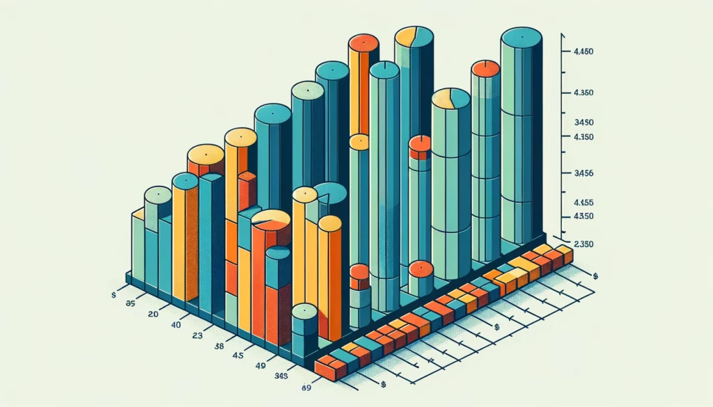
When looking to compare different values, bar and column charts are ideal. The length of each bar or column provides an instant visual representation of value comparisons. Grouped charts allow viewers to compare values across multiple categories. These charts clearly show comparisons across items, periods, departments, etc. This example perfectly answers the question: what should you use to illustrate the data when comparing different categories.
2. Pie charts for proportions
When you need to illustrate proportional values as parts of a whole, a pie chart intuitively displays relative sizes. Pie charts are most appropriate for data that adds to a meaningful total, like market share or budget allocations. Use only a few slices in a pie chart as it becomes hard to distinguish between small sections. Pie charts effectively showcase information like social media follower proportions or customer renewal rates by region.
3. Line charts for trend
Line charts connect data points with a line to display trends over time. This makes it easy to see upward or downward trends and fluctuations. Line charts work very well for time series data, especially spanning longer periods. Examples, where line charts shine, are showing website traffic growth over the past 2 years or product revenue changes across fiscal quarters. This is another great example of what you should use to illustrate the data when demonstrating trends over time.
4. Dot charts
For a simple, no-frills approach, dot charts are handy. Each data point becomes a dot, and dots are stacked vertically on an axis. This type of chart draws the viewer’s attention directly to the dots showing highs and lows. Dot charts work nicely for small data sets that don’t require fancy trend lines or categories. You’ll commonly see these to display website page views per month or satisfaction ratings over the past year.
Conclusion
Data visualization should provide clarity and actionable insights rather than simply presenting numbers in a graphical format. Carefully consider what story you want the data to tell. Map out what you want your audience to notice and the key takeaways. Then, select the visual display that will enable viewers to understand the significance of the data best. The right chart distills even highly complex data sets down to their most essential components and patterns. With the significant chart types in mind, you can determine what should you use to illustrate the data for maximum impact.