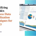
7 Ways How Presentation Tools Captivate Audiences With Data Visualization
Effective communication is vital for captivating audiences and conveying impactful messages. This is especially true when presenting complex data and insights. Fortunately, modern presentation tools offer innovative data visualization capabilities to bring numbers to life through intuitive charts, graphs, and other visual elements.
In this blog, we’ll explore seven key ways compelling data visualization in presentation tools leads to higher audience engagement and more memorable presentations. By implementing these best practices, you can craft data stories that inform and inspire.
The Power of Visual Learning
Data storytelling visuals allow people to process complex information faster. Rather than poring over spreadsheets or trying to imagine abstract concepts, audiences can rapidly decode meanings from effective charts, graphs, and pictorial elements. This leads to quicker comprehension and better recall.
Well-designed data visualizations for also tap into the brain’s ability to identify patterns. We are essentially hardwired to examine visuals and spot trends or relationships. This pattern recognition capability charges data visualization with the power to reveal insights that may otherwise be hidden in tabs and figures.
The visual learning process boosts audience engagement, expands understanding, and drives home impactful data stories.
7 Ways How Presentation Tools Captivate Audiences

Here are seven specific methods for effectively employing data visualization in presentations for audience engagement:
1. Utilizing Various Chart Types
The most fundamental aspect of compelling data visualization is choosing the right chart types. While a basic column or pie graph may work occasionally, utilizing a mix of creative charts keeps audiences engaged.
Consider a scatter plot to depict correlation, a tree map to display hierarchical data, a heat map to show intensity, or a gauge chart to represent progress toward goals.
2. Incorporating Interactive Elements
Static charts have their purpose, but interactive data visualizations enable audience engagement by providing key insights. For example, incorporate sliding scales to demonstrate how metrics fluctuate over time. Embedding user-controlled filters allows audiences to explore data by specific parameters like regions, products, demographic groups, etc.
3. Customizing Visuals to Audience Preferences
Data that resonates with executives may bore younger audiences. Customizing data visualizations to align with audience interests and preferences boosts their ability to relate to the material.
For stakeholders obsessed with profits, highlight financial returns in bold figures and coin icons. Policymakers should emphasize social impact metrics in prominent local statistics. When speaking to youth, use bright infographic-style images over stuffy pie charts.
4. Using Infographics for Simplified Communication
Infographics distill complex statistics, trends, and insights into easily digestible visual snippets. These bite-sized graphical depictions efficiently communicate key takeaways that may be buried in dense datasheets.
5. Implementing Real-Time Data Visualization
Real-time data visualization keeps audiences glued to ongoing changes and developments when presenting live data feeds. For example, illustrate social media conversations as word clouds that shift and evolve onscreen. Or have gauges that dynamically tick up and down based on live poll responses.
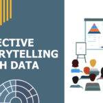
6. Enhancing Narratives with Storytelling Techniques
Without context and narrative, data visualizations fail to maximize impact. Use annotation, flowcharts, and other storytelling elements to walk audiences through data patterns, explain key forces at play, and reveal step-by-step insights.
7. Animating Data Transitions
Animated data transitions captivate audience engagement by revealing changes in metrics over time or demonstrating cause-and-effect relationships. For instance, show counters that visually tick up to highlight exponential growth or have bars on a graph pop in and out to showcase volatility over several years.
These animation effects inherently capture attention while also emphasizing important data narrative elements.
The Bottom Line
Data visualization is invaluable for captivating audiences and transforming complex statistics into intuitive insights. Modern presentation tools remove all barriers to incorporating creative charts, graphs, infographics, and other visual data elements into impactful slides.
By tapping into visual learning capabilities and leveraging innovations like interactive features, customized graphics, and animated transitions, presenters can craft truly compelling data stories.