Visual Storytelling Mastery: How to Tell Data Stories with Visuals
In the modern age of data proliferation, visual storytelling has emerged as a crucial skill. Companies and creatives now have access to massive data resources, but raw data alone fails to engage audiences. This is where the art of data storytelling comes in — the ability to weave data, visuals, and narrative together into compelling, insightful stories. In the section below, we’ll discuss how to create stunning data stories with visuals.
The Power of Visuals in Storytelling
Visuals have an unparalleled ability to make complex data easily understandable and emotionally engaging. Effective data visualization can instantly communicate key patterns, trends, and insights through the strategic use of visual encodings like color, shape, and composition. As the popular saying goes, a picture is worth a thousand words. When it comes to data-driven visual storytelling methods, strong visuals allow us to go beyond presenting information to crafting compelling narratives that inform, educate, and inspire.
Elements of Visual Storytelling with Data
1. Data Selection
The foundation of any strong data story is the thoughtful selection of the underlying data. Relevance is key—the data must connect clearly to the narrative and inform meaningful insights. Too much extraneous data can obscure the core story. To support robust analysis, it’s also crucial to ensure the data quality is high in completeness, accuracy, and consistency.
2. Visual Elements
Once the data is selected, several visual encoding decisions can significantly impact how successfully it communicates key insights. Elements like charts, graphs, shapes, icons, and text must be combined strategically based on data visualization, design, and cognitive science principles. For example, research shows that human perception is drawn to contrasts, so techniques like color or size variations help highlight important patterns.
3. Narrative Techniques
The visual elements must also be anchored by an engaging narrative arc that feels natural rather than disjointed. Techniques like an explanatory introduction, descriptive headers and transitions, storyboarding key sequencing in advance, and closing with a summary of insights and implications help tie it all together.
4. Color Psychology
Color choice also subtly guides audience interpretation and attitudes. Colors have psychological associations – blue feels stable, red urgent, green peaceful – that can be strategically leveraged. Additionally, considerations like color blindness support accessibility for wider audiences.
Ways to Tell Data Stories with Impactful Visuals

a. Understanding Your Audience
After engaging with your data story, the first step is getting clarity on who you are trying to reach and what you want them to think, feel, and do. Different audiences have different contexts and prior knowledge. Stories should reveal insights tailored to resonate with a target viewer’s interests, concerns, and open questions.
b. Choosing the Right Data
With audience goals clarified, the right supporting data can be identified to ground the narrative in relevant facts and trends. Data that ties directly to audience questions or illuminates misconceptions has the most pull and stickiness. Creative data gathering, like surveys or experiments, can fill gaps where existing data falls short.
c. Crafting a Compelling Narrative
The impactful visuals should flow together, driven by a compelling narrative sequence that reveals insights over time. Narrative techniques like establishing conflict, using descriptive language and metaphor, heightening drama with pacing, and resolving with key takeaways can make complex data feel like an engaging story.
d. Designing Effective Visuals
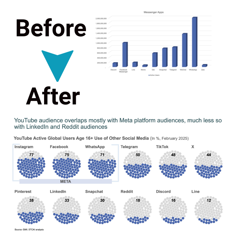
Strategic visual encoding choices help uncover patterns, trends, and relationships in data by combining visual variables like position, size, shape, and color. Following visualization best practices balances aesthetics and functionality. Examples like highlighting, annotations, and transitions direct focus where needed.
e. Integrating Visuals and Narrative
Seamless integration between impactful visuals and narrative creates a cohesive data story versus a disjointed slide deck. Introductory context should precede deep dives into data analysis. Descriptive headers anchor different sections of the narrative. Pull quote callouts strategically spotlight key insights and statistics, reinforcing their impact. Relevant captions explain visualizations to enrich understanding.
f. Interactivity and Animation
Today’s digital mediums also lend themselves to interactive data stories versus static reports. Filtering, zooming, and details on demand engage readers as active participants. Movement over time can be shown with animated data transitions. Interactive drill-downs enable custom, self-driven exploration to uncover personal insights.
The Bottom Line
Data storytelling through strategic visuals and narrative craft presents a powerful opportunity to inform and engage broader audiences. By mastering techniques spanning data science, design, and communications, creators can shape complex findings into intuitive stories that educate and inspire. With compelling data-driven storytelling, facts, and figures transform from dry statistics into memorable revelations that motivate future thinking and action.


