Uncover Hidden Insights Using 4 Descriptive Techniques From Reporting Tool
Business intelligence and data analysis have become integral for companies to uncover actionable insights from data. Organizations can better understand their performance, customers, and operations with the right reporting tools and techniques. Descriptive analysis forms the foundation of actionable business analytics. Analysts need to comprehend what happened and why before diving into predictive modeling or prescriptive analytics. Descriptive techniques help summarize data to provide this understanding.
In this blog, we’ll explore four powerful descriptive analytics techniques available in leading reporting tools.
Understanding Descriptive Techniques in Reporting

Descriptive analytics uses historical data to provide insights into past events. The key goal is to synthesize raw data into meaningful summaries.
Common descriptive analytics methods include:
- Data visualization – Using charts, graphs, and maps to represent trends, comparisons, distributions, correlations, and other data insights.
- Cross-tabulation – Creating pivot tables to analyze the intersection of two or more variables.
- Correlation analysis – Quantifying and visualizing the strength of relationship between variables.
- Trend analysis – Studying time-based movements and patterns in data over time.
- Summary statistics – Using measures like counts, sums, means, and medians to describe data.
Mastering these techniques paves the way for predictive and prescriptive analytics. The reporting tools help automate these techniques to uncover hidden insights.
Descriptive Techniques From Reporting Tool
Advanced reporting platforms like Tableau, Power BI, and Qlik offer intuitive interfaces to conduct descriptive analytics. Here are five techniques to extract powerful insights:
Data Visualization
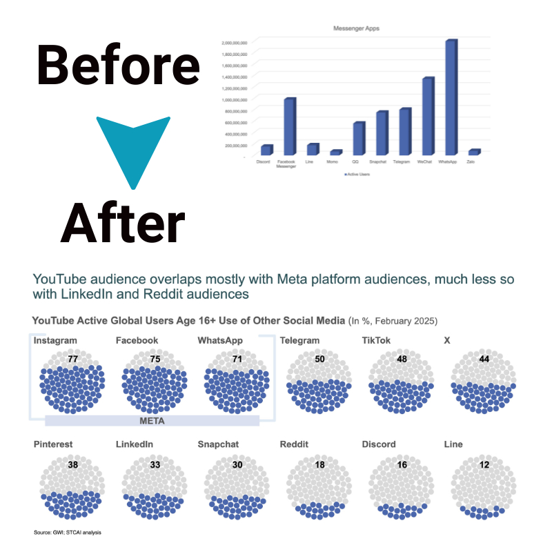
Data visualization graphically represents information using charts, graphs, heat maps, etc. Well-designed visuals simplify complex data and uncover insights.
Key types of visualizations include:
- Bar charts – Compare metric values across categories
- Pie charts – Show proportional breakdowns
- Line charts – Uncover trends over time
- Scatter plots – Assess correlations
- Heatmaps – Spot patterns in large data tables
- Cross-Tabulation
Cross-tabulation creates pivot tables by combining two or more attributes into logical categories for comparison. The values where attributes intersect reveal insights.
For example, cross-tabbing customer location vs lifetime value can show if certain regions have higher-value customers. Additional filters can further fine-tune the analysis.
Correlation Analysis
Correlation coefficients quantify the direction and strength of the relationship between variables on a -1 to +1 scale. Values near -1 indicate strong negative correlation; values near +1 indicate strong positive correlation. Visualizing correlations on a scatter plot illustrates the direction of the relationship. Correlation analysis helps identify leading indicators to predict other metrics.
Trend Analysis
Trend analysis examines increases, decreases, and, more generally, movement and patterns in data over consistent time intervals. Time series charts visualize the progression of metrics over time. Studying trends helps analysts check if key performance indicators follow expected progression or uncover unexpected changes needing investigation.
Summary Statistics
Summary statistics concisely describe large datasets using measures like counts, sums, means, medians, etc. Common examples include:
- Totals – e.g. Revenue, Profit
- Averages – e.g. Average Order Value
- Percentiles – e.g. 95th percentile response time
- Minimum/Maximum – e.g. Highest daily sales
These measures provide a snapshot view of data. Combining statistics expands insights – for example, average order value by customer segment.
Implementing Descriptive Techniques in Reporting Tools
Modern reporting platforms make it easy to apply these descriptive techniques without coding. With drag-and-drop interfaces, anyone can analyze to uncover insights.
Key features like visualization galleries, pivot tables, correlation analysis, and trend charts help automate techniques. Using parameters and filters allows users to fine-tune the analysis further.
Dashboarding capabilities provide a single lens to important metrics, statistics, trends, and insights. Descriptive analytics forms the base; adding forecasts and predictions enriches dashboards into a decision center.
The Bottom Line
Descriptive analytics techniques empower organizations to synthesize raw data into meaningful insights. Mastering essential methods such as data visualization, cross-tabulation, correlation, and trend analysis extracts hidden insights from the wealth of data.
Intuitive reporting tools eliminate technical barriers to conducting analysis. With the democratization of data and self-service analytics, every employee can leverage descriptive techniques to improve decision-making. Companies that promote a data-driven culture will gain a sustained competitive advantage.


