Turning Big Data Into Big Ideas: Humanizing Data Through Visualization
You might have come across these terms, like “big data visualization” and the need to manage quantitative data” a lot lately. Quantitative data, or just many numbers and figures, might seem boring at first glance. You might think of endless spreadsheets or complicated scientific papers—not exactly fun stuff for most people. However, something amazing happens when we turn these numbers into visuals like graphs, charts, and maps, using different shapes, sizes, and colors.
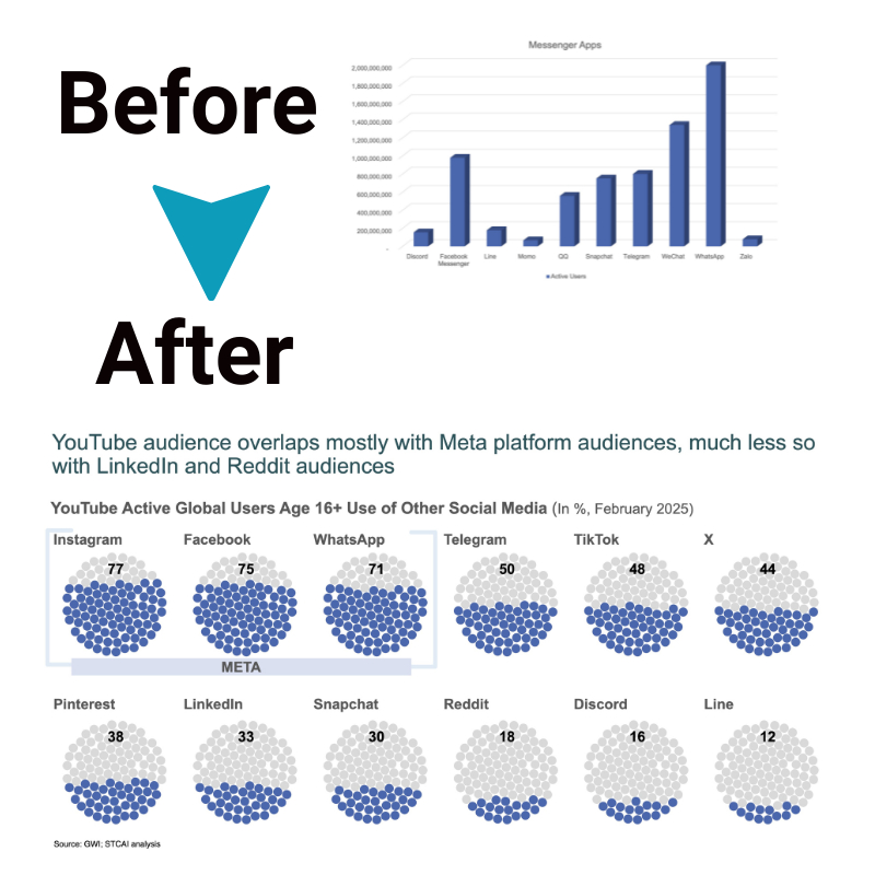
Like a good story can make complex ideas easy to understand, turning data into visuals helps us see the big picture.
It makes complicated information easy and exciting to grasp, leading to those lightbulb moments where everything suddenly makes sense.
This is how numbers become more than just numbers—they turn into insights we can see and understand, making the complex simple.
How does big data visualization affects businesses?
Big data is transforming how modern businesses operate and make decisions. As technology advances allow companies to gather and store ever-increasing amounts of data, learning to harness insights from that information is becoming critical to remaining competitive.
Effectively leveraging big data analytics enables businesses to identify patterns and trends around customer behavior to improve marketing efforts. It allows for the detection of potential equipment failures early to minimize disruptions. It helps project future sales more accurately to inform everything from inventory planning to hiring needs. Ultimately, data-driven decision-making reduces risks and seizes new opportunities.
Yet, while big data holds tremendous promise, realizing its full potential requires focus. Companies must intentionally collect and analyze information that addresses explicitly real business questions and goals. They need to prioritize building internal skills for working with data across departments. They have to present findings in clear, compelling ways to drive strategy. With proper governance and strategic application, the influx of big data can lead to big ideas.
Principles of effective big data visualization
Below are some key principles for creating visuals that are clear, accurate and efficient in communicating insights:
- Focus on clarity and simplicity in design so visuals are easy to interpret.
- Show data precisely without distortions.
- Streamline design to only essential elements so viewers can understand the key messages fast.
- Pick visual styles to best showcase data insights and patterns you want to convey, like trends over time or part-to-whole relationships.
- Use layout, colors, and text mindfully to make attractive and exciting data stories while balancing visual appeal with efficient communication.
- Dropping decorative elements that hinder quick understanding keeps visuals effective.
Best practices for turning big data into big ideas

1. Define clear goals and questions
Dealing with mountains of data can feel overwhelming. Where do you even start to make sense of it all?! However, following some fundamental best practices can set anyone up for success. First, be clear about the questions you want to answer or the problems you want to solve. Don’t just collect data for data’s sake. Focus your analytics on concrete goals that will inform real business decisions.
2. Involve key stakeholders
Make sure to involve the people who will be acting on those decisions from the beginning. Get their input on what data they need to have to feel confident deciding. That ensures the insights you work hard to dig up will actually be helpful to them.
3. Start small, be flexible
When starting with big data, starting small is perfectly fine! Run pilot projects where you analyze just a sample of data to demonstrate potential value before expanding projects more broadly. This allows room for experimentation without fully committing resources upfront. And build flexibility into processes to incorporate new data sources down the line.
4. Blend external & internal data
Here’s another tip – blend external data from outside an organization together with internal data. That gives a fuller picture of making smarter choices. Just be intentional about data governance when consolidating information from different places.
5. Focus on data quality
Investing in high-quality, clean data is vital! Taking the time upfront to structure and validate data properly saves a world of pain later. Garbage in, garbage out, right? Reliable analytics depends on reliable inputs.
6. Translate insights visually
And do more than present decision-makers with dry data tables! Translate insights into simple explanatory charts and visuals that showcase important trends and patterns. Brains process visuals so much faster than rows and rows of numbers.
7. Build internal data skills
Finally, recognizing that getting real value from data requires building team skills. Make sure to provide adequate training to develop the talent needed for ongoing success.
The bottom line
Data visualization plays a key role in humanizing big data. It helps translate abstract giant datasets into clear and meaningful visual stories anyone can understand. By using principles of clarity, precision, aesthetics, and purposeful design, data visualization unlocks big data’s buried value to ignite meaningful insights, ideas, and innovation that better our world.
As more data accumulates globally, harnessing the power of data visualization will be key for turning numbers into human progress.

