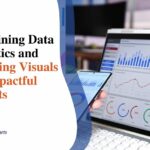
Big Data Visualization: 4 Techniques to Use in 2024
Big data visualization has become a critical technique to analyze and visualize large data sets. The advent of big data has brought both enormous potential and challenges. As organizations accumulate massive amounts of data, deriving meaningful insights can be like finding a needle in a haystack. This is where data visualization becomes invaluable. Presenting data visually reveals patterns, trends and correlations that would otherwise remain hidden.
Data visualization takes big data analytics to the next level, enabling data-driven decision-making, progress tracking and more. Read on to understand the complete process of handling large datasets with visuals.
What is big data visualization?
Big data visualization refers to the graphical representation of large, complex datasets, making them more accessible, easy to understand, and actionable. It transforms obscure numbers into visual depictions like charts, graphs, maps, and infographics. This allows huge volumes of multifaceted data to be summarized and consumed at once. Big data analytics and reporting relies heavily on visualization to convey insights.
Significance of big data visualization
The impact of visualization on big data analysis must be balanced. It empowers decision-makers to spot trends, identify relationships between different data points, and make accurate forecasts.
- Data visualized is More Understandable: Complex data becomes less abstract, and the key takeaways can be discerned efficiently.
- More Accessible: Data visualizations can be grasped by a wider audience without in-depth statistical skills.
- More Insightful: Interactive visuals reveal valuable discoveries that would be impossible to uncover otherwise.
- More Convincing: Data-backed visualization is a highly effective means to convey insights, trends, and recommendations.
- More Memorable: The human brain processes visuals 60,000 faster than raw text or numbers.
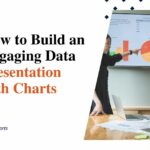
Types of Big Data Visualization

There are many visualization formats tailored to different datasets and analytical needs.
1. Line charts
One of the most universal and powerful big data visualizations are line charts. By plotting data points over time and connecting them with lines, they perfectly display trends, trajectories, milestones, and more. Multiple lines can also represent comparative time-series analysis. For example, showing revenue growth for different products or projecting future growth. Lines can encode a wealth of time-based insights at a glance.
2. Pie charts
In a classic visualization, pie charts divide data into segmented slices representing numerical proportions. They visualize part-to-whole relationships intuitively. For example, showing revenue share across regions, category contribution to overall sales or departmental budget allocation. Pie charts lend themselves well to benchmarking and performance tracking.
3. Bar charts
Bar charts use rectangular bars to compare metric values across different categories, ranks or periods. The length of each bar is proportional to its value. This allows easy analysis to determine the highest and lowest values, outliers and trends. Every business should harness bar charts to monitor KPIs. For example, showing revenue per product line, sales rep performance, or website traffic sources.
4. Column charts
Similar in principle to bar charts but using vertical columns rather than horizontal bars. This offers an alternative format for comparing categories where orientation suits the data or audience better. Typical uses include showing changes over time, such as monthly sales totals or quarterly profits. Columns can also encode 2 variables through color splits i.e. target vs actual.
There are many more options, but these form key starting visualization components for most big data analyst toolkits.
Big data visualization tips
Succeeding with big data visualization for business intelligence requires focusing a few fundamentals:
a. Define your goals and metrics
The first step is being clear on what you want to accomplish and what data points will indicate progress and success. This determines the direction for visualization design and development. Only start data analysis with purpose – it leads to wasted efforts.
b. Focus on key insights
Resist cramming all available data points into busy, cluttered visualizations in an attempt to ‘leave no stone unturned.’ Prioritize bringing the most important insights and trends to the forefront through simple, uncluttered representations explicitly focused on key metrics. Additional details can sit one click away for those needing to dive deeper.
c. Make visuals interactive
Build in capabilities for users to engage dynamically with the data visualizations rather than just passively consume. Interactivity empowers drilling down into data subsets, filtering by attributes, controlling time series, and more. This helps answer follow-up questions on demand through self-service exploration.
d. Keep it simple
The fundamentals of good information design and visual storytelling apply to data visualization too. Clean, uncomplicated designs avoiding embellishment are most effective. Only add chart elements and details if they aid comprehension and decision-making. Avoid 3D effects or other visually distracting but uninformative components.
e. Promote data literacy
Make adoption smooth through training and learning resources to improve understanding of available data visualizations and build confidence interacting with them. Create user guidance documentation showcasing the most relevant use cases. Tap power users as advocates to share tips and success stories.
Conclusion
Turning big data into big insights is no longer restricted to expert data scientists. Data visualization brings the powers of big data analytics to business leaders through easy-to-understand graphical representations.
This is key to data democratization, smarter decision-making, measurable value creation, and competitive advantage. Big data visualization is set to grow in strategic importance as data volumes continue growing exponentially.