Linear Trendline Techniques: How to Reveal Hidden Patterns in Your Data
Understanding patterns and linear trendlines in data is crucial for businesses to optimize operations and make informed decisions. However, with large volumes of data coming in daily, it can take time to identify underlying patterns and seasonal fluctuations.
This is where trendlines become extremely useful. Trendlines are a technical analysis tool that can help uncover trends, support and resistance levels, and seasonal variations in data. In this blog, we will discuss what trendlines are, the different types, and how to use them to unravel patterns in your business data.
What are trendlines?
A trendline is a straight line that demonstrates the overall direction of data points over some time. It helps recognize patterns and trends that may not be evident at first sight. Trendlines are commonly used in financial markets to analyze stock prices. However, the concept can be applied to analyze data from any industry.
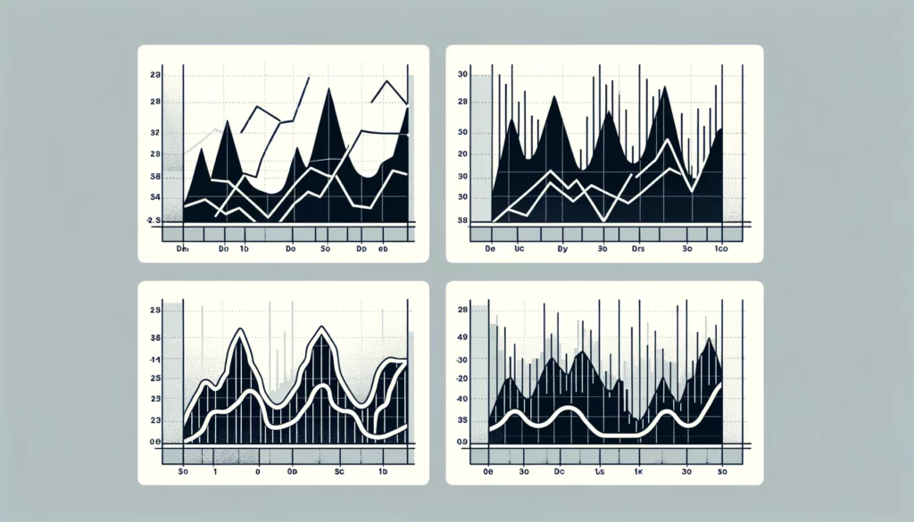
Trendlines involve connecting two or more data points on a graph with a straight line. The simplest type of trendline is a linear trendline, which draws a straight line through the data points. However, in some cases, the relationship between the variables may be nonlinear. In such situations, a higher-order trendline, like a trendline polynomial, can better illustrate the trend.
Types of linear trendlines
There are two main types of linear trendlines based on the direction of data movement:
- Upward sloping trendline: This trendline slopes upwards, indicating that the data is trending higher over the analyzed period. It shows an overall bullish trend where prices are increasing steadily with minor dips.
- Downward sloping trendline: In contrast, a downward sloping trendline slopes downwards, signifying that the data is trending lower gradually but not declining abruptly. It represents a bearish trend, with prices falling consistently despite occasional rebounds.
Trendlines can also be classified based on the timeframe – short-term trendlines cover days/weeks, while long-term trendlines analyze months/years of data. The appropriate type depends on the business goal and data frequency.
Using trendlines to spot trends
Trendlines play a vital role in technical analysis by helping identify trends, support/resistance zones, and breakouts in data:
- Identify trends: A trendline depicts the general direction of movement over time. An up or down-sloping trendline clearly shows if data is trending upwards or downwards in the long run.
- Support and resistance: Data typically consolidates or reverses direction around key levels of past highs/lows. Trendlines can represent these support and resistance zones.
- Breakouts: A breakout occurs when the price breaks above a resistance trendline or below a support linear trendline, signaling a potential trend reversal. It highlights shift points.
Using linear trendlines to analyze seasonal variations
Beyond identifying trends, linear trendlines can help unravel hidden seasonal patterns in data. This is highly beneficial for businesses to optimize operations based on demand cycles. Here are the steps to analyze seasonality using trendlines:
- Identify the relevant data set: Select time-series data covering multiple cycles of the expected seasonality (ideally at least 2-3 years).
- Create monthly trendlines: Plot monthly data on a trendline graph and draw separately for each month. For example, 12 trendlines for 12 months.
- Compare trendlines: Analyze and compare the 12 monthly trendlines. Certain periods will have trendlines much higher or lower than others, indicating seasonal variations.
- Identify seasonal pattern: Observable patterns in the relative positions of the trendlines reveal the underlying seasonality. For example, demand may be highest during summers and lowest during winters.
Using trendlines in your own business data
The process of incorporating trendlines for your business data involves the following:
- Select relevant data: Choose operational metrics most representative of underlying trends – daily sales, footfalls, website traffic, etc.
- Clean and compile data: Cleanse any errors, format data in a spreadsheet/database and compile all relevant historical data in one place ranging over years.
- Plot data on graph: Create a line or column chart with selected metrics on the Y-axis and periods on the X-axis to visualize fluctuations.
- Draw trendlines: Draw trendlines connecting two or more data points to represent movement direction over varying durations – monthly, quarterly, or yearly.
- Analyze patterns: Compare and contrast linear trendlines to spot emerging patterns, cycles, and outliers for informed decision-making.
- Adjust strategies: Modify business strategies periodically factoring uncovered demand trends and seasonality patterns from trendline analysis.
- Continually monitor: Track the effectiveness of adjustments against actual outcomes and refine strategies to optimize future performance. Keep updating trendline analysis regularly.
Trendlines thus serve as a powerful yet simple analytical tool for uncovering learnings from business data. With periodic reviews, it assists in improving productivity and meeting shifting customer expectations.
Conclusion
Trendlines are a versatile technique to recognize important demand and price patterns that underlying data may otherwise hide. Their application spans varied domains, from finance to retail management.
By systematically drawing and comparing trendlines over time, businesses can understand cyclic trends and seasonal variations impacting their operations. While not always accurate, linear trendline analysis offers valuable insights, especially when paired with current event context.