The Ultimate Guide to Item Comparison: Elevate Your Data Presentation Skills
Making comparisons is fundamental to many decision-making processes, whether in business, research, or our personal lives as consumers. However, comparing large amounts of data on multiple items can only be challenging with the right tools and techniques. Properly analyzing and visualizing comparison data is crucial for clearly communicating insights and influencing key decisions.
This article outlines best practices for collecting, analyzing, and presenting item comparison data in a visually compelling yet easy-to-understand manner.
Understanding the Basics of Item Comparison
Item comparison involves measuring and evaluating items or options across one or more dimensions to determine their relative strengths and weaknesses. These items could be products, services, companies, policies, treatments, or anything requiring evaluation. Comparisons can look at quantitative metrics like price, size, or performance and more qualitative attributes like customer satisfaction, sustainability, or aesthetics.
Comparisons can examine a pair of items, multiple alternatives, or rank a set of options. However, simultaneously directly juxtaposing too many variables or items risks overwhelming audiences. It’s also easy to introduce bias if the correct data isn’t collected or certain variables are overlooked. To ensure accuracy and credibility, comparison analyses must be based on reliable data from trusted sources.
Data Collection for Meaningful Comparisons
High-quality data forms the foundation for compelling comparisons. Primary sources include customer and expert surveys to gather ratings, reviews, and qualitative feedback. Secondary data sources include industry reports, published research studies, and government/organizational databases. Valid data varies by situation but often includes features, costs, specifications, reputations, and real-world performance metrics.
Objective third-party studies provide especially credible comparison points. Since different evaluations prioritize various criteria, understanding the context and priorities of target audiences helps focus data collection. Insights emerge from analyzing patterns in the data rather than just presenting isolated facts and figures.
Techniques in Data Analysis

Here are some techniques that can be used in data analysis for item comparisons:
- Look for Patterns: One of the most basic but useful things you can do is look through your data with fresh eyes, without assumptions, and see what patterns emerge. Sometimes, obvious connections are only noticed once you visualize the data differently.
- Group and Segment Data: Group or cluster similar data points together to get a bird’ s-eye view of segments and spot outliers. This can reveal natural groupings in your audience that you may want to target differently.
- Filter and Sort: Filtering lets you isolate certain variables to explore their impact independently. Sorting data numerically or alphabetically is a quick way to get a feel for the spread and find interesting extremes.
- Compare Averages: Take the mean values for each item or category on the metrics you’re comparing to get a high-level sense of relative performance at a glance. Pay attention to spreads and outliers.
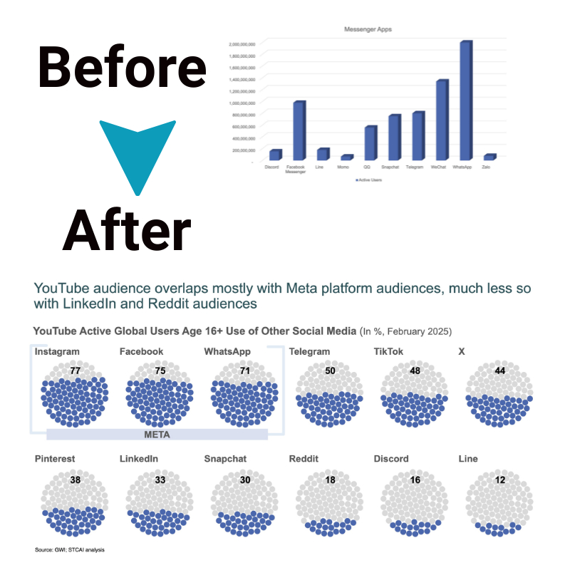
- Charts and Graphs: Visualizing numeric data in bar charts, line graphs, and scatter plots makes patterns easier to see. Try different chart types to see which best highlight the insights you’re looking for.
- Correlations: See how strongly different variables correlate positively or negatively. High correlations can reveal important cause-and-effect relationships or multi-collinearity issues.
- Regressions: Regression analysis examines the combined influence of multiple variables on an outcome, which helps predict what drives things like customer satisfaction, renewal rates, or sales.
- Statistical Testing: Use t-tests, ANOVA tests, or nonparametric alternatives to check if differences in item ratings, scores, or other metrics are statistically significant versus being due to chance.
- Outlier Detection: Isolating unusually high or low data points helps spot anomalies that could reveal important niche trends or problem cases that require investigation.
Visualizing Comparison Data Effectively
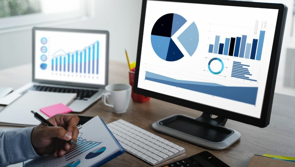
Turning data into visually compelling charts and graphs that “tell the story” of comparisons makes analysis impactful. Effective visuals adhere to clarity, accuracy, and aesthetics principles to communicate quickly and memorably. Common types for comparisons include:
- Bar charts and column charts for simple side-by-side comparisons of discrete metrics or categories.
- Line graphs to illustrate trends or changes over time for continuous variables.
- Pie or donut charts are used to emphasize part-to-whole percentage relationships.
- Scatter plots map the relationship between two quantitative variables.
- Tree maps and bubble charts are used to visualize more than three dimensions simultaneously.
Tools like Microsoft Excel, Tableau, and Datawrapper offer flexible options for professional-quality charts, while Canva and Infogram provide simple editor interfaces. Creative visualization choices should match the context and intended distribution platform capabilities.
Tips for Persuasive Presentation
Once analysis and visualization are complete, clearly communicating findings is key. General best practices include:
- Start with an executive summary highlighting the main takeaways.
- Tell a story through the presentation with a logical flow and introduction of key insights one by one in a memorable way.
- Give the audience context on objectives and methodology before delving into results.
- Use visualization generously to break up walls of text, yet discuss visuals to aid interpretation.
- Draw comparisons visually through dynamic charts that change based on filters or selections.
- Leave time at the end for any thoughts, implications, or calls to action based on findings.
- Maintain high production value through design/formatting while keeping it simple.
- Test presentation on others to fine-tune timing and ensure message clarity before stakeholder delivery.
Advanced Technique: Conjoint Analysis
Conjoint analysis is a sophisticated approach with applications for new product design, pricing optimization, and segmenting markets. This technique determines how people value different attributes or levels within the attributes that make up items or concepts. By having participants rate or choose between combinations of attributes across many questions, relative importance weights for each attribute are calculated.
This allows estimates for how preference might change with certain attribute tweaks, enabling evidence-backed optimization. Combined with financial data, conjoint outputs feed optimizations that maximize outcomes like revenue, market share, or net promoter score.
The Bottom Line
Properly analyzing, visualizing, and presenting comparison data allows executives, researchers, and even consumers to make significantly better-informed decisions and capitalize on opportunities. The tools and best practices covered here can be applied in various contexts from new product development and customer research to public policy analysis.
By committing to rigorous methodology, creative communication, and real user-testing, data comparison projects lead to insights that positively impact business and society. Continued advancements in AI and machine learning are ushering in even more powerful techniques for unlocking value from comparison data at scale.


