The Ultimate Guide to Creating a Professional Diagram in PowerPoint
Coming up with diagrams that look like a professional did them in PowerPoint isn’t hard. Producing neat and efficient diagrams is a big challenge for a lot of presenters. We will walk you through each part with this guide in an easy way.
The steps discussed below will help you when you are designing flow charts, organizational structures, timelines, or any diagram in PowerPoint. So, let us see how we can convert simple shapes into amazing designs.
Step 1: Structure of the diagram

On a piece of paper, sketch out the diagram structure roughly. What do you want to say? Choose the option for a new slide in PowerPoint.
Click on Insert, then on Shapes. Choose your layout for the content. Think about how information will move. Make sure the structure is simple and clear. Don’t forget to split the elements up. It will save time at the end of the day.
Step 2: Choose appropriate shapes
Then, you can find the shapes option under the Insert tab in PowerPoint. Select the best forms that best represent your views. They indicate processes for squares and continuous cycles for circles. Relationships and the flow of the process should be indicated by the arrows. Uniform figures should be used for elements that are alike.
The Shape Format tab contains many options to format. Make sure shapes are proportional and also aligned. Just think of using PPT templates so that you have such better options for laying out everything professionally.
Step 3: Add content and text
Any shape can be double clicked to add text. The text must be short and easy to read. If you use Arial or Calibri, then it will be clear. Also, remember to keep the font size of the font sizes uniform all over the diagram in PowerPoint.
Use format text alignment to make it more professional. If necessary, include brief explanations. Using the Format pane to style your text is better. Consider words and lines as spaces. Text in shapes should be avoided if the text is crowded.
Step 4: Apply colors and styling
Select a color scheme that goes well with the theme of your slides. The Shape Fill tool can assist in changing the colors. Use Shape Effects for a slight depth. Ensure that objects which are alike have the same colors. You may create consistent designs using PowerPoint diagram templates.
Avoid using too many colors. Contrast should be such that it enhances visibility. Be careful with applying gradients. Ensure you follow the brand guidelines if any.
Step 5: Joining and aligning objects
SmartArt is suitable for related data. Connect shapes with lines. Maintain equal spacing between neighboring elements.
Under the Arrange tab, we align elements and group related ones. Confirm that the arrows are correctly positioned. Consider bar graphs when presenting information. Ensure consistency in spacing throughout. Use guides for proper alignment.
Step 6: Improvise and refine
Enlarge chart separately. Ensure that the writing can be seen clearly from afar. Ensure even spacing and alignment of everything. Shadows should also be included in the picture where necessary. Also, think about using geo graphs to gather data related to locations.
STC AI – Simply smarter

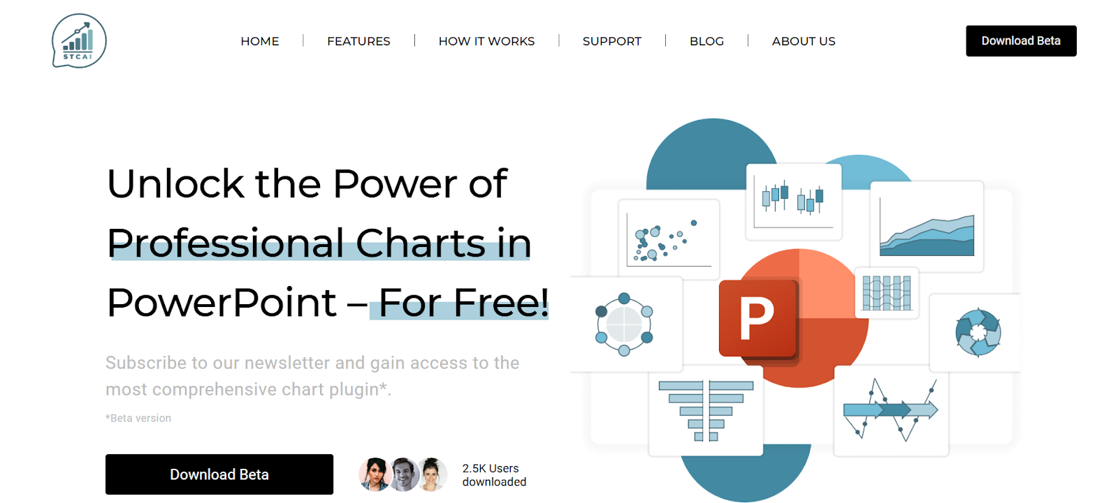
This is a cumbersome process to the point of having to manually draft a diagram in PowerPoint. STC AI removes this complexity from PowerPoint. This tool comes with over 50 different charts and visual options that help simplify the process of creating complex diagrams by simply clicking a button and cutting down the user’s time hours.
With more advanced flow charts such as in decision making, the program will also be able to handle them, saving you the headaches of the technical stuff so you don’t even have to second guess its use-ability when creating something really important!
Impact of STC AI
The way in which we make diagrams on PowerPoint changes with STC AI. The process is simple: Clicking a few keys allows you to choose the most appropriate visual representation for your data and input information as required. The ease of integrating data in terms of logics and texts between the participants is followed by these state of the art visuals which match with company’s branding.
With animations, they increase the fun. This is a standalone tool in PowerPoint and does not need other programs or skills to help all people to make good diagrams easily.
Conclusion
With these steps, you can quickly create a professional diagram in PowerPoint. If followed properly, these tips will help you come up with elegant diagrams within a short time, irrespective of whether you choose to do them manually or through STC AI.
Remember that everything must be clear and understandable. Start applying these approaches now to make your visual communication better.
Frequently Asked Questions
1. Can I make good PowerPoint diagrams in a reasonable amount of time?
A: With experience it takes 15-30 minutes to draw simple schematics, and it may take much of your time for complex ones.
2. Can post editing changes be made in PowerPoint charts?
A: Certainly, all components are completely changeable, which is why users are free to change any alterations inside created diagrams.
3. How can we have uniformity in diagrams?
A: It is recommended to use templates, and stick to a color scheme and equally distanced elements among each other.


