The Ultimate Guide on How to Make Visualizations for Slides
When it comes to making effective presentations, it is very hard to ignore the role of effective visualization. No matter whether you are giving a sales pitch or showing the findings of your new research – if you do not have engaging visuals to back you up, it can have a grave impact. But had it been that easy to create one, the problem would have been solved. Most professionals find it challenging to create proper visuals that convey their ideas. In this context, it is important to remember that 65% of people identify themselves as visual learners.
So, if you want to know how to make visualizations for slides, this guide will be your one-stop solution. As you finish reading, you will surely have a thorough understanding of creating visuals that are engaging.
Why visualizations are essential in presentation slides
If you think visualizations just add a cinematic feel to your slides, you are absolutely wrong. The most important thing for a professional is to connect with the audience, and that is where visualizations become important. They are necessary tools for communication that helps people to break down information and process them quickly.
- Simplify complexity: A good chart or graph will break down complex sets of data into easy-to-understand information.
- Capture attention: Visuals will engage the audience a lot more than texts.
- Support decision-making: Clear representations of data will help the stakeholders to make the right choices.
Key steps to create effective visualizations

Now that we have understood the need for visuals, let’s learn how to make presentation slides with engaging visualizations.
1. Understand your audience and purpose
The first thing that you need to do is to identify the target audience and have a clear understanding of your goals. No two visuals can be the same as you must tailor them according to the story that you want to put forward.
2. Choose the right chart type
Matching the data to the visualization is essential. Here’s a quick guide:
| Chart Type | Best For |
| Bar/Column Charts | Comparing categories |
| Line Charts | Showing trends over time |
| Pie Charts | Representing proportions |
| Decision Trees | Mapping options and outcomes |
| Bubble Diagrams | Highlighting relationships and sizes |
3. Leverage tools like STC AI

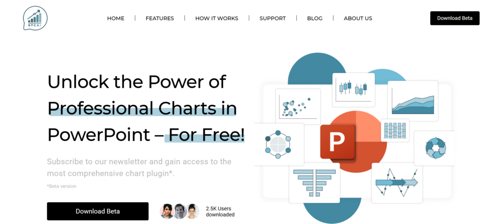
If you want to create complex charts directly in PowerPoint, tools like STC AI can be of great help. STC AI is a free PowerPoint add-in that allows users to create advanced charts like Decision Trees, Population Pyramids, and Process Charts. It comes with an intuitive drag-and-drop interface and useful real-time previews.
How to use STC AI in your workflow:
- Install the add-in: Access STC AI within PowerPoint.
- Select a chart type: Choose from over 50 options, including standard and advanced visuals.
- Import data: Upload your dataset directly from Excel or CSV files.
- Customize: Adjust colors, fonts, and animations to align with your presentation’s theme.
- Preview: Use the real-time preview feature to make final adjustments.
Common pitfalls to avoid
Creating impactful visualizations means learning to avoid common mistakes:
| Mistake | Solution |
| Using inappropriate charts | Match the chart type to the story your data tells. |
| Overloading with information | Focus on one key takeaway per slide. |
| Ignoring audience context | Design visuals for the knowledge level of your audience. |
| Inconsistent design | Stick to uniform fonts, colors, and styles. |
Conclusion
Mastering the art of how to make visualizations for PPT is all about selecting the right way to express your message effectively. Visualizations will break down complex data and make it easy for your audience to follow. This keeps them engaged and helps you connect with them better. In simple terms, effective visualizations are the way to go if you want to make your presentations memorable.
FAQs
1. What is the most common mistake you can make while creating visualizations?
If you use the wrong chart type for the data that you are presenting, it can be a grave mistake. Always make sure that your chart is in sync with the message you want to give.
2. How do I make sure my visualizations are readable?
You need to use proper fonts and appropriate sizes. Apart from that, use contrasting colors to make the visuals readable.
3. Can I use STC AI for complex visualizations?
Yes, you can use it for advanced visuals like Decision Trees and Population Pyramids. Also, you can create them directly within PowerPoint and that makes the whole process a lot easier.
4. How can I add animations to my slides?
If you want to make basic and interactive animations to make your data more engaging, you can use PowerPoint along with STC AI.


