The Psychology of Multiple Charts: Why Certain Combinations Work Better
Data visualization is a powerful tool for communicating insights, trends, and patterns in data. While a single well-designed chart can effectively summarize key findings, using multiple charts together can have additional psychological benefits for enhancing understanding and engagement.
Carefully combining visualizations allows people to make comparisons, detect relationships, and extract meaning more readily according to established visual perception, cognition, and behavior principles.
Understanding the Role of Cognitive Load in Data Interpretation
Interpreting data visualizations places cognitive demand on viewers. Several interrelated factors influence how easily or difficult it is for the human mind to process the information displayed in charts. These include:
- The intrinsic complexity of the data being visualized
- Design choices regarding visual encodings like shapes, colors, interactivity, etc.
- The way graphical elements are spatially arranged on the page
- The reader’s prior knowledge and familiarity with the chart types
Well-designed individual charts aim to optimize these factors to efficiently communicate insights without overloading viewers’ cognitive capabilities. However, using multiple charts introduces additional cognitive burdens of splitting attention between different visualizations and mentally integrating related information from separate graphics.
Strategic design and layout decisions are imperative for keeping the cumulative demands of multi-chart data presentations within bounds so users can successfully comprehend key aspects and make meaningful comparisons.
The Psychological Principle of Comparison and Contrast
Core psychological research on learning and decision-making shows that people naturally look for similarities and differences when presented with multiple options. This tendency stimulates more comprehensive mental processing. Displaying data visualizations nearby taps into this instinct, enabling more effective analysis. Thoughtfully combining charts provides intentional visual contrasts that reveal informative relationships.
Elements like colors, shapes, or positions can correspond across graphics to illustrate differences and commonalities in the underlying data. Practically arranging visualizations for effortless visual juxtaposition is essential for utilizing comparison psychology.
Color Psychology and Visual Hierarchy
Color is an incredibly influential visual variable that also carries psychological implications. Different hues inherently attract more visual attention based on properties like warmth and intensity. Color associations also stem from learned cultural influences and personal experiences.
Skilful designers consider these factors to direct focus and communicate meaning in line and bar charts through careful colour choices. For example, consistent colors between stacked or clustered bar charts creates clear links that help differentiate groups and categories. Aligned color schemes also integrate multi-chart data presentations into a unified whole rather than disjointed separate entities.
Establishing clear visual hierarchies further facilitates chart intercomparison—labels, titles, emphatic colors, and bolded borders denote the most critical graphical elements.
Pattern Recognition in Data Visualization

The human visual system is wired to detect patterns automatically by identifying repeating elements and structures. Charts and graphs leverage this capability to quickly infer trends, trajectories, proportions, correlations, etc. Showcasing the same data facets across multiple graphical formats stimulates insightful discoveries of data regularities.
Pairs of charts may exhibit identical directionality, proportions, or slopes, while trios can reveal converging relationships. Layouts that align identical axes, baselines, and data scales between charts boost mark matching and trend consistency checks. Data visualizations should balance simplicity for individual chart clarity with richness from multiplying graphical perspectives.
Reducing Data Misinterpretation with Multiple Chart Types
No single visualization format can completely eliminate potential misinterpretations or false conclusions. Every chart type has innate perceptual and cognitive limitations depending on properties like geometry, dimensionality, and visual metaphor. Mismatched visual encoding risks misleading data communications when the form contradicts functionality.
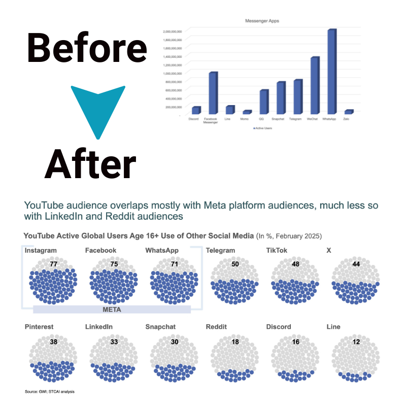
Combining complementary chart varieties – such as dot plots, heatmaps, and radial charts – safeguards against erroneous inferences. Each option displays the same numbers, but shifts perceptual focus to different attributes like central tendency versus distribution and absolute versus relative comparisons.
Varying visual models prompt a more thorough understanding by illustrating data from multiple mathematical perspectives, reducing instinctive yet inaccurate assumptions.
Emotional Engagement with Multiple Charts
Finally, thoughtfully incorporating multiple data visualization approaches elicits greater emotional and intellectual investment through capturing attention, inciting interest, and inspiring new discoveries. Jazzing up static statistics with diverse colorful and form-fitting charts signals relevance and importance. Mixing familiar and unfamiliar graphics also intrigues viewers by introducing novelty components.
Custom graphical mashups feel personally tailored rather than generic canned charts. Details spotted when pouring over figures may spur further exploration. Even seemingly dry quantitative data comes alive through versatile graphical lenses promoting more profound perspective and understanding.
The Role of User Familiarity with Different Chart Types
Balancing text and graphics for communicating data insights requires factoring in intended audience expertise regarding visualization literacy. Both novice and expert data consumers can gain insights from multiplying graphical formats, but the appropriate range and diversity of charts depend on recipients’ comprehension capabilities. Too few repeating chart types fails to take advantage of the full power of data visualization for illuminating findings from diverging angles.
Conversely, an oversaturation of novel complex charts dampens understanding by cognitively overloading viewers. Understanding target users’ base familiarity with common charts like bar graphs and line charts, as well as more advanced varieties like tree maps and network diagrams, informs smart selections and combinations for inclusion.
Conclusion
Thoughtfully integrating multiple data visualization approaches leverages core principles of human psychology – comparison, visual hierarchy, pattern recognition, and engagement – for more impactful and accurate data communication. Complementary charts provide insurance against misinterpretations rooted in standard graphical limitations.
By strategically aligning designs and layouts, the collective cognitive load imposed by multiplying graphics remains manageable. For both fledgling and mature visual thinkers, spurring discoveries through varied graphical data perspectives elicits richer analytical thinking and informed decision-making.


