The Impact of Storytelling in Business Meetings – 3 Ways to Use Microsoft Excel and Charts
Effective storytelling is emerging as a powerful tool for driving change and sparking action in business. Rather than simply presenting dry facts and data, integrating compelling stories and data narratives into business meetings helps capture attention, inspire audiences, and boost key information retention. In this blog, we’ll explore the storytelling Impact in business and three ways you can use Microsoft Excel and charts to bring data to life.
Impact of Storytelling in Business
Storytelling is not just for entertainment. When applied thoughtfully, it can be a powerful business tool. Stories have a remarkable ability to influence, educate and inspire. The dry numbers and statistics come alive by weaving compelling narratives into data-driven business presentations. Storytelling impact brings several benefits when used thoughtfully in business contexts:
- Builds trust and credibility by humanizing data
- Simplifies complex data sets through illustrative examples
- Drives emotion and builds connections to spur change
- Makes data memorable and sticky for audiences
- Captivates audiences and increases engagement
Presentations become interesting and impactful by taking raw data and crafting impactful stories around insights, trends, and outcomes.
Ways to Use Microsoft Excel and Charts
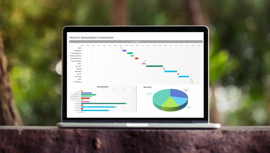
Excel offers useful creative tools to build data narratives. Here are three ways to use Excel effectively for storytelling with data:
1. Creating Compelling Narratives with Excel Data
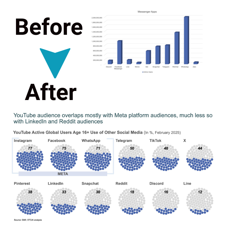
Excel allows you to analyze large datasets and identify key trends and patterns. You can then take this data and craft it into a compelling narrative arc, bringing the data to life. For example, analyzing sales data in Excel may reveal a dip in Q3. You could create a before-and-after story about the challenges that led to this dip and how the business recovered. This turns raw figures into an interesting story.
2. Using Excel Charts to Visualize the Story
Charts and graphs allow you to visualize the data-driven stories. For instance, showing monthly sales in a line graph visually tracks the highs and lows. Effective data visualization simplifies complex statistics into easy-to-understand charts. Audiences can now literally “see” the story unfold before them.
3. Dynamic Storytelling with Interactive Excel Dashboards
Linked charts in Excel dashboards make stories come alive through interactivity. As you click through data in one chart, the others update.
Seeing different data visualizations update dynamically improves understanding and engagement. The story becomes hands-on, and audiences actively participate.
Integrating Excel with Presentation Tools
While Excel helps model data stories, slideware like PowerPoint helps actually tell these stories visually. An impactful technique is linking Excel charts to PowerPoint slides so that connected charts update when data updates. This makes presentations dynamic.
Through integrated Excel-PowerPoint storytelling Impact, data narratives become truly engaging. The story shifts from a passive info dump to an interactive, dynamic walkthrough of insights.
Conclusion
Thoughtful storytelling Impact integrated with Excel data analysis and visualization enables deeper audience connection and improves retention of key messaging. Tapping into the emotional side of audiences with compelling data narratives makes them care more deeply. Raw data alone often fails to engage audiences fully.
Transforming dry statistics into insightful stories gives the data meaning, purpose and impact. Excel and PowerPoint can turn boring data presentations into compelling, memorable data stories that resonate with audiences driving understanding, recall and action.

