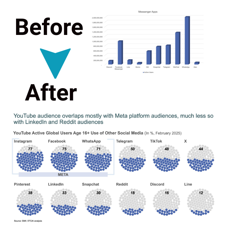
Tell Powerful Stories From Data: Techniques for Engaging Visual Narratives
Data stories transform boring numbers into memorable revelations. They liven statistics by blending interactive visualizations that let audiences explore findings with compelling storytelling elements that provide meaning. Building plots around data points takes viewers on an insightful journey. The twists and turns captivate attention, while grounded charts allow hands-on analysis. This fusion sticks better than raw figures alone. In the section below, we’ll discuss the strategies for using data visualization for storytelling.
What are data stories?
Data stories apply storytelling craft – character, conflict, plot arcs, crescendos, etc. – to analytical content using interactive visualizations as the narrative medium. They transform static numbers into experiences that engage and enlighten.
At the core, facts and figures maintain integrity to steer analysis. But thoughtfully layering persona perspective, unanswered questions that build intrigue, surprise plot twists revealing insights, and even embedded media adds dimensional context. This bridges data discovery with human connection to resonate perception shifts that live beyond cursory glances at charts.
Advantages of using data visualization for storytelling
- Meaning making – Storytelling techniques extract the tangible essence and impact from data, allowing audience understanding that is easier than standard visualization reporting, which often lacks resonating context. Narrative elements bridge raw statistics to realized human relevance that viewers can personally relate to for interpreting clarity.
- Memorability – The progression of plot setting, escalating rising action, peaks of conflict, and satisfying resolutions in data stories embed the most vital key findings for far better retention and accurate recall compared to glancing at isolated charts. Struggles make victories sweeter.
- Motivation activation – Framed as purposeful journeys mapped to viewer interests rather than generalized one-size-fits-all delivery, tailored data stories can spur further independent investigation of aspects that intrigue particular users well beyond the core presentation. Interactive control harnesses natural curiosity.
- Audience widening – Introducing the familiar entry points and guiding context of narrative conventions grounded in underlying data analytics invites less inherently data-savvy viewers across wider demographics to engage comfortably with and progressively gain insight from multifaceted statistical content they may otherwise reflexively avoid as too dense or intellectually intimidating without a relevant framing storyline.
Types of data and suitable charts
Matching data attributes to appropriate visual constructs clarifies communication for memorability.
- Textual data
Text details qualitative context too nuanced for charts. Selective highlighting guides viewers through key excerpts to back the analysis.
- Mixed data
Dashboards blending multiple formats provide unified narrative context: graphs to quantify trends plus text, images or video to add qualitative meaning.
- Numeric data
Time-series line charts showcase trajectory and patterns succinctly for time-based plots to build anticipation, while bar and pie charts climax for “aha” discoveries.
- Geospatial data
Maps overlay engaging geographic data layers to trace regional distributions, densities, and flows as chapters guiding exploratory plot arcs. Pins mark pivotal locations for emphasis.
Tips for using data visualization for storytelling

1. Identify your core story
First, be clear on the key lesson or change in thinking you want viewers to walk away with. That insight is the core of your data story. Build the narrative and visual flow to take audiences on a revealing journey to that “aha” moment. Use characters and real-world plots that relate to viewers’ lives, making numbers meaningful. Layer rising action, twists, and climax visuals that captivate people, so by the finale, the data directly translates into an impactful personal revelation for your listeners they’ll remember.
2. Know your audience
Thoughtfully consider the relevant firsthand experiences, personal preferences, accessibility needs, cultural perspectives, generational viewpoints, inherent biases, preexisting perceptions, subject expertise levels, and available background context that together influence and shape how diverse viewers across widening demographics will intuitively interpret and internalize key takeaways from both the layered narrative storyline and strategic visual encodings purposefully selected to convey the guided data-driven insight.
3. Craft compelling narrative
Apply literary techniques: an intriguing opening hook, protagonist viewer proxies making data points relatable, plot buildup spurring engagement, climax dots connecting to pivotal discovery, and resolving takeaways improving audience decision making. Build your storyline around the key data revelations, using the charts themselves like story illustrations that come alive as viewers interact. Structure rising action about questions the data can answer and make the climax deliver those visual “aha” answers to stick the landing.
4. Clarify through visuals
Leverage visual hierarchy, styles, and interactivity tailored to direct narrative flow from the opening hook through rising engagement to climatic discovery peaks for crafting memorable revelations. Guide viewer attention across pivotal data details as the journey unfolds toward conclusions.
Conclusion
Data stories navigate between boring facts and fantasy fiction. An effective blend combines data credibility with narrative context. Interactive charts permit factual exploration, while compelling story elements build engagement without embellishing. Together, they lure attention, efficiently clarifying insights. This fusion explains dry statistics appealingly so the core lessons resonate over the long term. Maintaining quantitative rigor remains crucial, but engaging communication is equally critical for audience relatability.


