5 Techniques for Effective Data Communication Using Microsoft PPT
Data communication has become vital in the modern business world. With massive amounts of data generated from multiple sources, organizations need robust platforms and tools to collect, analyze, and disseminate data insights effectively. This is where Microsoft PowerPoint steps in as an indispensable data visualization and communication tool.
In the section below, we’ll discuss five proven techniques for using PowerPoint’s visual Impact for driven communication.
Role of Microsoft PowerPoint in Data Visualization

PowerPoint offers a versatile canvas with stunning visual capabilities for creating engaging data-driven presentations. With its easy-to-use data import and graphing tools, PowerPoint enables the rapid creation of infographics, charts, graphs, and data models to communicate insights. It empowers presenters to tell compelling data stories that influence stakeholder decisions and drive business growth.
Techniques for Effective Data Communication
Technique 1: Simplify Data Visualizations
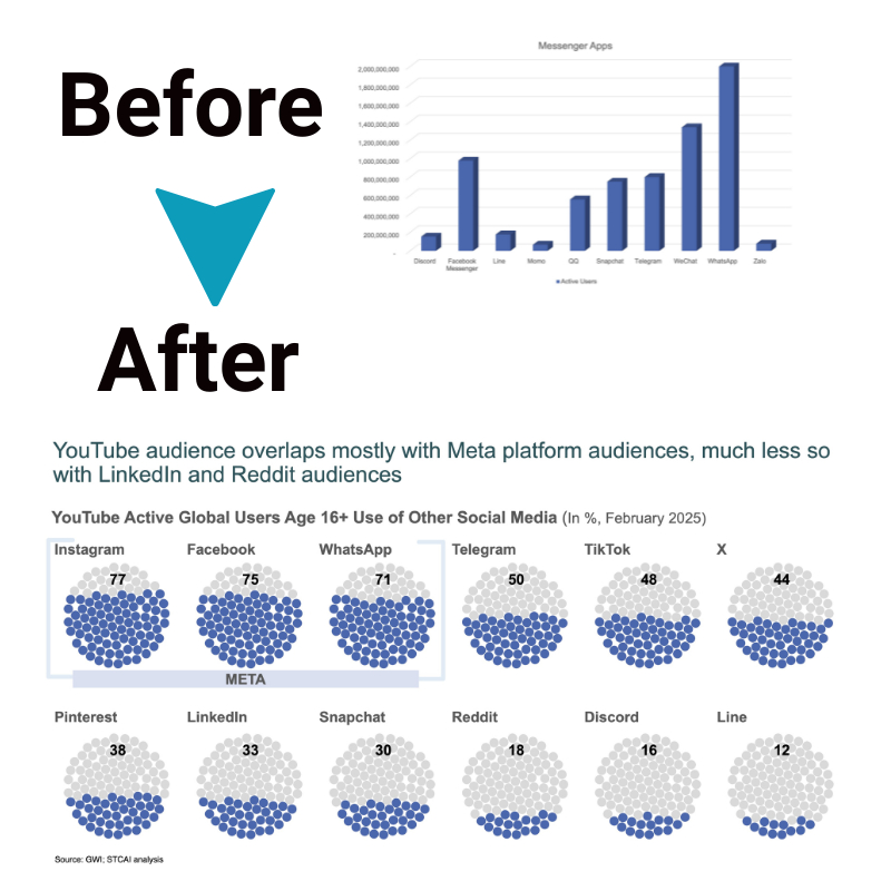
The biggest mistake most presenters commit is overloading slides with redundant data. Too much data clutters the slide, overwhelms the audience and obscures the core message. The mantra is – “Less is more”. Some ways to simplify data through visual Impact are:
- Show only the most relevant data by filtering out noise
- Use minimalistic designs and muted palettes
- Display only essential trend lines instead of raw data
- Round off figures and summarize labels concisely
- Use charts instead of dense data tables
Adopting these simplification strategies results in clean, uncluttered slides that communicate clearly. The audience can easily discern patterns, trends and key takeaways.
Technique 2: Use Consistent and Professional Design
A consistent design system across slides fosters better cognition and retention. Core elements of professional design include:
- Maintain consistent layouts, font styles and color schemes
- Separate and categorize data logically into discrete slides
- Use slide templates to achieve polished looks quickly
- Craft easily navigable slide hierarchies for fluid storytelling
- Implement company visual Impact elements for brand consistency
Such design cohesion enhances information flow and creates trust. The professional sheen also builds the presenter’s credibility.
Technique 3: Highlight Key Data Points
Audiences need more attention spans. Hence, presenters should focus on accentuating only the most impactful data points instead of displaying all the minutiae. Strategies include:
- Call out significant data using callouts, arrows, circles, etc.
- Spotlight outliers, peaks and troughs using contrasting colors
- Zoom into specific chart areas to showcase vital data
- Annotate data markers to draw attention to relevant points
- Reinforce insights using concise slide titles and takeaways
Such selective emphasis guides the audience towards crucial information.
Technique 4: Incorporate Interactive Elements
Plain static charts quickly lose viewer interest. Transforming visualizations into dynamic interactive elements that respond to user input helps sustain engagement. Ideas include:
- Import Excel data models into PowerPoint to enable slicers
- Add triggers to show/hide data or navigate slides
- Use click animations to showcase more data on click
- Enable users to filter data within charts
- Provide scrollable charts to reveal additional data
Interactivity promotes active participation, deeper understanding and longer recall.
Technique 5: Utilize Animation and Transition Effects
Subtle animations can be used judiciously to shift audience focus across key data points and transition smoothly between slides. Animation ideas include:
- Show data presentation build-up using chart animation
- Fly-in titles/images relevant to data points
- Animate custom chart objects like arrows and callouts
- Morph charts seamlessly into the next variants
- Implement compelling slide transition effects
When used sparingly, animations infuse visual Impact and maintain audience attentiveness.
The Bottom Line
Mastering the given techniques requires hands-on experimentation and an intrinsic understanding of audience psychology and visual communication principles. With its unrivalled ease-of-use advantages, PowerPoint enables subject matter experts with no design expertise to instantly transform raw data into compelling data stories that influence decisions.


