Storytelling With Charts: Tips for Engaging Chart and Graph Design
Stories have been ingrained into the fabric of humanity since ancient times of early cave paintings portraying hunting expeditions. In today’s world, organizations have discovered the impactful potential of using stories to bring data to life and motivate stakeholders to take action. This technique, known as data storytelling, involves crafting a persuasive narrative accompanied by a compelling chart design, transforming abstract statistics into tangible and easily understandable concepts.
When the audience is able to relate to the data, they are more likely to act in the desired way. Ultimately, data storytelling can be a powerful tool for effectively communicating information and influencing behavior. This article sheds light on how to improve your data narratives through intriguing chart design.
- Be careful with colors.
The use of color is a powerful and effective tool in data visualization. When utilized effectively, it can enhance and engage the reader. However, it must be used with caution as it can also be a distraction and even mislead the viewer if used poorly.
Remember that the use of the right colors can help in finding the required data within 70% less time. While colors can make your charts more engaging, avoid using more than six colors in a single layout. Otherwise, the presence of too many shades might confuse and overwhelm the viewers.
To ensure clear and effective communication in your chart design, it is important to use consistent colors to represent the same type of data. For instance, if you are presenting monthly sales data on a bar chart, stick to a single color. On the other hand, if you are comparing sales figures from different years in a grouped chart, it is appropriate to use a different color for each year.
It is crucial to be mindful of color associations, especially when representing positive and negative numbers. Avoid using red to depict positive numbers or green for negative numbers, as these colors have strong associations that can easily confuse the viewer and reverse the intended meaning.

- Make comparison easier
Data visualization effortlessly facilitates comparison, allowing you to grasp the differences between two datasets visually. However, simply placing two charts next to each other may not effectively achieve this goal. In fact, it can often result in confusion.
It’s important to maintain visual consistency so that the reader can easily make comparisons at a glance. This can be achieved through a multitude of graph design options, depending on what is most suitable for your data. But don’t overload the reader by including too many charts that require them to work too hard to make comparisons.
Additionally, the placement of your charts is crucial. You may have well-designed stacked bar charts that are intended for comparison. But if they are spaced too far apart to be easily comprehended, the effectiveness of your visuals is diminished. Keep your charts strategically placed for optimal understanding and engagement.
- Focus on the order of data.
The purpose of data visualization is to provide a clear understanding. However, when faced with random and confusing visual patterns, it can be frustrating and counterproductive to the intended message.
To effectively communicate with your audience, it’s important to organize your data in a way that flows naturally. This could mean arranging categories in alphabetical or sequential order or by value.
Consistency is extremely crucial in data storytelling. This applies not only to the overall design but also to the ordering of items in your legend.
In addition, when selecting increments for your axes, aim for even and natural intervals rather than uneven or awkward intervals. This will ensure a visually appealing and easily understandable representation of your data.
- Declutter your charts and graphs.
When creating data narratives, it’s important to carefully consider all elements and ensure they serve a purpose in telling the story. This doesn’t mean cutting out half of your data points. But you only need to get rid of unnecessary and irrelevant elements.
The chart design can play a crucial role in enhancing and communicating the story. So, let the design do its job. But avoid using 3D charts or anything that can distort the perception of the data.
- Use Consistent Scale and Units
Don’t toggle between different x/y axis scales, units of measurement, or legend keys when displaying related data. It distorts the visual comparison and makes trends hard to decipher. Pick one standard scale and set of units and stick with it across all graphs for seamless data analysis.
Maintaining a consistent scale and units allows viewers to assess relationships between data points across charts easily. Sudden changes in scale from one graph to the next force the audience to reinterpret the data visually in their mind. This extra cognitive load can frustrate and confuse readers.
- Highlight Key Information
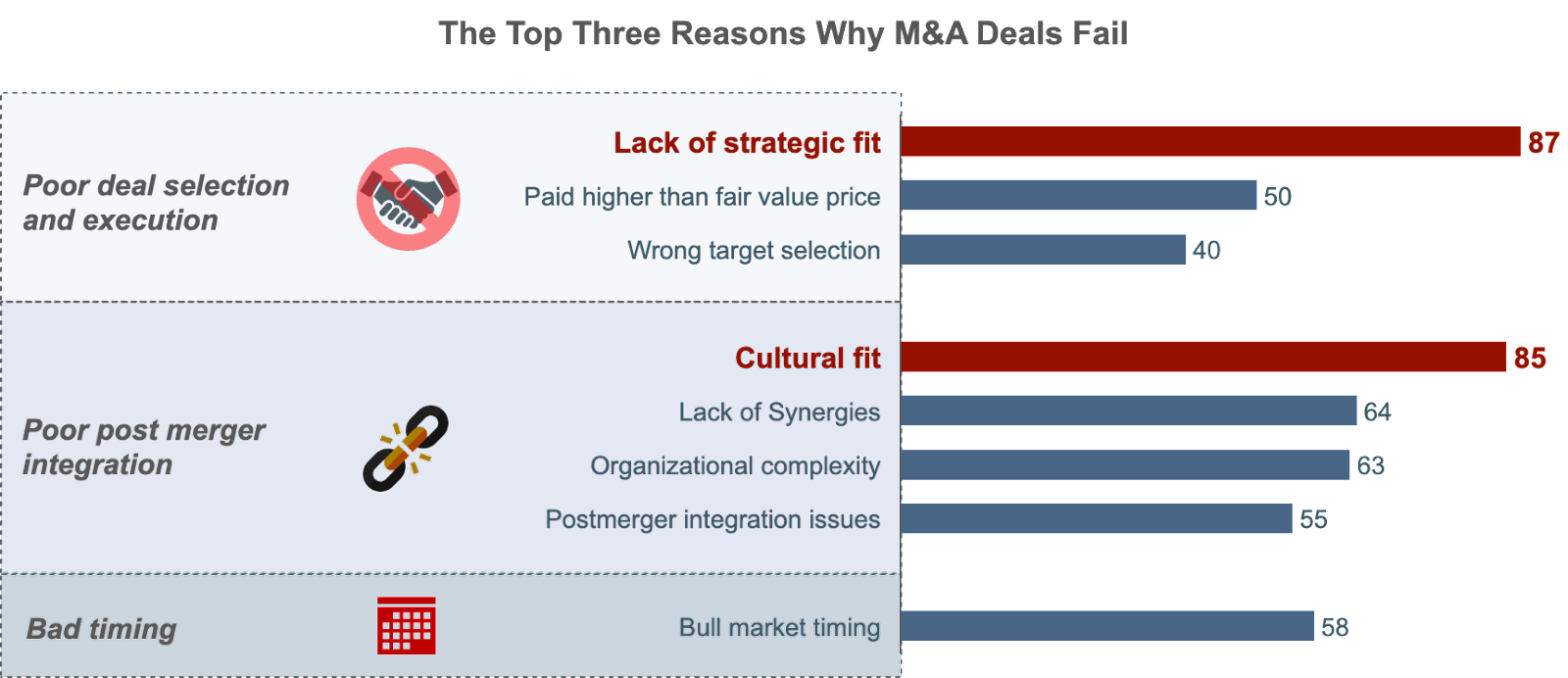
Strategically use visual cues to direct focus to the most meaningful parts of the data. Bold colors, larger sizes, or callout labels can spotlight significant patterns, outliers, or takeaways without going overboard. Keep it subtle yet eye-guiding. When highlighting key data stories, resist the urge to make everything bold and bright.
Amid a sea of loud colors, nothing stands out. Instead, selectively emphasize the most significant statistics, trends, or comparisons you want viewers to notice.
Make outliers pop by muting the rest. Use carefully chosen highlights to create a visual hierarchy that leads the audience step-by-step through the core insights. Like a map legend, these visual guides tell readers where to look and what deserves their attention.
- Choose the Right Chart Type
Select chart formats suited to the data structure and narrative you want to convey. Time-series data trends beautifully on line charts while comparisons pop through bar charts. Scatter plots showcase correlations, and pie charts (sparingly!) display part-to-whole relationships.
Choosing the wrong chart type can distort data stories or fail to spotlight key insights. Consider data structure (categorical, time-series, geospatial, etc.) and your narrative goals.
Ask yourself what relationships or patterns you want to highlight, and let this guide your chart selection. While certain formats, like pie charts, may look sleek, they can obscure nuances. Form follows function – the right chart conveys the data story cleanly and intuitively for accurate comprehension.

- Utilize Interactivity
Users can dig deeper into the data through toggles, tooltips, filters, and clickable elements. But be judicious – too many flashing buttons compete with visual comprehension.
Make sure each interactive element adds value, enhancing the user’s understanding rather than being a flashy distraction. It’s all about balancing, providing enough tools for users to explore, but keeping the interface clean and intuitive.
Conclusion
Using a strategic blend of data and visual aids has the potential to transform mindsets and actions both within and beyond a company. This makes data storytelling a crucial skill in today’s data-centric world, capable of enacting meaningful and lasting transformations in business operations. Grab your copy of Storytelling with Charts to learn more about creating effective charts for engaging data stories.


