Storytelling with Charts: How to Communicate Quantitative Analysis Effectively
Have you ever felt like your data analysis was lost in translation? You spent hours crunching the numbers, finding the insights, and crafting the perfect report, only to have your audience yawn, shrug, or worse, misunderstand your message. What went wrong?

The problem is not your data, but how you present it. Data alone is not enough to persuade, inform, or inspire your audience. You need to tell a story with your data, a story that connects with their emotions, values, and goals. A story that makes them care.
But how do you tell a story with charts? How do you turn dry numbers into compelling narratives? How do you balance accuracy and clarity with creativity and flair? In this blog post, we will explore some tips and tricks to help you master the art of storytelling with charts.
Tip #1: Know your audience

Before you start creating your charts, you need to know who you are talking to. Who is your audience? What are their needs, interests, and expectations? What are they looking for in your data? What are their pain points, challenges, and opportunities? How do they prefer to consume information? What level of detail and technicality do they need?
Knowing your audience will help you tailor your charts to their specific context and goals. It will also help you avoid jargon, acronyms, and assumptions that might confuse or alienate them. Remember, you are not creating charts for yourself, but for them. So put yourself in their shoes and think about what they want to see and hear.
Tip #2: Choose the right chart type

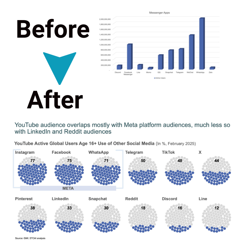
Once you know your audience, you need to choose the right chart type for your data. There are many types of charts available, such as bar charts, line charts, pie charts, scatter plots, etc. Each one has its own strengths and weaknesses and can convey different messages and relationships.
The key is to choose the chart type that best suits your data and your story. For example, if you want to show trends over time, a line chart might be a good choice. If you want to compare proportions or percentages, a pie chart might work well. If you want to show correlations or outliers, a scatter plot might be useful.
But don’t just pick a chart type based on convention or habit. Think about what you want to emphasize or highlight in your data. What is the main point or takeaway that you want your audience to remember? What is the most relevant or interesting aspect of your data? Choose the chart type that can showcase that aspect in the most clear and effective way.
Tip #3: Use visual elements wisely

After choosing the right chart type, you need to use visual elements wisely to enhance your chart. Visual elements include things like colors, shapes, sizes, labels, legends, titles, axes, grids, etc. These elements can make or break your chart, depending on how you use them.
The general rule is to use visual elements sparingly and strategically. Don’t overload your chart with too many colors, shapes, or labels that might distract or confuse your audience. Instead, use visual elements to draw attention to the most important or relevant parts of your data. For example, you can use colors to highlight key trends or patterns in your data. You can use shapes or sizes to differentiate categories or groups in your data. You can use labels or titles to explain what your data means or why it matters.
But don’t just use visual elements randomly or arbitrarily. Think about what they imply or suggest in your data. What is the meaning or message behind each color, shape, or size? How do they relate to each other and to your story? Use visual elements that can reinforce or complement your story, not contradict or undermine it.
Tip #4: Add context and commentary

Finally, after creating your chart with the right type and visual elements, you need to add context and commentary to complete your story. Context and commentary include things like captions, annotations, notes, explanations, etc. These elements can provide additional information or insights that might not be obvious from the chart alone.
The purpose of context and commentary is to guide your audience through your chart and help them understand what it means and why it matters. It is also an opportunity for you to inject some personality and voice into your chart and make it more engaging and memorable. For example, you can use captions or annotations to point out interesting facts or findings in your data. You can use notes or explanations to provide background information or assumptions behind your data. You can also use humor, irony, or emotion to spice up your chart and make it more relatable and human.
But don’t just add context and commentary randomly or excessively. Think about what is essential or helpful for your audience to know or learn from your chart. What questions might they have about your data? What answers can you provide them? What actions or decisions can you inspire them to take based on your data? Add context and commentary that can answer these questions and motivate these actions or decisions.
Conclusion
Storytelling with charts is not an easy skill to master, but it is a valuable one. It can help you communicate your data analysis more effectively and persuasively, and make a lasting impression on your audience. By following these tips and tricks, you can turn your charts into powerful stories that can inform, inspire, and influence your audience.
So next time you create a chart, don’t just show your data, tell a story with it. A story that your audience will care about and remember. A story that will make a difference.


