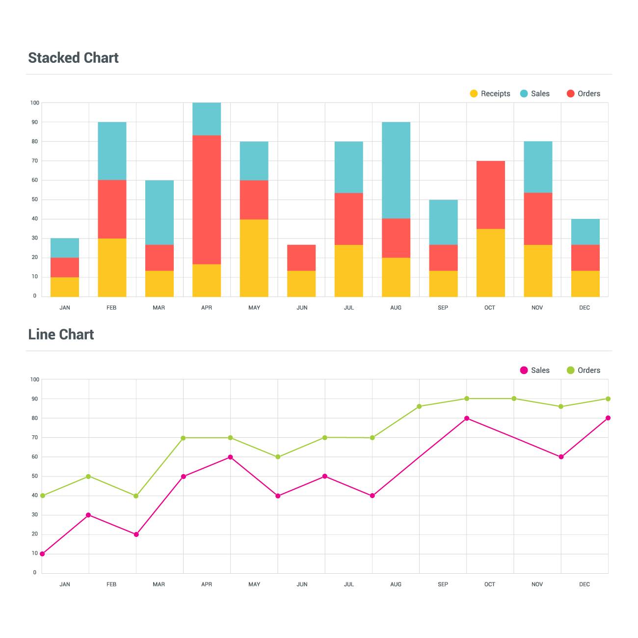
 Data storytelling is a powerful technique that involves presenting data in a narrative format to convey a specific message or highlight insights. Charts play a crucial role in data storytelling as they help visualize data and make it easier for the audience to understand and engage with the information. Here’s a guide to different types of charts and how to use them effectively in data storytelling:
Bar Chart:
- Best for comparing discrete categories or showing changes over time.
- Use different colors or patterns to represent different categories or time periods.
- Label the axes clearly and provide a descriptive title.
- Avoid clutter by limiting the number of categories or time periods.


Line Chart:
- Ideal for showing trends or changes over time.
- Plot data points and connect them with lines to highlight the overall pattern.
- Use markers to emphasize important data points.
- Add labels, titles, and axis descriptions for clarity.
Pie Chart:
- Effective for displaying proportions or percentages.
- Limit the number of slices to 5-7 to avoid clutter.
- Label each slice with its corresponding category and percentage.
- Consider using a legend if there are too many categories.
Scatter Plot:
- Useful for examining relationships between two variables.
- Place data points based on their respective values on the x and y axes.
- Use different shapes or colors to represent additional dimensions.
- Add a trend line or regression line to show the overall relationship.
Area Chart:
- Great for illustrating cumulative totals or proportions over time.
- Stack multiple areas to represent different categories or components.
- Use contrasting colors to differentiate between areas.
- Label the axes and provide a clear title.
Histogram:
- Suitable for displaying the distribution of a continuous variable.
- Divide the range of values into equal intervals or bins.
- Label the x-axis with the intervals and the y-axis with the frequency or percentage.
- Use appropriate bin sizes for clear visualization.
Heatmap:
- Effective for representing data on a grid or matrix.
- Use colors to indicate the intensity or value of the data.
- Add labels to the rows and columns for context.
- Include a legend to explain the color scale.
Remember, effective data storytelling involves selecting the right chart type based on the data you want to convey and the message you want to deliver. It’s essential to keep the visualizations clear, concise, and visually appealing, ensuring they support your narrative and engage your audience effectively.
