Stacked Bar Graphs for Business Presentations: When and How to Use Them in PowerPoint
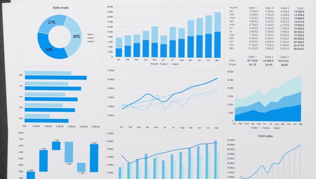
Stacked bar charts are column or bar graphs that allow you to break down and compare parts of a whole. Business presentations are an extremely effective way to visualize data trends, demonstrate growth and decline, and showcase the composition of various metrics.
Used strategically in PowerPoint, stacked bar charts bring Key Performance Indicators (KPIs) and other business metrics to life through visually striking and easy-to-grasp comparisons. Audiences can instantly recognize patterns, trends, and relationships that might otherwise take paragraphs of text to explain.
In this comprehensive guide, we’ll explore ten impactful ways to incorporate stacked bar charts into your next business presentation deck using PowerPoint.
What is a Stacked Bar Chart?

A stacked bar chart is a type of bar graph that allows you to break down and compare parts of a whole. Each bar shows a total value, but it is made up of different segments stacked on top of each other, each representing a value contributing to that total.
Here are the ways to incorporate stacked bar charts into your next business:
1. Track Revenue Growth and Decline Year-Over-Year
A simple yet powerful application of the stacked bar chart is to showcase revenue growth trends over time. For example, you can create grouped columns for the past 5 years of revenue data, with each year split into stacks representing different product lines, business units, territories, etc.
This makes it easy to observe which segments are driving the most revenue growth and decline year-over-year. Are enterprise products pulling their weight? Is revenue from the West Coast decreasing? This type of insight informs strategic decisions.
2. Demonstrate Market and Category Share
Stacked bar charts shine for showcasing market share metrics. For example, you can use stacked bars to exhibit your brand’s share of voice compared to competitors in your market. Breaking each bar down into percentages or dollar amounts allocated to different brands packs a visually striking punch.
You can also visualize category share trends, demonstrating where your brand is gaining or losing ground amongst consumer segments. The audiences can clearly recognize shifts in competitive positions from year to year.
3. Spotlight Sales Team Performance
For sales-driven organizations, stacked bar charts are extremely effective for showcasing sales team performance. For example, you can stack bars vertically by salesperson, with each bar segmented horizontally into deal volume won vs. lost. Alternatively, create horizontal stacks for important product segments or service lines and break performance vertically by individual team members.
This allows executives to easily identify all-star players driving the most deal volume and growth opportunities. On the flip side, low-performing salespeople instantly stand out.
4. Present Customer Acquisition and Retention Rates
Understanding sales and revenue metrics is only half the story. Savvy executives also need visibility into key customer metrics, such as acquisition rates and customer retention/churn percentages.
This is where strategically placed stacked bar charts can work wonders. You might structure acquisitions vertically by segmenting them. Stacked bars also allow you to incorporate targets and benchmarks, making it easy to showcase performance gaps.
5. Spot Trends in Customer Lifetime Value
While most businesses track simple customer counts, forward-thinking organizations understand the importance of monitoring metrics like customer lifetime value (CLV). This measures overall customer profitability.
Stacked bar charts enable you to break CLV metrics down by essential segments like customer type, geo-region, purchase channel, onboarding cohort or other dimensions. You can showcase trends over time, calling attention to dips or surges in profitability.
This allows executives to pinpoint problem segments faster and develop strategies to improve CLV.
6. Demonstrate Staffing and Headcount Metrics
For HR executives managing large workforces, monitoring headcount and staffing allocation metrics is vital for staying on budget. This includes tracking the number of full-time employees vs. contractors over time and by department, function, and seniority level.
Stacked bar charts make an ideal visualization for showcasing gaps or imbalances in resourcing and headcount allocation. HR can use this to bolster requests for additional headcount and demonstrate strategic hiring needs aligned with corporate objectives
7. Compare Channel and Campaign Marketing Spend
Stacked bar charts enable clever visualizations for showcasing shifts and adjustments to channel marketing and campaign spending over time. For example, stacks can showcase percentage budget allocation across channels like paid search, social ads, and content marketing. You can overlay this view with performance metrics like click-through rate and cost per conversion per channel.
This approach makes it easy to spot channels and campaigns delivering the highest return on spending and informs decisions on where to invest more (or less) in the budget going forward.
8. Unpack Website Traffic Sources and Conversion Rates
Business presentations aimed at executives often focus heavily on website analytics, such as visitor traffic, bounce rates, and conversion metrics. However, raw top-level numbers rarely tell the full story when reporting on website KPIs.
This is where stacked bar charts come in handy for easy visualization. For example, you can break monthly visitor metrics into channels like organic search, social referrals, direct mail, etc. Conversion rates can also be stacked by traffic source or by demographic segment, like mobile vs. desktop.
This granularity helps showcase volatility and opportunities in website performance below the surface that executives may otherwise miss.
9. Demonstrate the Composition of MQLs and Sales Pipeline
Stacking bar charts enables creative analysis of sales funnel metrics that are invaluable for sales leaders. For example, you can showcase quarterly trends in marketing qualified leads (MQLs) generated, splitting each quarterly bar into lead quality rating, lead source or lead type.
You can similarly visualize the sales pipeline – stacking pipeline value into distinct stages while demonstrating conversion rates through each funnel stage over time.
This analysis spots bottlenecks stunting pipeline growth and provides actionable advice to sales executives.
10. Present Employee Sentiment and Engagement Survey Data
For a holistic analysis of people metrics required to operate a thriving business, stacked bar charts help showcase trends uncovered from employee sentiment surveys. You can break down engagement scores by department, tenure, age groups and other filters that shed light on growing or declining company culture KPIs. Executives can spot categories of employees showing concerning patterns to address fast.
The Bottom Line
Stacked bar charts enable transparent reporting of business metrics and KPI trends that executives rely upon to make wise strategic decisions. Grouped thoughtfully and labelled clearly, stacked charts spotlight insights hidden below the surface across revenue, sales, marketing, customer, HR and website data.
By calling attention to growing or declining metrics through simple and striking visuals, stacked bar charts focus discussions on what matters most and provoke critical thinking on future opportunities or risks. The versatility and simplicity of stacked charts cement these as universally valuable tools for elevating any business presentation.


