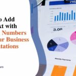
Spider Chart Examples: How Businesses Can Utilize Spider Graphs for their Growth Analysis
Spider charts, also known as radar charts or web charts, are a unique way to visually display multivariate data and compare different data sets across the same variables. With their web-like shape and multiple axes, spider charts allow businesses to analyze complex information and relationships at a glance.
Unlike simple bar or line graphs, spider charts can showcase performance across various key areas, pinpoint strengths and weaknesses, reveal trends and patterns, and enable data-driven decision-making for organizational growth. This makes them an extremely useful analytical tool for managers and executives looking to track progress, benchmark competition, understand market dynamics, allocate resources effectively, and form data-backed strategic plans.
Let’s explore what comprises a spider chart, some business-focused examples of utilizing them, and tips for incorporating spider graphs into a data-driven growth framework.
Understanding the Components of a Spider Chart
A spider chart has a few key components that must be well-designed for optimal graphical analysis:
1. Axes Representing Variables
The multiple axes protruding from a central point represent the different measured variables, which can be diverse areas like sales, costs, customer satisfaction, quality metrics, market share and more. Each axis is scaled to allow measurement and comparison across those variables.
2. Data Points and Web Structure
Data points are plotted along each axis, connected by lines to form the web. Multiple data sets can be plotted this way to overlay variables and enable visual comparison between metrics like historical performance, competitor standing, target goals, and more.
3. Visual Comparison Advantage
The resulting web-like visual makes it easy to contrast the data sets by sub-variables quickly. Gaps in the web can spotlight improvement areas, while overlaps reveal similarities. Spider charts lend contextual clarity to multidimensional relationships at a glance.
Practical Examples of Spider Charts for Business Growth
Spider charts have extremely versatile business applications. Let’s explore some examples that can drive organizational growth analysis.
Example 1: Performance Evaluation Across Departments
A company can use a spider chart to evaluate key performance indicators (KPIs) across functions like Sales, Marketing, Operations, Finance etc. Metrics plotted could be revenues, costs, output, efficiencies, lead conversions and so on per department. The chart can highlight lagging vs leading groups.
Example 2: Competitor Benchmarking
Plotting a spider graph comparing company sales, market share, revenue, customer NPS scores and other metrics versus key competitors allows understanding relative positioning and strategizing expansion plans accordingly.
Example 3: Product Development and Customer Feedback Analysis
For a technology firm, a spider chart can track metrics like adoption rates, user feedback surveys, return rates, calls to customer service as new features roll out – pinpointing successes and pain points.
Example 4: Strategic Planning and Resource Allocation
As strategies and budgets are set, management can use spider charts to allot resources per initiative by plotting required investment, ROI potential, and talent needs and identifying priority buckets.
Benefits of Using Spider Charts in Growth Analysis

There are several valuable ways spider graphs boost strategic planning for organizational advancement:
1. Multidimensional Comparison
The key advantage of spider charts is the ability to compare multiple variables and metrics in a single visual concurrently. This is invaluable for business managers tracking progress across diverse functions and objectives. For instance, a retail chain can utilize a spider graph to monitor annual sales growth, customer satisfaction scores, warehouse efficiency metrics, delivery times and workforce productivity KPIs across all stores and channels.
Overlaying historical performances allows quick identification of trends. Comparing performance across departments spots differential achievement. Benchmarking against competitor data pinpoints relative strengths and opportunities. Spider charts clarify interrelationships between complex metrics that would otherwise require examining many separate reports. The visual web shape simplifies the assimilation of multidimensional dynamics essential for strategic evaluations.
2. Easy Identification of Strengths and Weaknesses
The overlaying of data sets on a spider chart makes it effortless to discern performance overlaps and gaps across different metrics. Areas of overlap represent organizational strengths where targets are being met or exceeded. However, gaps in the web instantly spotlight shortcomings requiring intervention.
For example, a SaaS firm’s spider graph may show successful customer acquisition but missed low retention rate targets, indicating potential product or service issues needing resolution. Similarly, a clinic’s charts can reveal patient satisfaction, and outcomes scored highly but lagging on the accuracy of diagnosis or costs, pinpointing improvement areas. Rapid distinction of what’s working versus problematic is invaluable for strategy prioritization.
3. Clear Communication of Complex Data
Spider charts allow even intricate relationships between diverse data points spanning metrics like sales numbers, percentage changes, customer ratings, operational efficiencies, etc., to become easily comprehensible. The visual construct of scaled axes transforming statistics into an intuitive web shape amplifies information communication and comprehension speed.
Let’s face it – most business reports crammed with rows of performance indicators are dense to parse. Spider graphs simplify the visualization of complex statistics and interlinkages, enabling faster inferences – a picture speaks a thousand words, after all! Decision makers can instantly absorb spider chart insights for responsive strategy direction.
4. Visualization for Strategic Planning
The spider chart’s holistic and graphic view of overall business health and metrics empowers leaders to make well-calibrated growth decisions, be they investment prioritization, resource allocation, process improvements, or competitor benchmarking.
Charts readily convey where more funding can accelerate revenue metrics, operational changes can enhance service quality scores, which initiatives warrant scaling company-wide based on adoption patterns and so on – better strategy visualization drives precision execution. Leaders can also set future performance goals as overlays on spider charts to ensure initiatives ladder up to tangible organizational targets – spurring proactive management.
Best Practices for Utilizing Spider Charts in Business
To leverage spider charts effectively for data-centric growth initiatives, here are a few best practices:
Keep Variables Consistent
Using the same set of axes and metrics allows accurate historical comparisons critical for trend analysis.
Limit the Number of Variables
While spider charts allow multiple axes, 5-7 variables convey the optimum level of detail without becoming overly complex.
Normalize Data
When combining metrics with different scales (revenues vs percentage metrics), normalizing data sets aids proper analysis.
Use Color and Design Intelligently
Strategic color coding of data sets (actual vs targets) and clean chart design boosts clarity.
Conclusion
As seen across the numerous applications above, spider charts enable multidimensional and visual tracking of data variables – allowing the identification of interdependencies and patterns to inform business strategy and planning. Their comparative capabilities make them the ideal analytical tool to incorporate as a business looking to utilize data and visualization to accelerate growth.
While they require some design considerations, as outlined, spider graphs can drive competitive advantage through data-driven decision-making when leveraged effectively. Their ability to crystallize complex relationships, simplify strengths/weaknesses communication, and provide an analytical edge makes adding spider charts a strategic growth driver for any modern data-centric business.