Simplifying Complex Business Data: Visualization Techniques for Clarity
Data is essential for businesses to track performance, identify opportunities, and guide strategy. However, raw data alone can be overwhelming and tough to interpret. This is where data visualization comes in – it allows us to see and understand patterns, trends and insights that may not be observable in tabular data. Effective data visualization enhances comprehension, sparks curiosity, and drives action. It is a vital skill for any business leader aiming to leverage data to make informed decisions. Read on to learn the right things for visualizing complex data.
The role of data visualization in enhancing communication
One of the key benefits of visualizing complex data is improved communication. Visuals allow us to digest information rapidly compared to text or speech alone. They transcend language barriers and jargon, conveying the essence of complex data to broad audiences. For instance, charts demonstrating sales growth over time impart an intuitive snapshot to employees, stakeholders and customers.
This builds an understanding of business performance and priorities among diverse groups. Great data visualizations unite numbers with meaning and context. They tell compelling stories that rally people to action. There are also tools to simplify data analysis that you must look out for.
Choosing the right visualization techniques for different data types
Picking the right visual representation technique depends greatly on the underlying data properties and the desired insights. Rather than taking a one-size-fits-all route, aligning the visualization approach with data types and analytical goals proves more prudent. Let’s examine popular options.
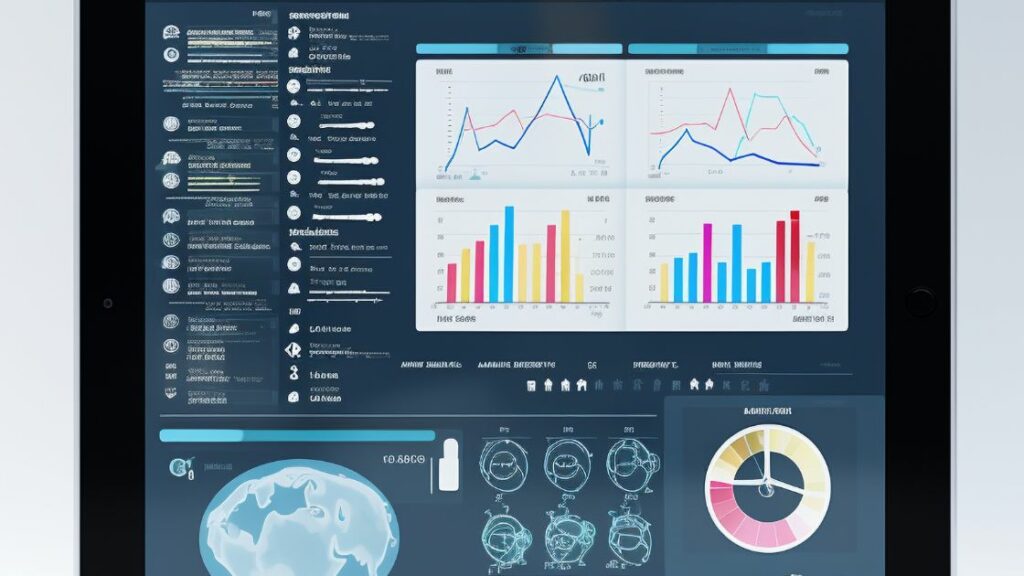
Bars charts effectively showcase quantitative differences across separate categories through proportional rectangular bars of varying lengths or heights. The ability to rank divergent values between groups through simple visual area comparisons drives easy interpretation of patterns. For instance, sales per product segment, revenue by regional markets, and brand equity across customer personas.
Circular pie charts demonstrate composition as parts of a whole through proportionate slices, delineating percentage contributions to a total. Best for highlighting part-whole correlations rather than fine variations. E.g., market share distribution across players.
Line graphs track metric values over a timeline, proving extremely versatile in mapping rises, falls, inflection points, and volatility trends. Ideal for sequential data like sales history, traffic rhythms, hiring waves etc. Dot plot charts align data points to corresponding values on a scale. Color coding adds dimensionality. Clustering and distributions rather than connections reveal insights. Think statistical demo analysis, scoring variances, and multivariate mapping through visual variables.
Column types provide flexible options too – stacked/grouped formats for analyzing parts combining to totals or categorical segmentation. Benchmark comparisons help gauge performance. The lengths rapidly convey relative magnitudes across charted attributes.
Benefits of visualizing complex data for businesses
1. Accelerated analytics interpretation: Well-designed reports, dashboards and graphs allow users to grasp key messages at a mere glance rather than examining extensive datasets. Quicker comprehension from executive to frontline staff speeds up decision cycles. Moreover, you can check out the ways for simplifying data visualization best practices.
2. Enhanced internal communication: Intuitive data stories enable collaboration between cross-functional leaders to spot priority areas like sales spikes or emerging bottlenecks. Information democratization diminishes the risk of departmental silos undermining organization-wide progress.
3. Strengthened stakeholder trust: Interactive, easy-to-understand visualizations foster transparency from operations to investors about current business health and outlook. Committing to truthful data representation builds confidence in leadership.
4. Improved customer engagement: Externally exposing interesting data-driven insights through captivating visuals makes customers feel involved in the company’s journey to serve their needs while displaying innovation capacity.
Future trends in visualizing complex data
While the core purpose remains to convey complex data effectively to accelerate business insights, exciting new capabilities are expanding the possibilities of data visualization:
a. Interactive Dashboards: Beyond static reports, customized dashboards allow users to filter and explore data freely based on changing priorities to unearth new connections. Real-time responses fuel dynamic decision optimization.
b. Smart Data Discovery: Augmented analytics leverage AI to automatically process, analyze and generate representations of key data perspectives, allowing human creators to focus on higher-value interpretative tasks.
c. Cross-Device Delivery: Responsive data stories seamlessly adapt visualizations to user context across desktops, tablets and mobile. Consistent messaging persists through bite-sized, multi-modal reporting.
d. Enriched Reporting: The spread of business intelligence comics and conversational analytics combine data-driven facts with narrative storytelling and natural language for more resonant and memorable data impact.
Conclusion
Data visualization is moving from a business luxury to indispensable literacy. Simple yet powerful visuals open windows into the health, opportunities and threats facing organizations. They turn complex data into intuitive formats for clarity and aligned action across teams. Rather than intimidate or confuse, modern data vizualisation informs and inspires. It will pay dividends for enterprises to present data visually and nurture a culture that continually questions the stories behind the numbers.