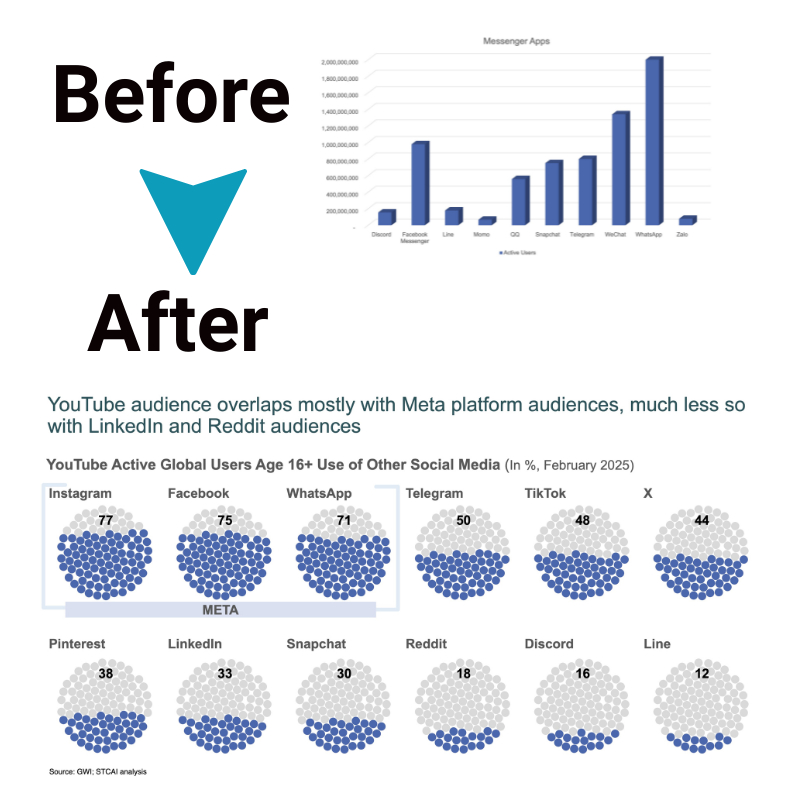
Should You Use a Bar Graph or Choose Another Chart Type?
With endless options for visually displaying data, determining the optimal chart type can be paralyzing. But while flashy graphics dazzle, sometimes simple works best. This guide explores knowing when basic bar charts excel versus when specialized visuals like lines, pies, or columns better fit analytical needs and audience perspectives. So, read on to learn when do you use a bar graph.
What is a bar graph, and when is it most useful?
A bar graph uses rectangular bars to represent different categories or values. The height or length of each bar is proportional to the data value it shows. But when do you use a bar graph? The answer is multi-faceted, depending on the story your data tells and the insights you wish to convey.
a. Comparing data across categories
Bar graphs excel at representing comparisons across qualitative categories. For example, sales performance across different product lines, demographic surveys, and score breakdowns by grading criteria. Bars make it simple to spot top and bottom performers.
b. Displaying changes over time
Bar graphs are handy when considering changes over time if the time intervals are wide enough. This addresses the frequent question of when you use a bar graph in time series analysis, providing a clear visual of trends over years or months when data points are not densely packed.
c. Emphasizing differences between items
The staggered heights of bars immediately highlight sizeable value differences between categories. Our eyes naturally decode greater vertical length as a bigger numerical value. Bars give a simple visual cue to the largest and smallest categories. This is why, when you use a bar graph, it is often answered when there’s a need to showcase the stark differences between groups.
When to choose alternative chart types
The question of when you use a bar graph extends beyond simple comparisons. It is suitable for:
- Draw comparisons between distinct categories or groups, highlighting how they differ or relate to each other.
- Illustrate trends or shifts over periods, providing enough space between these intervals to keep the visualization clear and understandable.
- Emphasize the notable variances among various data points, making it easy to see which stands out or lags behind.
- Understanding when to use a bar graph ensures that your data presentation is effective and insightful, making complex data comprehensible at a glance.
Bar graph vs line graph

Deciding between a bar graph and a line graph often depends on the type of data and the narrative you aim to present. When do you use a bar graph over a line graph? The answer lies in the nature of your data—bar graphs for discrete data comparison and line graphs for continuous data trends.
Choosing the right chart type
When pondering when do you use a bar graph or any other chart, consider the data type, the story you wish to tell, and your audience’s understanding. The decision to use a bar graph—or any chart type, for that matter—depends on several factors:
- Data Type: Numeric, categorical, or time-series data each have chart types that display them most effectively.
- Storytelling: What is the narrative behind your data? The chart type you choose should complement the story you want to tell.
- Audience Understanding: Consider your audience’s familiarity with different chart types. Opting for a more commonly understood graph, like a bar graph, might be preferable in many contexts.
Why is bar graph a better option than other alternatives?
A bar graph stands out as a better option than many other chart types for several reasons, particularly when clarity and immediate understanding are priorities in data presentation. Here’s why:
- Ease of Understanding: One of the primary advantages of bar graphs is their straightforwardness. The visual representation of data in the form of bars makes it exceptionally easy for viewers to grasp comparisons and trends without needing to delve into complex interpretations.
- Effective Comparison: Bar graphs excel at comparing data across different categories. The distinct separation between bars allows for quick visual comparison, highlighting differences in magnitude.
- Versatility in Data Representation: Bar graphs can represent a wide range of data types, from discrete categorical data to changes over time (provided the intervals are not too dense).
- Customization and Clarity: Bar graphs offer considerable flexibility in terms of design and customization, such as adjusting bar colors, spacing, and orientation (horizontal vs. vertical).
Conclusion
Understanding when do you use a bar graph is more than a technical decision; it’s about effectively communicating complex information in an accessible manner. With their straightforward design and clear visual comparisons, bar graphs offer a powerful tool for presenting data across various contexts. However, the art of data visualization encompasses a broad spectrum of chart types, each with its unique strengths and applications.By considering the nature of the data, the narrative to be told, and the audience’s understanding, one can select the most appropriate chart type to unlock the story hidden within the data. Remembering these applications ensures that when the question arises—”When do you use a bar graph?”—you’ll have the insight to answer confidently and effectively.


