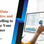
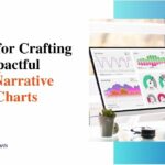
Predictive Data Visualization: Visualizing Forthcoming Trends and Patterns
Data visualization is a practice of transforming complex information into simple information. It can be a map or a graph or anything that showcases a data set. The main goal of data visualization is to simplify the process of identifying patterns.
The majority of terms use the term interchangeably with others, including visualization, information graphics, and statistical graphics.
Predictive data visualization is one of the big steps of the data science procedure. It states that after the data has been accumulated, processed, and modeled, it should be visualized for conclusions. While data visualization is important, how do you use it to predict trends and patterns? In this blog, we will take a look at how data visualization has a say in predicting trends and patterns.
The need to predict future trends
Predicting the future trends is indeed a valuable skill for any data analyst. It is something that will help you answer many questions like ‘how can you change the sales over time?’ and ‘what factors will affect the customer satisfaction?’. By utilizing predictive analytics visualization techniques, you can not only take a glimpse of past occurrences but also predict future trends and patterns. Data visualization has many benefits in predicting future trends, from testing your hypothesis to validating your assumptions.
What is trend analysis?
Trend analysis and data prediction is basically a procedure of testing historical data to identify patterns, changes, and directions over time.
It is basically something that can help you in understanding the current situation and past performance. It can also help you with the probable features of variables in a system. For example you can use train analysis to track the sales of your company and revenue.
If you wish to perform trained analysis you are needed to collect and organize data. Make sure you select a suitable graphical representation to predict the upcoming trend.
Importance of predictive data visualization

Data visualization is something that grants a quick and effective way to communicate information in a universal manner while using visual information. This sort of practice can assist businesses in identifying which factors affect the behaviors of the customers and pinpoint the areas that require improvement and need more attention. Here are some of the benefits of predictive data visualization:
- An enhanced understanding of the next steps that need to be considered to improve the company.
- A seamless distribution of data increases the chance to share insights with everyone who is involved.
- An enhanced ability to act on the findings quickly.
- The ability to take information quickly, enhance insights, and make decisions faster.
- An improved ability to maintain the interest of the audience with the information they can understand
- Eliminate the requirement of data scientists as data is more understandable and accessible.
How can you use data visualization for prediction?
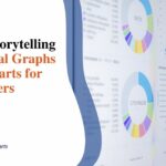
The methods of data visualization can be used to help predict the future trends. It can be based on data goals and audiences. For example the time series charts can be used to understand patterns and cycles.
The scattered plots can be used to find correlations and clusters. It can be also used to find outliers in data and model them using linear logistic. Heat maps may also be used to visualize the frequency of data and it’s intensity. We will also compare them among categories and locations.
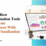
Easier exploration and trend analysis
The greatest tools of data visualization ensure trained analysis that are effortless. This helps you analyze current and historical events quickly. They also assist in predicting the future.Events like potential growth or decline of sales.
The solutions of train analysis tools give detailed dashboard and visualization design tools. It does this so you can apply the best practices for your charts and graphs and other aspects of personalization.
Wrapping Up
Forecasting data visualization is something that will benefit organizations in an extended way. Data visualization in itself is a method of communicating and presenting data in a visual form. With the constant improvements in technology, the future of data visualization in predicting trends is much more innovative than what it is today. For in-depth information, you can browse here.
FAQs
- How is data visualization used to study trends?
Data visualization is something that assists in telling stories by curating data into a form that is easier to understand.
- What is the use of predictive future trends?
Predictive analysis is something that uses historical data to predict events in the future. Generally, historical data is used to build a mathematical model that captures vital trends.
- What are the benefits of data visualization for trends?
From helping you understand better to allowing you to communicate your predictions, data visualization for trends has a lot of benefits.