Mastering Component Comparison for Effective Business Presentations
When making important business decisions, analyzing the available options thoroughly is crucial. Comparing key components is a vital part of the decision-making process. By breaking options down into comparable features, performance metrics, costs, and suitability factors, decision-makers can identify the best solution for their needs.
Effective component comparison allows businesses to make well-informed choices that maximize benefits. Presenting comparison data well to stakeholders is also vital to gaining support and approval for the chosen option. This article will explore how to prepare and deliver component comparison in data presentation to facilitate optimal business decisions.
Understanding Component Comparison
Component Comparison in data presentation involves systematically examining the various elements that comprise different products, services, or ideas. The goal is to assess similarities and differences across options according to pre-set evaluation criteria. Key elements commonly compared include features, performance, cost, and suitability for the intended purpose or use case.
Features refer to the attributes, characteristics, and specifications of each component. Examples may include size, weight, materials, technological specifications, additional functions, etc.
Performance comparison analyzes how well components function or carry out key tasks. Quantitative metrics, such as processing speeds, storage capacities, throughput rates, energy efficiency ratings, user ratings, and so on, are ideal here.
Cost is another essential aspect to evaluate through comparison. Examining purchase prices, maintenance fees, operating costs, total cost of ownership, and return on investment over time helps determine each choice’s relative value and budget impacts.
Finally, suitability comparison looks at how appropriately each component’s features, performance attributes, and other qualities fit the business’s specific needs, circumstances, and goals.
Preparing for a Component Comparison in Data Presentation

The following steps can ensure effective preparation before undertaking a component comparison presentation:
Identifying the key components to compare is a prerequisite. These will be the alternative products, services, or ideas under consideration that require evaluation.
Gathering accurate, objective, and standardized data on all comparison parameters and component attributes through quality research. Data sources may include component specifications, lab testing, pilot programs, performance analytics, supplier documentation, etc.
Establish clear comparison criteria per assessment category, such as features, costs, and suitability. These criteria direct the evaluation and ensure an “apples-to-apples” assessment. Weightings can also be applied if some factors matter more than others.
Organizing all data systematically in spreadsheets, comparison tables, or other visual formats for analysis. This eases processing a potentially large dataset required to cover all components in depth.
Tools and Techniques for Effective Comparison
Various software tools and presentation techniques help showcase comparison results effectively:
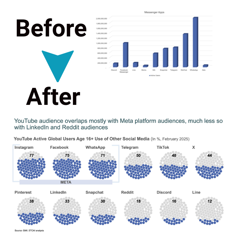
Component Comparison in data presentation analysis relies heavily on visuals like charts, graphs, and tables to synthesize a lot of numeric data for viewers to comprehend differences easily. Common options include line charts for trends, bar or column charts for relative values, pie charts for proportions, scatter plots for correlations, and more.
Specialized comparison tools in spreadsheets (such as Excel) or dedicated comparison software (like Tableau) allow filtering, formatting, calculations, and custom visual outputs ideal for dissecting multi-dimensional comparison datasets.
Organizing data tactically by categories, sub-categories, or ranking helps spotlight the most vital elements, variances, or component winners and losers. Formatting typography, coloring, or interactive elements like sliders or sort functions can accentuate priority findings.
Incorporating ratings, scales, percentages, or other benchmarking alongside raw data simplifies complex concepts for general audiences. Quotes, anecdotes, or images personalize dry facts.
Employing effective storytelling techniques in presentations keeps attention while smoothly guiding viewers through the logical comparison process and important “take-away” conclusions.
Techniques for Effective Storytelling in Presentations
Several storytelling tactics help component comparison presentations really engage audiences:
Start by providing an overview of the business problem or opportunity context to explain why the comparison matters. Then, pose a challenging question that piques interest in the needed solution.
Introduce the alternative components as characters in the story, with personalities, strengths, and weaknesses that position them as potential heroes or villains in addressing the core challenge.
Draw viewers interactively into the comparison journey with calls to action, asking them to evaluate and interpret emerging evidence as findings are unveiled step-by-step.
Apply story flow principles by building drama through a climactic point where one top component triumphs based on the cumulative case developed from the data.
Bring the story full circle by reiterating why the comparison process was meaningful, and how the selected component will resolve the core problem presented at the start, now with confirmation by evidence.
Encourage involvement and buy-in from the audience by soliciting reactions, questions, and validation of the recommendation before proceeding to the next action.
Balancing Factual Data with Anecdotal Evidence
Here are some tips for balancing factual data with anecdotal evidence in component comparison:
Adding Personality to the Presentation
When presenting statistical data and metrics, it’s easy for things to become dry and detached. Stories, examples, and narratives help bring components to life in a way numbers can’t. They put a human face on abstract ideas. Component Comparison in Data Presentation is enhanced by blending factual specifics with relatable anecdotes.
Illuminating Data with Real-World Context
Data analysis techniques like graphs and charts are powerful for showcasing performance trends. But raw figures alone only sometimes paint a complete picture. Comparison methods are strengthened by complementing metrics with on-the-ground experiences. Hearing how components benefit clients, end users, or pilot programs lends meaning.
Painting a Vivid Picture
Well-crafted examples transport the audience to a specific setting. They visualize abstract factors in a tangible way. A single illustrative story at key points can be more memorable than reams of bullet points. It links conclusions suggested by the facts to realistic scenarios people can imagine.
Providing Depth and Texture
Anecdotes add richness, nuance, and variability to data, addressing limitations. No two implementations are identical, so narratives acknowledge real-world complexity beyond simplistic A-B comparisons. They showcase how multifaceted factors like suitability play out in real situations.
Sparking Relatability
Stories engage emotions as well as intellect. When listeners personally connect or see components addressing needs similar to their own, they’re more apt to believe evidence and commit to decisions. Targeted examples root abstractions in universally understandable challenges anyone could face.
The Bottom Line
Masterful component comparison requires careful planning, thorough research, analytical rigor, and strong presentation to influence decision-making. When done well, it empowers businesses to choose optimum solutions by methodically sorting fact from fiction among available options.
Presenting data through interactive storytelling keeps stakeholders engaged in the evaluation process, cementing consensus around the substantiated best choice. Following proven practices for preparation, analysis techniques, and delivery, craftsmanship assures component comparison achieves its goal of guiding toward fully-informed choices.


