Line Graphs: An Introduction to a Foundational Data Visualization Technique
A line graph, also known as a line chart, is one of the most universal and intuitive types of charts for representing data that changes over sequential breaks. As a staple of data visualization, line graphs have stood the test of time due to their simplicity, clarity, and effectiveness in conveying trends.
In this detailed guide, we will explore what line graphs are, their key varieties, appropriate uses of this versatile charting method, and real-world examples to understand line graphs better.
What is a graph line or line graph?
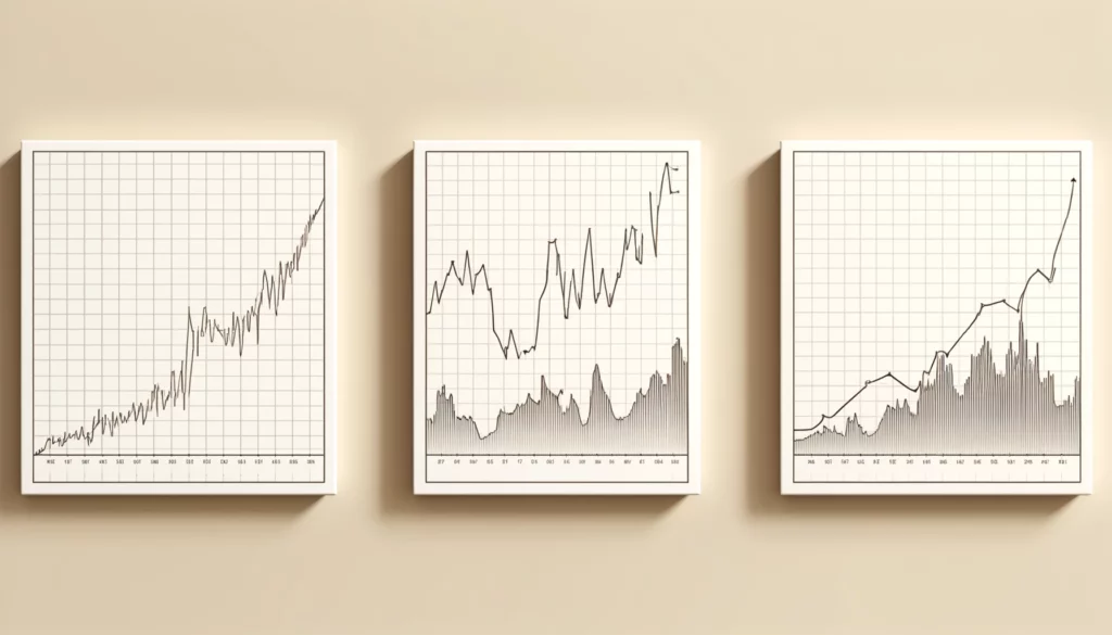
A line graph, also known as a line plot, visually connects numerical data with lines to display changes over time, effectively showing trends such as stock prices or weather patterns. For instance, the S&P 500’s performance during Federal Reserve cutting cycles since 1965 illustrates this, with a 4.9% increase 12 months after the first cut, on average.
In 2023, the S&P 500 index experienced fluctuations, beginning at 3892 in January and peaking at 4707 by December, demonstrating the graph’s ability to track changes over periods.
Traders find line graphs helpful for watching stock price movements from the past. This gives an idea of changes in value for stock or entire markets over days, weeks, and longer. Other uses show things like weather patterns or website visitor numbers changing month to month.
Varieties of line graphs
There are two primary categories of line graphs based on the number of data series depicted:
Single-line graph
As the name suggests, a single-line graph plots just one dataset’s performance over intervals against the axes. It is suitable for monitoring simple metrics like monthly temperature or daily stock price.
Multiple-line (grouped) graph
A grouped line graph facilitates the comparison of trends for two or more related aspects on the same scale. Distinct colors, line thicknesses, or formatting like dashed lines help distinguish each series. For example, it could evaluate sales of various product lines over quarters.
When is a line graph used?
Line charts are best used when the key objective is to reveal continual variable associations prominently since their delineating lines highlight trends. Some common applications include:
- Tracking periodic scientific measurements or financial indicators
- Comparing growth profiles of multiple concurrent phenomena
- Demonstrating gradual year-on-year percentage or numerical changes
- Visualizing smooth transitional modifications plainly without clutter
Their simple construction and interpretation at a glance also make line graphs a preferred option in several scenarios. However, other chart types may work better based on specific data properties and objectives, as discussed later.
Line graph examples
To ground the concepts shared so far, here are line graph examples that are commonly encountered:
Stock price movement
A single-line graph traces the daily closing price history of a publicly traded company, clearly bringing out intervals of bullish and bearish market sentiment.
Weather patterns
A grouped line graph layers average monthly temperature and rainfall readings over decades for a location on the same axes to identify climate shifts.
Website usage trends
Multiple lines on a graph outline page views and unique visitor statistics for a website across years to aid analytical insight.
Crafting effective line graphs
While line graphs are instinctively straightforward, some best practices maximize their impact:
- Use descriptive titles and labeled axes for strong communication
- Employ consistent, relevant scaling along straight axes for visual precision
- Opt for thicker dominant lines and thinner supplemental ones for distinction
- Incorporate gridlines, legend, and data labels sparingly to reduce visual noise
- Suitably select line styles colors accessible to color-blind users
- Leverage additional enrichment like callouts and arrows for emphasis
- Provide a data table Summary for those preferred numbers
- Consider annotation, comparison, or dashboarding for added context
Line graphs help see data changes over time
Line graphs connect numbers to make it easy to see how things change. For example, a graph of monthly sales can show if sales go up and down at different times of year. Lines let us spot patterns.
Excel charts help add trend lines to graphs. Trend lines show which way the numbers are moving. They help understand patterns better. These lines are useful for guessing what may happen next. They also help make good plans for the future.
By joining numbers in the order they happened, line graphs show changes clearly. The lines tell stories. They support predicting changes and making smarter choices. This is important when situations can change quickly.
While line graphs are basic, they stay useful. That’s because trends shown by lines are clear compared to messy charts. Whether now or later, line graphs show differences step-by-step over months, years, or seasons very well.
Conclusion
Line graphs have gained immense reach and adoption over the decades due to their intuitive simplicity balanced with the ability to convey trends concisely. Though insufficient for certain cases, their intuitive comprehension leaves a lasting impression. With intentional design and contextual understanding, line charts can serve as a foundation for impactful data storytelling.