Interpreting Scatter Plots and Assessing Variable Relationships
When analyzing data, it’s important to determine how different variables are related to each other. This can provide valuable insights and help make more informed decisions. Scatter plots are a useful visual tool for studying relationships and assessing correlations between numerical variables.
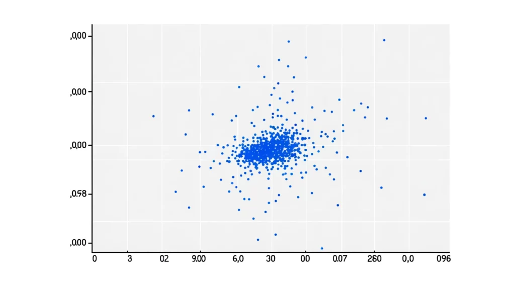
Scatter plots provide an intuitive descriptive analysis of the data, known as a scatter plot description, which allows viewers to quickly understand the general distribution and determine if any relationships exist between the variables. A well-crafted scatter plot description highlights key aspects such as the direction, form and strength of any relationships visible in the data.
In this blog post, we will discuss what scatter plots are, how to interpret them, and techniques for assessing the strength and direction of relationships between variables through a detailed scatter plot description.
What is a scatter plot?
A scatter plot, sometimes referred to as a scatter graph, is a type of data visualization that uses Cartesian coordinates to display values for typically two variables for a set of data. Scatter plots are a simple yet effective way to analyze the relationship between quantitative variables visually.
Assigning variables to axes
Each data point represents values of two variables for one of the observations made during data collection. The data points are graphically plotted over the coordinate axes to show any relationships between the variables. The variables are plotted along the x-axis (horizontal) and y-axis (vertical) with each variable assigned one of the axes. For example, a scatter plot might show profit on the y-axis and spending on the x-axis for different marketing campaigns.
Spotting patterns in the data
Scatter plots provide a quick visualization of the general distribution of the data and can help spot patterns, clusters, and outliers. Upon visual examination, one can identify how concentrated or dispersed the data points are as well as determine if they form any distinct shapes. Tight clusters around an imaginary line indicate a strong association between the variables compared to more diffuse scatterings.
Interpreting variable relationships
The positioning of data points on the scatter plot allows us to examine the association or correlation between the variables plotted by observing the direction, strength, and form of the relationship. Do the variables increase or decrease together? How closely do they track each other? These insights can be derived by interpreting the scatter plot, guiding further statistical analysis of the variable relationships.
Interpreting scatter plots
Once we have plotted the variables on a scatter plot, how can we interpret what it shows us about their relationship? Here are some key things to look for:
- Strength of relationship: Higher clustering = stronger association.
- Form of relationship: Different forms suggest variable relationships of different types like linear, exponential, etc.
- Outliers: Outliers can sometimes represent errors but may also reveal additional insights.
- Variable determination: A higher correlation implies greater determination.
Analyzing these features on a scatter plot sheds light on the type and extent of interdependence between the chosen variables.
Let’s take a closer look at some key relationship patterns.
Assessing types of relationships
Scatter plots are helpful in categorizing relationships as linear, nonlinear, positive, or negative based on visual analysis:
- Linear relationships: Data points form a straight line or straight-line pattern, implying a direct linear equation best describes their association.
- Positive linear Relationship: Both variables increase or decrease together along an upward-sloping straight line.
- Negative linear relationship: One variable increases as the other decreases, forming a downward-sloping straight line.
- Nonlinear relationships: Data points display a curved or exponential pattern with no identifiable straight-line association between variables. The relationship is nonlinear.
- No relationship: Data points are randomly dispersed with no identifiable pattern, suggesting little to no correlation between variables.
Being able to recognize linearity scatterplot patterns enables estimating the strength and nature of relationships among datasets. It forms an important preliminary step before applying other statistical techniques to quantify correlation.
Importance of scatter plots
There are numerous importance and applications of scatter plots:
- Reveal multivariate relationships not apparent from just viewing one variable at a time.
- Reveal outliers, unusual observations, and errors that may need correcting.
- Suggest appropriate scatter plot graph type – linear, logarithmic, or exponential based on visual inspection.
- Provide a visual basis for fitting trend lines or curves of best fit to study direction and form.
- Provide an intuitive understanding of correlation through clustering tightness before statistical tests.
- Enable estimating the impact of changing one variable on another through their association.
- Guide hypothesis generation about what factors drive changes in the response variable.
- Support data exploration and preliminary model building in predictive analytics projects.
- Communicate visually tested relationships in case studies and research papers.
Conclusion
Scatter plots are an invaluable visual tool for exploring and understanding the complex relationships that often exist within real-world data. Beyond a simple glimpse into correlations, their true value lies in guiding more rigorous statistical analysis. A well-crafted scatter plot description that highlights key patterns can help researchers form initial hypotheses.
By leveraging the human eye for pattern recognition, scatter plots allow researchers to form initial hypotheses about variable associations and outlier observations that may otherwise go unnoticed. The descriptive analysis of a scatter plot facilitates communicating visualized relationships and trends to broader audiences. This helps establish a foundation for quantitative testing of trends observed in the visual scatter plot description.