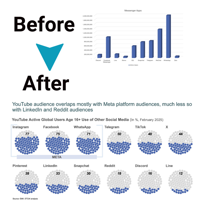
Interactive or Static: 7 Tips for Selecting the Right Data Visualization Type
Deciding on the most effective way to visually represent data can be tricky. But with countless chart formats to choose from, how do you pick what efficiently conveys key findings to audiences? It depends on aligning attributes of the data itself, intended audiences, communications objectives, and technical constraints.
By navigating seven key considerations around these elements, clarity emerges on the optimal visualization approach. Whether interactive or static, data tools take a backseat to data understanding when insight guides design. Read on to learn about interactive data visualization insights.
Challenges in selecting visualization types
Many factors influence ideal visualization design, including:
a. Data Properties: The inherent nature of the data itself guides appropriate graphical representation. Time-series statistics that showcase trends over uniform time intervals suit different chart formats than geographic distributions plotting location-based variables. Even simple considerations like nominal versus ordinal or continuous measurements will point to ideal visualization shapes.
b. Audience: The viewer demographic shapes effective visualization methods on multiple fronts. Their visual literacy regarding grasping complex graphical formats, potential subject matter expertise to interpret intricacies, cultural perceptions that inform the interpretation of elements like color symbolism, and even technical accessibility requirements for those with visual impairments all influence how information is best processed into insight.
c. Goals: Whether seeking to objectively report definitive research findings rather than taking an exploratory tack to uncover open-ended data relationships significantly guides design choices. Reporting-focused visuals aim to efficiently convey key conclusions immediately, while data discovery tools require extensive interactivity so audiences can journey through layers of granular detail.
d. Medium: Practical factors like intended visualization display mediums and environments enable different representation capabilities that designers must consider. Screens lend themselves to dynamic real-time updating and viewer configuration, while print introduces innate static constraints. Delivery via presentations or multi-user apps also shapes feasible options.
With such interdependent variables at play, it’s easy to default to simplistic graphs that fail to highlight insightful aspects of data – or worse, mislead. By intentionally navigating key considerations, interactive data visualization achieves its full communication potential.
Tips for selecting the interactive data visualization Type

1. Understand Your data
With goals framed, you can match appropriate visualization methods to your data attributes and audiences’ needs. Consider relevant options like:
- Bar Charts: Effective for comparing differences across discrete categories or groups, especially changes over time. Their familiar columnar layout offers intuitive readability for general audiences to parse value comparisons even for more complex layered categories. Just make sure the x-axis categories appear in a meaningful order.
- Line Graphs: Useful for inspecting trends and trajectories across continuous data series. Lines accentuate the flow of a trend, implying forward motion. Multiple lines overlayed allow comparing patterns across items like forecast models. Just beware, overly congested lines can get confusing. Keep colors and symbols clearly distinguished.
- Pie Charts: Provide an insightful snapshot into part-to-whole relationships at a moment in time. The integrated unification of all values conveys the sense of components forming a singular whole. But beware of more than 5-6 slices getting difficult to adequately distinguish visually.
- Scatter Plots: Reveal telling relationships and correlations between paired, continuous variables by spreading plotted points to showcase clustering patterns. Position conveys the integration of the x-y values for interpreting covariance and predictive trends. Include trend line overlays to make correlations plainly evident at a glance.
2. Know your audience
Visual literacy and accessibility differ between audiences. Simple clean designs with easily discerned meaning facilitate comprehension for general public readers. Meanwhile, expert analysts have context to parse multifaceted chart types packed with variables.
Cultural perceptions also influence interpretation – colors, spatial organization and sizing all bring associative meanings that interactive data visualization designers must consider. Even seemingly basic design choices carry weight.
3. Define your objectives
Reports seeking definitive answers need accurate charts directly conveying key findings at a glance. Exploratory visualizations allow open-ended interaction so viewers reach their own conclusions. Data storytelling dashboards employ visual hierarchy and flow for viewer journeying. Outlining intent provides direction.
4. Apply design principles
Thoughtfully leveraging concepts like visual contrast, hierarchy, balance, emphasis, and negative space activates graphical perception channels that highlight meaningful patterns within data.
5. Test and iterate
There are always multiple valid visualization approaches for any dataset. Mocking up alternative styles and then gathering targeted viewer feedback identifies optimal constructs, refining so insights become intuitively clear to audiences.
6. Consider interactivity
Static charts suffice for simple communication tasks or constrained mediums. But interactive visualizations empower drilling into granular detail while retaining contextual big-picture perspective when dynamic questioning is required. The hands-on engagement also sustains user focus.
7. Utilize tools and resources
Smart visualization platforms provide graph type guidance plus automated design refinements. Online communities share ever-evolving collective wisdom. Referencing what works for similar data unlocks better starting points for customization fine-tuning.
Conclusion
While an infinite array of aesthetic designs dazzle, interactive data visualization only succeeds when purpose-driven – guiding audiences to meaning within data efficiently, accurately, and intuitively through deliberate visual constructs tailored to situational needs. By intentionally navigating choices, boring spreadsheets transform into captivating graphical gateways of understanding that inspire audiences rather than overwhelm them.


