How to Make Visualizations for PPT That Boost Your Presentation
Learning how to create impactful presentations involves the art of data visualization. By learning how to make visualizations for PPT, we can turn complicated information into compelling stories.
Modern viewers have set expectations for engaging visuals with which they can be held and used to communicate a message. This guide explores practical techniques to improve PowerPoint presentations through strategic visualization methods.
1. Color psychology and contrast
Emotions and how to direct a viewer’s attention from slide to slide are triggered by colors. Pick a set color palette that is consistent with brand identity. Use contrasting colors to provide focus on some key data points. Do not pile too many options for eyes to handle.
Cool blues convey trust, and warm tones convey energy. Strategic color placement will build in visual hierarchies. Find test color schemes under different lighting conditions. When designing charts, think of color blind accessibility.
2. Whitespace management

Empty space can be used well strategically to clarify visuality and focus on the audience’s attention. Get rid of the clutter on slides. Put breathing room between elements of the position.
Consume complex information in digestible chunks in various slides. Intentionally space for guide viewer attention. The symmetrical arrangement allows you to create balance with your visual. Consistently use margins. Draw attention in an obvious way to important data points.
3. Animation and transition
Key points can be emphasized by thoughtful animations. Show cause and effect with motion. Don’t have too many animations; animations should be subtle and purposeful.
Avoid distracting effects such as hiding content. Smoothly transition in between data points. Make a visual flow that supports the narrative.
4. Typography and hierarchy
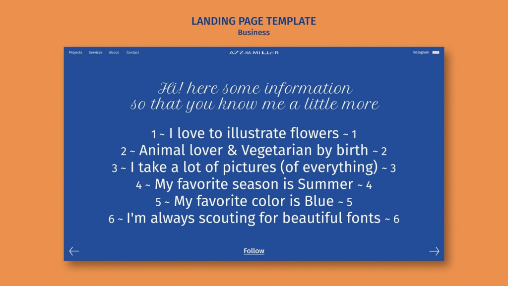
The font used influences how readable and how much information retention is. Consistent typography across powerpoint data visualization. Choose the fonts that can be read at different distances. Be sure of what is in relation to what by sizing and weighing things differently.
If possible, limit font families to keep your visual consistency. Too much information can be condensed into strategic text styling for emphasis of key statistics. The choice of font size should depend on the viewing conditions. Don’t crowd text elements.
5. Interactive elements
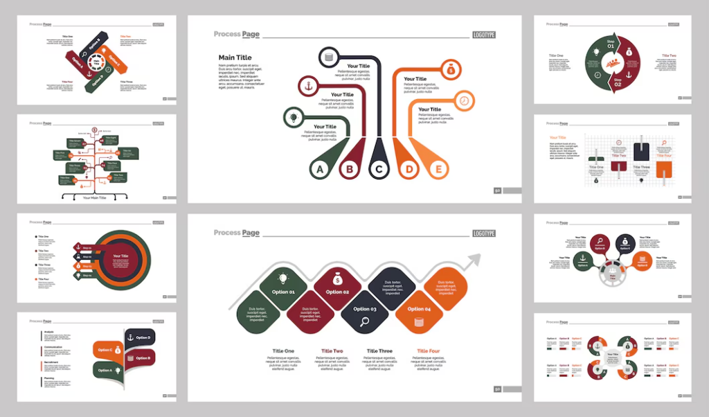
Show audiences clickable elements and dynamic content. Give the ability to create drill down capability for detailed data exploration. Add elements that are hoverable with additional context that show up. Design interactive comparisons between two data sets.
It will make the audience participate through linked elements. The ability to build flexible navigation between related charts. Add in-depth analysis into expandable sections. Produce support for natural exploration of complex data.
6. Data simplification
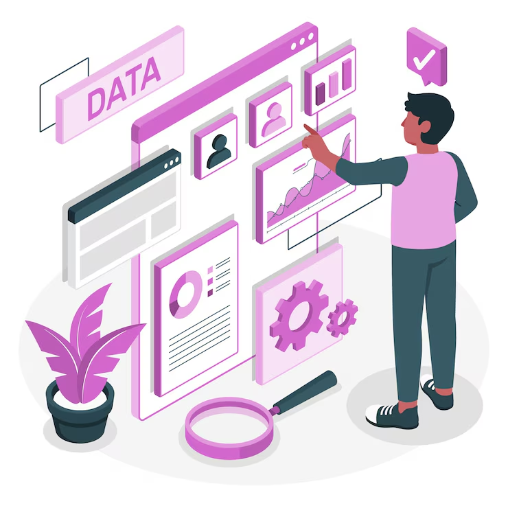
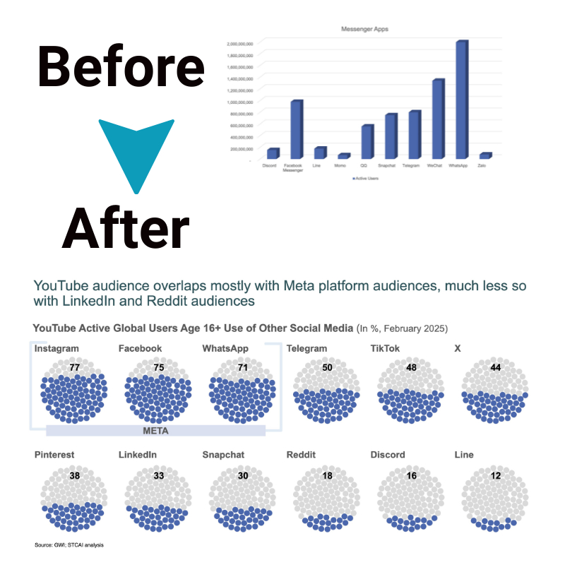
Make complex datasets clear visual stories. Get information in a digestible form. Pay attention to the metrics that are critical to making decisions. Get rid of useless decimal points and technical but not commonly used dictionary words.
Show present trends with simple, intuitive graphics. Brought out the most important patterns in the data. It helps you create visual comparisons and shows you insights instantly. Relate data visualization PowerPoint presentation elements to support main points.
7. Custom icons and graphics
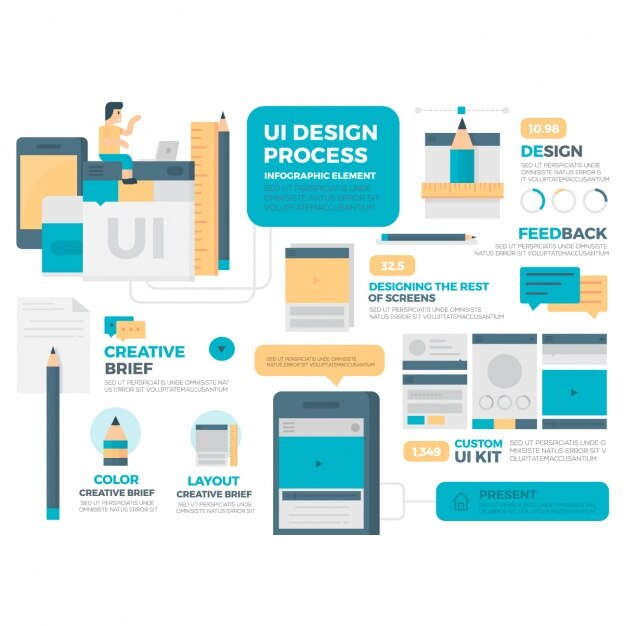
Use this device to create unique visual elements that add to the brand identity. Make sets of icons for different categories of data. Create custom illustrations to explain complex things. Be very careful with regard to the visual harmony across all graphic elements. Scale icons according to different slide layouts. Keep your graphics clear at various resolutions. Present data in flexible symbol systems.
8. Template consistency
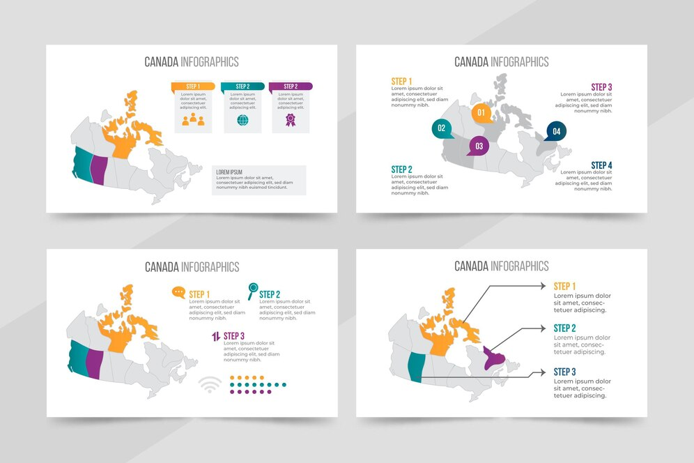
Provide reliable visual metaphors for customary presentation requirements. Reusable layouts for data types. Keep recurring elements always in the same position. Write design flexible templates that will adapt to different content needs. Speed up the process of customizing by building modular components. Make sure that the visual is consistent for multiple presenters. Define clear rules for using the templates.
STC AI streamlined visualization
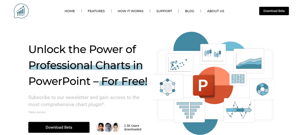
With a comprehensive toolkit, STC AI revolutionizes how to make visualizations for PPT. It is a powerful platform that intermixes with PowerPoint and has over fifty advanced chart types. Without any technical expertise, users can create professional visualizations.
It lets you brand it how you want, make it interactive, and animate it the way you want. Data presentation is effortless, with real-time customization and intuitive controls. The complex visualization tasks are handled by STC AI, with storytelling as the focus.
Ending note
Learning how to make visualizations for PPT makes ordinary presentations into memorable experiences. These are techniques that help to make presenters successfully communicate complex information.
These methods are practised over and over and these skills become strong visual communicators. Anyone can create professional quality visualization with the right tools and approaches. Keep in mind that supporting the core message does not mean that visualization is overwhelming.
Frequently Asked Questions
1. Which chart types are best for comparing multiple data sets?
Comparisons can be clearly shown by bar charts and line graphs. Scatter plots can help visualize relationships between variables. Pick according to your data story needs.
2. Is there a way to keep presentations visually interesting without blowing your brains out?
Provide detailed information while maintaining clean design principles. To keep it uniform, use styling consistently and strategically make use of animation. Utilize careful use of the elements to keep focus on key messages.
3. Why is it that data visualization works best to engage audiences?
Visual hierarchies are clearly defined and design is easy to understand. The elements are interactive and there is strategic animation to keep people engaged. Key messages are supported by simple, focused visuals.

