How to Improve Your Data Literacy Through Storytelling
Data and numbers can often feel dry and uninspiring. But when data is combined with storytelling, it comes alive in powerful and memorable ways. With the anticipation that approximately 75% of data stories will be crafted automatically by 2025, learning how to tell a story with data is an incredibly valuable skill that can significantly improve your data literacy and ability to drive impact with data.
So, let’s get started.
What is a data story?
A data story is a narrative that involves data and visuals to tell a tale. Unlike traditional storytelling, it uses data as its main character, with the narrative providing context that guides the audience through the data compellingly. The goal of a data story is not just to present data but to make it resonate with the audience by weaving it into a narrative that engages and informs. You must understand how to tell a story with data to engage your audience.
When done well, data stories resonate both intellectually and emotionally. A few data story examples include:
- An internal presentation showing how a new company initiative has boosted key metrics
- An infographic showing the global rise of a particular trend over time
- A case study demonstrating how data was leveraged to identify and fix an inefficiency
How to tell a story with data
Telling a story with data involves several key steps:
1. Understand your audience and goals
Before crafting your data story, get clear on who you’re communicating to and what you want to achieve. What are your audience’s needs, interests, and level of data fluency? What do you want them to know, feel, and do as a result of your data storytelling? Answering these questions upfront will guide the rest of your process.
2. Identify the key questions
With your audience and goals defined, determine the key questions your data story needs to address. What are the most important things your audience needs to understand? How can data shed light on these questions? Limit yourself to a few key questions to keep your story focused.
3. Gather and analyze the data
Now, it’s time to dive into the data. Gather relevant data from the reliable sources and analyze it to uncover meaningful insights that address your key questions. As you analyze, think about the emerging narrative. What are the key takeaways? Are there any surprises or counterintuitive findings? These insights will form the foundation of your data story.
4. Craft your narrative arc
A compelling story has a clear beginning, middle, and end. Your data story should follow a similar arc:
- Set the stage by introducing the key questions and why they matter
- Reveal your insights and how they address the questions
- Close with a clear conclusion and call to action
Use analogies, examples, and anecdotes throughout the narrative to make the data relatable and memorable. Remember, you’re not just presenting data but telling a story.
5. Determine the most effective visuals
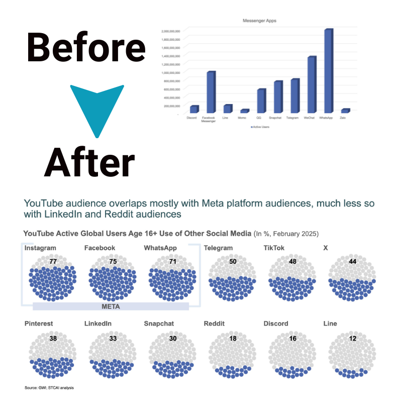
Visuals are a key part of compelling data storytelling. Well-designed data visualizations can communicate insights quickly and powerfully. Consider what type of charts, graphs, or infographics will best support your narrative and resonate with your audience. Ensure visuals are clear, accurately represent the data, and are easy for your audience to interpret.
6. Bring it together into a cohesive story
With your narrative and visuals prepared, it’s crucial to integrate them into a unified data story, emphasizing the natural progression where each point seamlessly connects to the next. Considering that the brain processes 90% of its information visually, lean on your visuals to convey the bulk of your message, minimizing textual content.
7. Practice delivering your story
Effective data and storytelling requires practice. Before delivering your data story, rehearse it multiple times. Pay attention to your pacing, tone, and visual cues. Solicit feedback from a test audience and refine as needed. The more you practice, the more confident and impactful your final delivery will be.
Data and storytelling: a powerful combination

The synergy between data and storytelling is undeniable. Stories can transform abstract numbers into meaningful insights, making data more accessible and engaging. This combination enhances understanding, fosters empathy, and drives action. Understanding how to tell a story with data will help you a lot in terms of customer engagement.
Improving data literacy through storytelling
Once you’ve understood how to tell a story with data, it is imperative to know that Improving your data literacy through storytelling involves practice and a willingness to learn. Here are some tips:
- Engage with data regularly: Practice interpreting data and identifying the stories it tells. The more you work with data, the more intuitive it becomes.
- Learn from examples: Analyze effective data stories to understand what makes them work. Pay attention to how they structure their narratives and present data.
- Use tools and resources: Leverage software and online resources to improve your data visualization and storytelling skills. Tools like Tableau, Excel, and Google Data Studio can be invaluable.
- Get feedback: Share your data stories with others to get feedback. This can provide insights into how well your message is received and where you can improve.
The bottom line
The ability to tell a story with data is more than a valuable skill—it’s necessary in today’s data-driven world. By understanding how to tell a story with data and exploring data story examples, individuals can enhance their data literacy and storytelling abilities. The combination of data and storytelling not only makes information more accessible but also more compelling.

