How to Create Stunning Data Charts in Excel for Data Storytelling
Do your eyes automatically shut off every time you hear the words Excel and spreadsheets? But wait, we know the perfect way to make Excel sheets captivating. If you are wondering what, the answer is data charts. With detailed and intuitive charts on an Excel sheet, you can achieve the goal of data storytelling.
An estimated number of 1.1 and 1.5 billion folks rely on Excel. You might be one of them. But how can you make the most stunning data charts on Excel to narrate a story and keep the audience hooked? Here are a few smart tips for you to ace storytelling through data and numbers in Excel charts.
- Pick the right chart.
Design elements are a major aspect of data visualization. However, the design elements won’t help unless you are presenting your data in an optimal format. Remember that every type of chart or graph in Excel will tell a different story about your data.
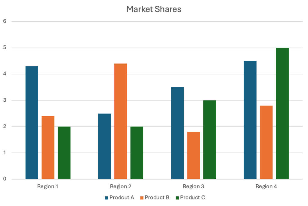
Both bar graphs and pie charts are useful for comparing categories. But pie charts will only help compare parts of a whole. On the other hand, you can use bar graphs to compare anything you want.
So, bar graphs are often a safe choice for data storytelling. Since bar graphs are easy to interpret, they help discover the differences between different categories. Meanwhile, you should use pie charts when one particular category is extensively larger than the other.
- Remove background lines
An Excel graph will let you compare data within a set. But you won’t be able to really dig into it. It’s crucial to remember that anyone looking at your graphs won’t be interested in noticing differences between data points. Instead, they will be interested in looking at the general, overarching trends in the graph.
If you want to allow people to focus on the trends, use a chart maker to get rid of the background lines. The background lines are only distracting and will shift focus from the main data. So, cutting out the background lines will help people focus on the key takeaways.
- Get rid of unnecessary design elements
An Excel chart usually comes with certain design elements by default. However, these elements often come in the way of communicating proper data. You should get rid of unnecessary design elements like outlines, rotations, and shadows from your graphs and charts. As long as they don’t bring any value to the story of your data, you don’t need them in your bars and charts. It’s easy to get carried away customizing and risk gilding the lily.
But superfluous styling only muddles clarity, distracting from intrinsically impactful data stories. So diligently scrutinize each visual addition – if flourishes don’t focus the audience’s attention or enhance meaning, scrap them. Over-engineering interactivity can also paradoxically inhibit comprehension.
- Ignore 3D effects
3D effects can be captivating because they make the bars and graphs look extra fancy. But resist the urge to use 3D effects to make your charts more visually appealing. To be honest, 3D effects are one of the most overused data visualization effects.
However, they only make your data harder to understand. By adding 3D effects, you represent the data in a skewed manner. Don’t even think about adding 3D effects if you want to present a strong argument with your data.
- Get rid of the legend
The purpose of the legend is to make it easier for you to read a graph. But legends make sense only when you have multiple categories on your X-axis. You should also go ahead with legends when you have numerous data points in each category. However, a legend will only make your charts more cluttered if you are comparing only a handful of data points. Legends lend helpful context when distinguishing extensive series, especially in small multipurpose charts. But given room to breathe, strategic data visualization guides the eye to deduce meaning from axis labels and line representations. So consider omitting legends where interline contrasts readily differentiate datasets, reserving that added annotation only where clarification proves necessary.
- Cut Down the Y-Axis Labels
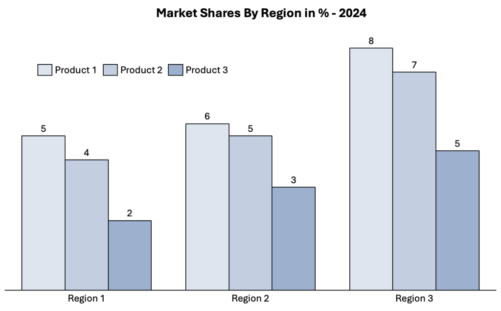
Long Y-axis values take up a lot of space and often look messy. Shortening them is a great idea to make your graph look cleaner. You can simply choose the format axis option by clicking on a label on the Y-axis. Trim overly detailed numeric labels down to clean, rounded numbers. Show the full details only when needed on hover or in subtitles instead of cramming the axis. Decluttering creates visual space for the key lines themselves to shine clearly. Precise figures get distracting when the goal is big-picture clarity.
Give key lines room to narrate their flowing trajectories with legible landmarks, not obscuring clutter. Apply this “less is more” principle judiciously until only the most lucid contour remains.
Conclusion
In the era of big data, telling stories through numbers is a must-have skill. Using engaging charts on Microsoft Excel will make your data instantly more easily digestible for the audience. So, embrace the power of charts and graphs on Microsoft Excel to tell a captivating story. With thoughtful customization, Excel’s friendly visualization toolkit helps transform sterile datasets into intuitive, artistic data stories that resonate. Approach your figures as a creative medium ripe for clarifying spotlighting and polished presentation. Strategically guide your audience’s observational journey through engaging interactive dynamics and artful flow. And if you need additional knowledge regarding data storytelling, get your copy of Storytelling with Charts today!
FAQs:
- What is the concept of data storytelling?
Data storytelling is all about bringing data to life. The use of charts and graphs can help us narrate compelling tales. So, data storytelling involves creating memorable narratives out of basic numbers. Leveraging the explanatory power of charts, graphs, and judicious annotations, spreadsheets can become more accessible stories rather than just sterile information displays. Strategic rendering of data patterns emphasizes insightful relationships, provoking engagement on an intuitive level that resonates beyond strictly conveying the facts.
- What is the best type of graph to use in Excel?
Usually, bar graphs are the best because they help represent different types of data. These graphs are ideal for drawing comparisons between anything you want. Bar charts immediately spotlight relative magnitudes across categorical dimensions thanks to aligned visual clustering. Their intuitive format simplifies grasping “more than” and “less than” relationships at a glance.
- What are the other types of charts and graphs to use in Excel?
You can use line graphs, pie charts, and more in Excel. You can also use flow charts to represent your data in Excel. Additional options like stacked columns, scatter plots, and gauges expand your data visualization possibilities. Combination charts overlay distinct graph formats for multifaceted analytical perspectives.