How to Add Graphs to Your PowerPoint Presentations Easily
Graphs help simplify numbers presented in PowerPoint effectively. Research indicates that visuals enhance understanding by up to 400% and that 90% of information communicated to the brain is visual. Inserting a graph in PPT is important because it builds a good story when it comes to creating business reports, academic presentations, or financial summaries.
Adding graph in PPT
It is really easy to insert graphs in PowerPoint. Now, let us easily generate a data visualization that looks appealing:
- In PowerPoint, you must open the slide.
- Navigate to the slide where you want to put the graph.
- Bring up the ribbon and click on the Insert tab.
- You will see a dialog box with a chart section.
- Choose a chart type
- Options that are often used are:
- Bar charts for comparisons.
- Pie charts for proportions.
- Line graphs for trends.
- Choose a chart appropriate to your data.
- An embedded Excel sheet will now open in PowerPoint.
- Just swap out the sample data with your real numbers.
- Every time you close the Excel sheet, PowerPoint will refresh the graph.
How to insert a chart in PPT for higher visual impact
To make the presentation more interesting and meaningful, when inserting a chart inside PowerPoint, remember these tricks:
- Apply different colors: Make sure different parts of the graph can be recognized easily.
- Remove any needless clutter: Make sure your labels and data points are kept to a minimum yet very meaningful.
- Make use of legends and labels: Specify each data series in order to make it more readable.
- Strip axis and gridlines: Leave them clean to improve readability.
Select the correct format of the chart: Pick the exact type of chart that goes with the characteristics of your data.
Enhancing PowerPoint graphs with free add-ins

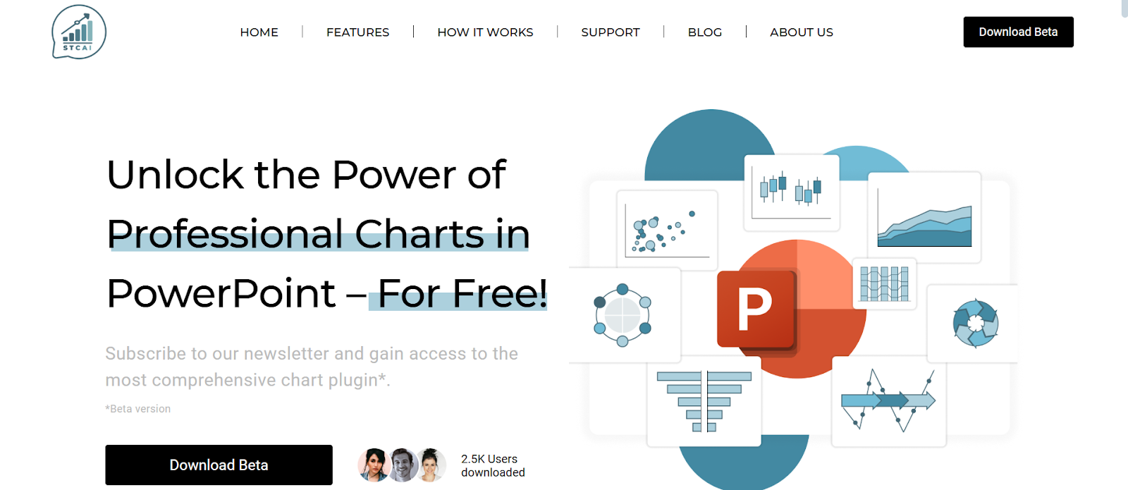
The simplest method to improve PowerPoint charts is using free add-ins. Using tools like STC AI, you can create graphs that look much more professional even without having advanced design skills. Offering numerous advanced chart types, STC AI, a PowerPoint add-in, simplifies the process of creating visual presentations with features like decision trees and bubble charts.
Customize graphs for a clean finish
You can then either insert a basic chart or choose an advanced option that allows more customization. Once the chart is inserted, you can customize it to ensure it matches the theme of your presentation. Here’s how:
- Edit chart colors: Click on chart -> Chart Tools -> and pick a color scheme.
- Change font styles: Change the size/font type for your slide to get it in line with the branding.
- Minimum resize: Make sure your graph can work perfectly in the layout of the slide.
- Enhance graphs with animations: You can use an animation to present these graphs one after the other.
- Data labels: Highlight important data points for improved readability.
Errors to avoid when pasting graphs in PowerPoint
You will have to avoid common pitfalls when adding graphs to PowerPoint presentations.
- Limit graphs to one or two main points to help ensure they can be understood easily. If the information is excessive, the audience may become overwhelmed and miss the key message.
- Selecting the appropriate chart type is important. Choose a graph that depicts your data and makes it easier to understand.
- Change fonts for better visibility. Normally, small text is unreadable from a distance, so you should use larger text for titles and labels so that people at least can see it.
- Always focus on color contrast. Avoid combinations of colors that make your graphs hard to read.
- Make sure that you validate your data before presenting it. Ensure that the displayed info is correct and accurate to avoid spreading misinformation.
Final Thoughts
Learning how to insert chart in PowerPoint is all you need to take your presentation to the next level. From choosing the best chart form and tweaking design elements to using free add-ins such as STC AI, you can bring a twist to your data presentation and make it more intuitive and engaging, too. Whether they are business metrics, research results or sales forecasts, a good graph keeps your audience interested and simplifies the fundamental data that you have presented.
FAQs
1. Which graphs can I create in PowerPoint?
You can insert different types of graphs in PowerPoint, including bar, pie, line, and column charts, to present your data for different purposes.
2. Can I change the data in a graph after putting it into PowerPoint?
When you want to edit your graph, right-click on the chart, then choose ‘Edit Data’, and you can re-update your data.
3. How can I make my graph fit properly in my PowerPoint?
Adjust the colors, fonts, and sizes of your graph to fit the theme and layout of your presentation.
4. Can I animate my graph so that it looks better for presentation?
From the “Animations” tab, choose the effects that bring your graph to life as you go through the presentation.


