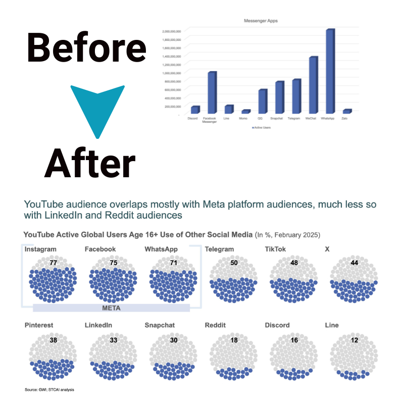
How to Add Context with Graph Numbers on Your Business Presentations
A key part of any effective business presentation is visualizing data that communicates insights. However, graphs and charts need context to connect with audiences. To maximize impact, you must frame numbers with details that establish meaning and relevance. This article explores simple techniques to anchor data visualizations in contextual details that spotlight the “why” behind the “what” in graph numbers. With the right approach, presentations shift from just showcasing data to telling compelling data stories that drive change.
So, let’s get started.
The art of streamlining data visualization
The goal of data visualization should be to inform and engage audiences, not overwhelm them. An avalanche of complex graphs with endless data points does little to drive understanding or action. Well-designed charts and number graph artfully streamline intricacies into clear, actionable insights by eliminating non-essential details and isolating the core essence of what data reveals.
To further drive simplicity, consider formatting choices that enable intuitive analysis – draw attention to noteworthy trends with bold colors and contrasting highlights. Evaluation is also crucial; stepping back and reviewing each visualization through the audience’s eyes shapes perspective.
Ultimately, excellent data visualization is defined by the resonance that sparks change. Behind the eye-catching number graph lies the contextual framework needed to transform numbers into compelling stories that drive strategic impact. Providing the right lens for understanding complex data sets the stage for communication that motivates action beyond the boardroom. The art is simple – streamlining intricacies into clarity that informs and engages.
What is context for charts and graphs?
Context supplies the integral details needed to interpret data visualized in charts and graphs properly. It provides the necessary framework to derive meaning from graph numbers rather than view them in isolation.
For graph in numbers, context encompasses relevant reference points like targets, benchmarks, or previous performance metrics that establish a baseline to evaluate the magnitude of current numbers. It also includes critical labels, units of measurement, timeframes, and clarification of the scope and scale of underlying data sets.
With contextual information firmly anchored into the visuals through callouts, axis formatting, secondary indicators, and other creative solutions, audiences can readily grasp the intended meaning. They can see the whole story rather than isolated plot points, understanding the relationships between graph numbers. Context enables catching emerging trends in the data, focusing on what matters most for strategic decision-making.
Importance of accuracy in data graph numbers
Precision instills confidence. When creating graphs, meticulously check numbers against data sources to verify accuracy. Even minor mistakes undermine credibility.
With sizeable data sets, manually confirming calculations becomes unrealistic. Leverage spreadsheet tools and graphing software to:
• Automatically import figures from linked spreadsheets
• Recalculate instantly if source data changes
• Format numbers consistently with custom label settings
Strategies to add context to graph numbers and charts

Context transforms generic charts into impactful stories. With the right approach, dashboards and presentations come alive.
1. Title and subheadings
Like road signs for understanding, well-written headers orient viewers. Titles establish the overall topic and high-level patterns. Concise subheadings call out specific details worth noting in the graph in numbers below.
2. Secondary Dimensions
Multi-measure charts convey complex messages clearly. Consider augmenting status bars, pie slices, or trend lines with secondary dimensions like target thresholds, historical peaks, or rankings. Dual indicators layered into single graphs tell a deeper data story.
3. Annotations
Callouts spotlight noteworthy points directly within chart frames. Icons, arrows, or text boxes draw attention to niches like surges, dips, or cross-over moments in time-based graphs. Annotations eliminate the need for heavy explanatory legends.
4. Hard Numbers and Ratios
Quantifying key takeaways grounds data in measurable substance. For percentage increases or decreases – include the actual figures behind those changes. Showcase how current KPIs stack against benchmarks with simple ratios.
5. Paragraph Text
Written supplements help connect the dots between multiple graphs, examining different aspects of related concepts. Synopsize the story so far with clarifying intro paragraphs. Bridge between images discussing unique angles of the same topic with summarizing transition statements.
6. Benchmarks
Reference points tailored to the audience function like feedback mechanisms for data checks. Establish context early with projected goals, competitor performance, past internal results, or industry standards. Viewers evaluate the magnitude of numbers on graphs relative to meaningful benchmarks.
Conclusion
Context is paramount for transforming generic graph numbers into impactful data stories that motivate strategic decisions. Thoughtfully framing visualizations establishes relevance, while meticulous accuracy lends credibility. Combined with clarifying text supplements, intuitive formatting, and secondary indicators layered into charts, presentations shift from just showcasing data points to spotlighting their deeper meaning.
This multidimensional approach to anchoring numbers in contextual details sets the stage for data visualization that resonates, informs, and transforms businesses beyond the boardroom.


