Good, Bad and Ugly: Examples of Data Visualization Best Practices
We live in a data-rich world. Making sense of endless rows and columns is challenging. This is where data visualization comes in – the graphical depiction of information to uncover insightful patterns. Well-designed charts communicate complex data and engagingly. However, not all visuals enlighten. Some need clarification and guidance due to poor technique or questionable motives. This article explains data visualization best practices, common mistakes, and when to watch out.
Importance of data visualization
Making sense of complex data is tricky for the human brain. Staring at a spreadsheet with endless rows and columns makes most people glaze over. But turn those abstract numbers into colorful shapes, graphs, and charts, and boom – suddenly, meaningful patterns and insights start jumping off the page. Our eyes can interpret flowing visual shapes and trends far faster than scanning raw statistics.
That’s why data visualization transforms boring datasets from confusing clutter into captivating stories that clearly communicate findings and messages. So if you want your audience to engage with and remember the core discoveries buried within all those numbers – show them, don’t just tell them!
By including data visualization examples, we can see how effectively shapes and images can convey complex information, making it more digestible and engaging for the audience.
The good: hallmarks of effective visualizations
1. Clear objective
Great graphics should highlight the main message – for example, comparing values, showing the relationships between measurements, or illustrating distributions. Knowing the whole purpose of the graphic upfront helps pick the best type of chart. Sometimes, a basic bar graph works to show differences. The data shows a correlation at other times, so a scatter plot is better. Incorporating data visualization examples, such as bar graphs for comparison and scatter plots for correlation, can significantly enhance the understanding and impact of the presented data.
2. Simplicity is better
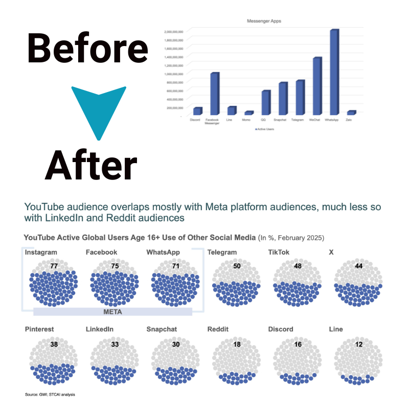
The most intuitive visuals employ minimalist aesthetics to let data command attention. Emphasizing only meaningful patterns through easily decoded visual variables like size and shape allows accurate reading. Eliminating ornamental chartjunk -gridlines, borders, and legends unrelated to the message shifts focus. Simplicity amplifies comprehension minus distractions.
3. Integrity in data representation
Maintaining integrity requires accurately portraying data without distortions from truncated axes, overlooked data points, or misleading scales. Design choices should default to linear scales. Representational integrity breeds reader trust and guards against faulty interpretations. Data visualization examples that adhere to these principles highlight the importance of maintaining integrity in data representation.
4. Strategic use of color and layout
Thoughtful use of color coding, layout, and white space directs focus for faster understanding. Color differentiates information categories at a glance. Complementary or distinct hues optimize visibility between labels and encoded variables. Well-organized visual flow and white space compartmentalize multifaceted charts into digestible sections with logical ties.
5. Interactivity powers insights

Modern visuals incorporate user-controlled interactivity for filtering, sorting, and customizable views. Tools like Tableau facilitate fluid data investigation – toggling selections and scales alters insights. Empowering self-directed exploration this way unlocks analytical versatility across needs.
The bad: common pitfalls to avoid
1. Clarity lost through clutter
Some visuals appear sleek yet falter at their function – to enable understanding. Superfluous embellishments only obscure messages. Overwrought fonts, needless dimming effects, and ornamental junk hijack attention better spent decoding data. Examining data visualization examples, such as overly decorated infographics or excessively stylized charts, is a stark reminder of how clutter can hinder comprehension and detract from the main message.
2. Misleading representations
Distorted data representation misleads, whether inadvertently or unethically. Exaggerated display effects through axis truncation or omitted inconvenient data points convey fake perspectives, breeding mistrust. Misleading chart types likewise spur incorrect conclusions.
3. Poor color choices exclude and confuse
Choosing the wrong colors can make things confusing. If colors are too similar, people can’t tell them apart. Not thinking about color blindness can leave some unable to see the differences. And using colors that clash can be hard on the eyes.
4. Missing context encourages misreads
Charts devoid of explanatory notes regarding methodology, parameter definitions, and other qualifying details cast data adrift for misunderstanding. No graphic is self-explanatory. Context fuels accurate interpretation. Data visualization examples that lack contextual information, such as unlabeled axes or missing legends, underscore the importance of providing sufficient context to ensure data is interpreted accurately and meaningfully.
The ugly side: when it goes wrong
1. Chartjunk and decoration overload
Extraneous visual elements termed chartjunk burden graphics with ornamental frills at the cost of decipherability. Charts framed by clipart images or canvas backdrops look flashy but draw attention away from comprehension. Decoratively captioned axes, data encoded as icon arrays, and functionally pointless animation provide glam at the gland of digestibility.
2. Incomprehensible visuals
Some overly ambitious data visuals sacrifice cognition for artistry under the fallacy that presentation style supersedes content. However, stylistic flair should always uphold comprehension – the most creative graph would only succeed in its purpose if the viewer could interpret the message. Overemphasis on aesthetics at the cost of functionality does a disservice.
3. Ethical considerations and misuse
Data graphics can manipulate perceptions by misrepresentation or visual distortions that portray inaccurate narratives for deceptive, unethical ends. Unethical tampering compromises integrity, like altering statistical chart types to show illusory correlations or magically transforming inconvenient data trends. Visuals should enlighten, not propagandize.
Conclusion
When leveraged thoughtfully, data visualization catalyzes intuitiveness and amplifies comprehension of complex datasets. But incorporation of misleading, distracting or dishonest elements erodes its powers of illumination. Data visuals can fulfill their truth-revealing potential as indispensable analytic assets by exemplifying data presentation best practices and avoiding common downfalls.


