Gaining Consensus with Data Visualization in Meetings and Presentations
Meetings filled with endless data and statistics can glaze over people’s eyes. However, good data is meant to inform decisions and drive change. The trick is presenting that data to clarify the whole room. Simply reading numbers aloud is a sure way to lose people’s interest quickly. But pairing data with simple yet intuitive visuals keeps audiences engaged. Charts elegantly cut through verbal and language barriers to tell a story. Let’s look at the ways to using data visualization to persuade.
An overview of data visualization
Data visualization refers to the graphical depiction of information and data. It generates visual representations such as charts, graphs, and interactive digital displays to communicate key insights. Data visualization is valuable because it can elucidate complex data sets into simplified formats for comprehension. The human cognitive system processes visuals more easily than raw numerical tables or text passages. Using data visualization to persuade is an essential technique for professionals aiming to present complex information in a digestible format.
Within business contexts, data visualization enables managers and analysts to identify issues, opportunities and trajectories in data that quantitative descriptions alone may not unveil. It accelerates the data analysis process and facilitates data-driven decision-making for organizational strategy. Overall, thoughtful data visualization maximizes the legibility and digestion of multifaceted information.
Benefits of data visualization in business
1. Identify trends and patterns
Using data visualization to persuade in business settings can greatly enhance the ability to identify trends and patterns. Visual representations of data make it easier to spot trends, outliers, and patterns that may otherwise go unnoticed in tabular or text-heavy data. For example, tracking sales over time through a simple line graph quickly shows whether revenue rises or falls over quarters or years. You can see if there are any unexpected spikes or dips that warrant further investigation.
Additionally, color coding variables on charts draws the eye to unexpected deviations – a sales rep’s suddenly poor numbers stand out brightly against properly visualized data. And charts that map values out spatially, like heat maps or geospatial mappings, surface hard-to-see patterns around how certain metrics correlate to location, events, or other factors.
2. Simplify complex data
Data visualization takes complex data sets with huge numbers and reduces them into easily digestible visuals. Charts, graphs, and maps simplify the data into key points and relationships. This makes it easier to grasp key takeaways.
For example, decision-makers can quickly glean insights from a line graph showing 3 years of sales data and trends rather than poring over endless rows and columns in a spreadsheet. The visual format presents the essence of complex data in a simplified yet impactful manner.
3. Improve decision making
By transforming data into visuals that illustrate the key aspects, data visualization enables better and faster business decisions. Trends become obvious and help leaders decide on optimum strategies. For example, a sales manager can instantly know which products have rising or falling sales by viewing a simple bar graph over time rather than plowing through huge reports. This agility and clarity help make well-informed choices. Moreover, In today’s data-driven world, using data visualization to persuade audiences has become a key strategy for effective communication.
4. Enhance reports and presentations

Incorporating thoughtful data visualizations into reports, dashboards, and presentations makes them more engaging, interesting, and impactful. The visual representations of data communicate insights and key takeaways far more effectively than text or tables alone. They help convey the core message and storyline simply yet effectively.
5. Identify root causes
Using data visualization to persuade becomes particularly effective in business when it comes to identifying root causes of issues. Interactive data visualizations allow users to drill down into the granular details. Analysts can spot patterns, customize views, filter data, and uncover the root causes of problems that need addressing. This leads to better diagnosis of issues. The interactivity empowers businesses to analyze the specifics, understand why certain metrics are underperforming, and trace problems back to their sources.
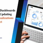
6. Track performance metrics
Interactive data dashboards with auto-updating charts and graphs make it simple for teams and leaders to continuously monitor key performance indicators like sales, web traffic, operational efficiency, etc. This enables real-time performance tracking. The visual depictions of KPIs facilitate quick assessments of progress made towards goals and help identify areas needing improvement.
7. Boost collaboration
Visually representing business data and metrics in dashboards, reports, and presentations enables greater team collaboration through a shared, universal language that makes complex data easier to digest. This allows departments to be on the same page.
Conclusion
Data visualization is an invaluable asset for today’s data-driven business landscape. The ability to transform dense sets of metrics and figures into intuitive, visual stories unlocks game-changing insights. Visually represented data becomes accessible knowledge that rallies stakeholders to make smarter decisions faster.
While spreadsheets will always have a place, truly savvy analysts, leaders, and communicators recognize that data must move minds and provide objective facts. Visualization brings data to life, surfacing patterns and opportunities that inspire teams to question, optimize, and innovate continually. Ultimately, data exists to drive understanding and positive change – visualization delivers on that promise.