From Data Visualization to Fast Action: Designing for Decisiveness
Data visualization involves presenting information, often numeric, graphically to enable rapid analysis and insight identification. Effective data visualizations convey complexity in simple and clear visuals like charts, graphs, maps, etc. Well-designed data visuals empower leaders across teams and organizations to spot trends, issues and performance metrics at a glance. This equips them to take quick, decisive, data-driven action aligned to key objectives.
The Role of Data Visualization in Decision-Making
Visual representations allow large datasets to be understood faster and more clearly than dense tables of numbers and figures. The appropriate graphs draw attention to noteworthy patterns and outliers within the data. Leaders can analyze the information to rapidly gain key insights compared to assessing reams of raw data. These data-driven insights motivate and optimize decisive follow-up across operational, tactical and strategic decisions.
Types of Data Visualizations
When it comes to data visualization, the options are expanding rapidly as data volume and variety accelerate. From foundational charts like bar graphs to emergent technologies like virtual reality, there is now a robust toolkit available to help interpret statistics.
Novel innovations sometimes get adopted based primarily on their novelty before their utility is proven. However, the core design principles remain constant – prioritizing clear, accurate communication.
Virtual reality data visualization can provide an exciting, interactive experience by enabling immersion into a 3D data landscape. This spatial representation may elicit valuable new insights. However, there is a risk that the flashy graphics could distract from the core message.
More importantly, virtual reality analytics currently requires specialized software and hardware that most organizations do not have access to. As a result, it has limited relevance for everyday business decisions in most sectors. Over time, as prices fall and capabilities improve, VR data visualizations will likely become more commonplace.
For now, classic charts and graphs remain the mainstream staples for business intelligence and performance tracking. Tables serve an important role for detailed reference data. While heat maps and network diagrams build an understanding of complex interconnected systems.
Principles of Effective Data Visualization

Several key principles enable insightful and impactful data visualization:
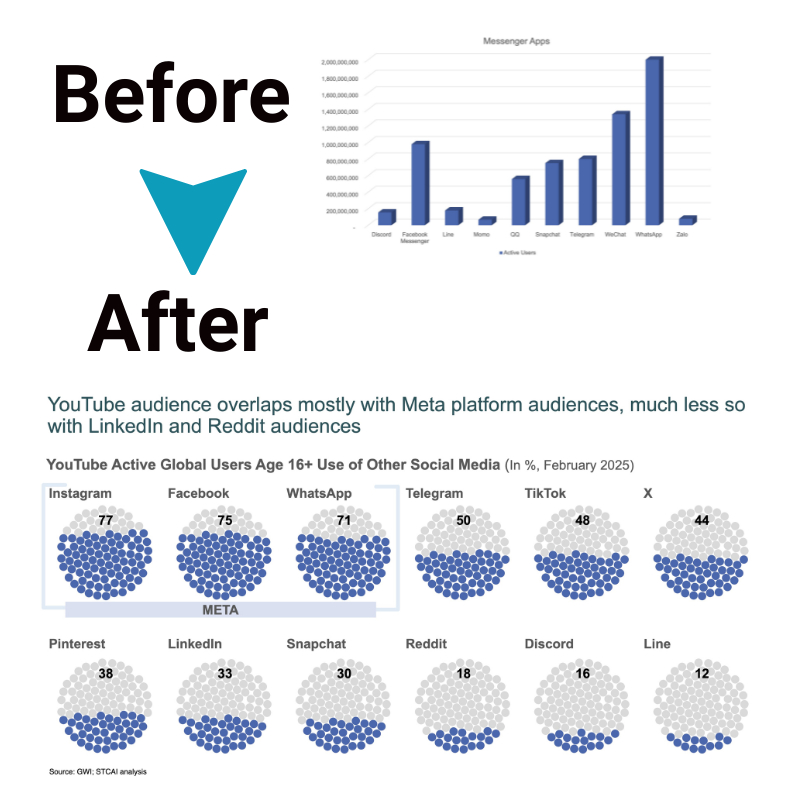
- Clarity and Simplicity: The representation must clearly communicate the key messages without unnecessary complexity. Decluttering to focus only on the most relevant elements creates sharp analytical clarity.
- Choosing the Right Visualization – The graph type must suit the analysis goal and data structure. Using inappropriate representations confuses. The right visualization conveys the message accurately and concisely.
- Color Theory and Accessibility – Colors attract attention while also encoding meaning. However insensitive color choices can impede accessibility for the color blind. Universal accessibility must blend color theory with inclusive design. All crucial insights should emerge without color reliance.
- Data Integrity and Ethics – Accuracy and transparency regarding data collection methods and metric definitions is mandatory. Unethical selectivity or manipulation should never occur. The visualization must build trust in the data while protecting privacy.
Designing for Decisiveness
a. Identifying Key Metrics and KPIs
Data visualizations optimized for decision making highlight the most relevant Key Performance Indicators (KPIs) related to strategic goals. Executives need holistic operational visuals with high-level KPIs. Managers require task-specific mid-level KPIs to guide teams. Frontline staff need tactical micro-level daily KPIs.
b. Tailoring Visuals for Audiences
Visualizations must be tailored to focus each audience segment on their vital metrics while excluding less relevant data. This reduces distraction and directs focus towards priority KPIs for more agile decisions.
c. Real-Time Data Visualization
With easy automation across data pipelines and dashboards, visualizations can feed live data insights for immediate issue identification and response. Real-time data accelerates mitigation minimizing negative impacts through rapidly data-driven decisions.
Future Trends in Data Visualization
The future offers exciting potential to enhance data visualization through AI, machine learning, predictive analytics, virtual reality and augmented reality. These emerging innovations promise more versatile, automated and immersive data visualizations that radically improve analytical flexibility and speed.
AI and ML will expand access and augment human analysis by automating visualization generation for custom datasets. They can tailor graphics to focus on crucial dimensions within complex, multidimensional data. By handling repetitive design tasks, AI and ML enable people to focus on higher judgement and creativity. Intelligent algorithms will also surface valuable insights that humans may overlook. However, human oversight will remain essential to guide tool usage ethically.
Predictive modeling-based visualizations will estimate future trajectories beyond the current status. This prescriptive analytics allows leaders to visualize potential challenges ahead of time and implement preventative measures proactively. Models empower organizations to avoid issues through smart contingency planning of responses before crises emerge.
Immersive technologies like virtual reality (VR) and augmented reality (AR) will pioneer new 3D interaction methods for visualized data. Spatial computing promises to transcend flat screens by rendering data constructs directly viewable and manipulable in physical environments. This embodied user experience holds huge potential for collaborative analytics, though still nascent. VR and AR extend possibilities to connect abstract data insights to tangible real world spaces for flexible and accelerated decisions.
Conclusion
Data visualization empowers teams across diverse industries to simplify complexity, enable clarity, and champion informed action. Following core principles around ethicality, representation relevancy, and audience alignment sets up impactful data visuals that drive expedient and analytics-based organizational decisions.
The future offers expanded potential through automation, AI and new technologies like VR and AR. Data visualization leads to understanding, enabling decisiveness, and will only continue improving as a pivotal capability for enterprise strategy and operations.


