Expert Guide to Designing Insightful Venn Diagrams in PowerPoint
Creating Venn diagrams in PowerPoint can seem like a simple task, but crafting truly insightful and visually compelling ones requires a bit of strategy and creativity. Venn diagrams are powerful tools to visually represent relationships, overlaps, and differences between sets of data or ideas. Whether you’re an educator, business professional, or student, designing a Venn diagram effectively conveying your message is essential.
This guide will help you easily create insightful Venn diagrams in PowerPoint, complete with practical tips and examples.
What is a Venn Diagram?
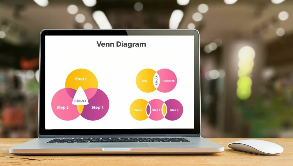
A Venn diagram consists of overlapping circles, each representing a distinct set. The intersections of these circles highlight commonalities between the sets, while the non-overlapping sections show their unique attributes.
Why Use Venn Diagrams?
Venn diagrams simplify complex relationships and make data more digestible. They’re used in various fields like mathematics, business, science, and education. For example:
- A business Venn diagram example can compare competitors’ product features.
- An education Venn diagram example can highlight the similarities and differences between two historical events.
Step-by-Step Guide to Creating Venn Diagrams in PowerPoint

1. Set Your Purpose
Before opening PowerPoint, determine the purpose of your Venn diagram. Are you comparing marketing strategies, visualizing data, or explaining a concept? Define your sets and the relationships you want to highlight. This clarity will guide your design process.
2. Open PowerPoint and Insert Shapes
- Open a new PowerPoint slide.
- Go to the Insert tab.
- Click on Shapes and select the circle (oval) shape.
- Draw the first circle by clicking and dragging on the slide.
3. Create Overlapping Circles
- Copy and paste the circle to create duplicates.
- Arrange the circles so they overlap. Ensure the overlaps visually represent your intended relationships.
- Use Ctrl + D (or Command + D on Mac) to duplicate shapes quickly.
4. Customize Colors and Transparency
- Select a circle, then right-click and choose Format Shape.
- Adjust the Fill Color and set the transparency level. This makes the overlaps easier to see.
- Repeat for each circle, using distinct but harmonious colors.
Pro Tip: Stick to a color palette that aligns with your presentation’s theme. Tools like Adobe
Color or Coolors can help you choose complementary colors.
5. Add Labels and Text
- Click inside each circle to add text that represents the set.
- For overlaps, use text boxes to label commonalities.
- Use concise language to keep your diagram clean and easy to understand.
6. Fine-Tune Your Layout
- Align and distribute the circles evenly using PowerPoint’s Align tool.
- Adjust the sizes and positions for better visual balance.
7. Incorporate Visual Elements
- Use icons or images to make your Venn diagram more engaging.
- Insert relevant illustrations or logos inside the circles.
- Ensure the visuals don’t clutter the diagram.
Save as a Template
If you frequently use Venn diagrams, save your design as a template. This will save you time and ensure consistency across presentations.
Advanced Tips for Insightful Venn Diagrams
1. Leverage Pre-designed Templates
PowerPoint has built-in templates that can save time. Simply search for “Venn diagram” under Insert > SmartArt. These templates are customizable, allowing you to tweak colors, shapes, and text.
2. Use a Venn Diagram Maker
Sometimes, external tools can offer more advanced customization options. Venn diagram makers like Canva, Lucidchart, or Visme provide intuitive interfaces and unique design features. Once created, you can import the diagram into PowerPoint.
3. Incorporate Data
For data-heavy presentations, consider overlaying numerical data on your Venn diagram. Use text boxes or Excel charts to display statistics within the sets and intersections.
4. Experiment with Shapes
While circles are traditional, you can use other shapes like ellipses or rectangles for a creative twist. This approach can make your diagram stand out while still conveying your message.
5. Interactive Venn Diagrams
Linking each section of the Venn diagram to a slide with more detailed information can add interactivity to your PowerPoint presentation. This is especially useful for complex topics.
Real-World Venn Diagram Examples
Example 1: Marketing Strategies
A business might use a Venn diagram to compare digital, traditional, and hybrid marketing strategies.
- Circle 1: Digital Marketing (SEO, PPC, Social Media)
- Circle 2: Traditional Marketing (Print, TV, Radio)
- Overlap: Content that works across both platforms, like storytelling.
Example 2: Educational Content
Teachers can use a Venn diagram to compare historical events:
- Circle 1: World War I
- Circle 2: World War II
- Overlap: Shared causes like alliances and militarism.
Example 3: Product Comparison
A tech company might use a Venn diagram to showcase product features:
- Circle 1: Smartphone A
- Circle 2: Smartphone B
- Overlap: Features like battery life and camera quality.
Common Mistakes to Avoid
- Overcrowding the Diagram
Too many circles or excessive text can overwhelm viewers. Stick to 2-4 circles for clarity.
- Poor Color Choices
Avoid clashing colors that strain the eyes. Use soft, contrasting hues.
- Unaligned Shapes
Misaligned circles can distract from the message. Use PowerPoint’s alignment tools for precision.
- Lack of Labels
Unlabeled sections can confuse your audience. Ensure every area is clearly identified.
The Bottom Line
Designing insightful Venn diagrams in PowerPoint is both an art and a science. With the right balance of creativity and strategy, you can create diagrams that effectively communicate complex ideas. Remember to plan your content, choose your design elements thoughtfully, and always keep your audience in mind.
Whether you’re comparing marketing strategies, explaining data overlaps, or highlighting product features, a well-crafted Venn diagram can elevate your presentation. With PowerPoint’s tools and these expert tips, you can create diagrams that inform and inspire.


