Essential Guide to Constructing Population Pyramids in PowerPoint
Population pyramids are a vital tool in understanding the demographic makeup of a region. Whether you’re a student, researcher, or business professional, knowing how to create one can help you present data in a visually compelling way. This guide will walk you through the steps of constructing population pyramids in Microsoft PowerPoint, breaking it down into easy-to-follow instructions.
What is a Population Pyramid?
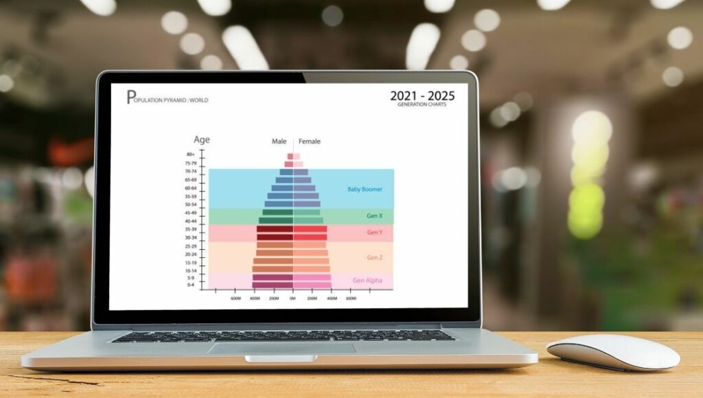
A population pyramid is a graphical representation that shows the distribution of a population by age and gender. It’s typically shaped like a pyramid, hence the name. Each bar in the graph represents a specific age group, with males usually displayed on the left and females on the right.
Why Use Population Pyramids?
Population pyramids provide valuable insights into:
- Demographic Trends: They help identify whether a population is young, aging, or stable.
- Policy Planning: Governments and organizations use them for health care, education, and economic planning.
- Comparative Analysis: Comparing population pyramids from different years or regions reveals how populations change over time.
For instance, a population pyramid example of a developed country might show a narrow base and wider top, indicating an aging population, while a developing country might show a wide base, indicating higher birth rates.
Steps to Create a Population Pyramid in PowerPoint

Follow these steps to create a professional-looking population pyramid directly in PowerPoint.
Step 1: Gather Your Data
Before diving into PowerPoint, you’ll need accurate data. Population pyramids require:
- Age groups (e.g., 0-4, 5-9, 10-14, etc.).
- Population counts or percentages for each age group, divided by gender (male and female).
Step 2: Organize Your Data
Organize your data in a table, preferably in Excel for easy import.
Step 3: Open PowerPoint and Insert a Chart
- Open PowerPoint and navigate to the slide where you want the population pyramid.
- Go to the Insert tab and choose Chart.
- From the chart types, select a Bar Chart (specifically, a Clustered Bar).
Step 4: Input Your Data
- Once the chart is inserted, PowerPoint will open an Excel sheet with placeholder data.
- Replace the placeholder data with your population data. Input males’ data as negative and females’ data as positive.
- Close the Excel window. The chart will update automatically.
Step 5: Format the Chart
Now, it’s time to make your chart look like a proper population pyramid.
Adjust Axes
- Right-click on the horizontal axis (X-axis) and choose Format Axis.
- Set the bounds and intervals to match your data range (e.g., -10 to 10 for percentages).
- Ensure the axis shows numbers clearly and symmetrically for both sides.
Reorder Age Groups
Population pyramids require age groups to run from youngest (bottom) to oldest (top).
- Right-click the vertical axis (Y-axis) and choose Format Axis.
- Under the axis options, check Categories in Reverse Order.
Change Bar Colors
- Click on the male bars and choose a color (e.g., blue).
- Do the same for female bars (e.g., pink or orange).
- Avoid overly bright colors; the focus should remain on the data.
Step 6: Add Titles and Labels
- Chart Title: Add a title that reflects your data, such as “Population Pyramid of Country X, 2023.”
- Axis Labels: Label the X-axis as “Percentage of Population” and the Y-axis as “Age Groups.”
- Legend: Ensure the legend clearly differentiates between male and female populations.
Step 7: Customize for a Polished Look
To make your population pyramid presentation-ready:
- Gridlines: Minimize gridlines to reduce visual clutter.
- Font Size: Use readable font sizes for titles and labels.
- Data Labels: Add data labels to the bars if the exact values are crucial for your audience.
Advanced Tips for Population Pyramids in PowerPoint
Use Templates for Consistency
Consider using a pre-designed PowerPoint template if you’re creating multiple population pyramids. This ensures consistent formatting across slides.
Add Context
Accompany your pyramid with a brief explanation of what it shows. For example:
“This population pyramid highlights the youthful population of Country Y, with 40% of its population under the age of 20.”
Compare Multiple Pyramids
To show changes over time or differences between regions:
- Insert multiple population pyramids side-by-side.
- Use consistent colors and formatting for easy comparison.
Real-World Applications of Population Pyramids
Understanding how to create and interpret population pyramids has wide-reaching applications. Here are a few examples:
1. Economic Planning
Governments use population pyramids to plan workforce needs and allocate resources. For example, a large working-age population may indicate economic growth potential.
2. Health Care
Health officials analyze population pyramids to predict health care demands. A wide base suggests the need for maternal and child health services, while a wide top indicates increased demand for elderly care.
3. Education
A population pyramid example of a young population may signal a need for investment in schools and education infrastructure.
Conclusion
Creating population pyramids in PowerPoint is not just about making a chart—it’s about telling a story with data. By following this guide, you can design clear and visually appealing population pyramids that convey important demographic insights. Whether you’re a novice or a seasoned professional, mastering this skill will enhance your presentations and help you make data-driven decisions. So, gather your data, open PowerPoint, and start building population pyramids that make an impact!


