Effective Correlation Analysis for Data-Driven Presentations
As data and analytics play an increasingly important role in decision-making, understanding relationships between variables is essential. Correlation analysis helps reveal how two or more variables are related without assuming any causation. Performing correlation analysis and presenting the results effectively can provide valuable insights to inform decisions.
Correlation is a statistical technique that measures the strength and direction of association between two continuous variables. It assesses how much one variable changes in response to changes in another variable. The correlation coefficient produced ranges from -1 to 1, where -1 is a perfect negative correlation, 0 is no correlation, and 1 is a perfect positive correlation.
Correlation does not imply causation; it simply shows that variables move in the same or opposite direction without explaining why. Understanding correlation is crucial for data-driven presentations and decision-making.
Types of Correlation
Here are the main correlation techniques:
- Pearson’s correlation: This is the most widely used technique. It measures the linear relationship between two continuous variables measured on interval or ratio scales. Think metrics like sales numbers or test scores. It’s best for large sample sizes and assumes data is normally distributed. The coefficient ranges from -1 to 1.
- Spearman’s correlation: This nonparametric method assesses how well an arbitrary monotonic function describes the relationship between two variables. Even if the relationship isn’t a straight line, it evaluates their monotonic association. It’s useful when you have ordinal variables on a Likert scale from surveys. The scores are ranked, and the correlation is measured between the ranks.
- Kendall’s correlation: This other nonparametric option is best for small sample sizes as it doesn’t assume normality like Pearson. It measures concordance, looking at all pairings of observations and counting the number of agreements versus disagreements in how they rank the variables. So, it assesses how consistent the ordering of the variables is within the sample.
It can calculate multiple correlation techniques to gain different relationship perspectives. For example, Pearson reveals linear correlations, while Spearman and Kendall expose monotonic trends, too. Each has merits, so trying multiple gives you a fuller picture of the patterns in your data. Choosing the right coefficient for the variable types and data size helps ensure you get valid correlation results to analyze properly.
Importance of Correlation Comparison
Correlation comparison allows you to see which variable pairings have the strongest relationships based on their coefficients. The higher the correlation value, the more closely associated two variables are changing together. Spotting the variable pairs with the strongest or weakest correlations through comparison can highlight what may be most impactful to focus on.
It’s also informative to examine how correlations between distinct variable groupings differ. For example, comparing correlations between demographic traits and satisfaction ratings versus correlations between purchase behaviors and product usage. Significant divergences in these correlation comparisons may signify meaningful distinctions in how certain variable types interconnect.
Correlation comparison further helps validate your findings or raise questions. If correlations between like variables are consistent with expectations but some outliers exist, those outliers merit further investigation. In contrast, widespread inconsistencies in correlation comparisons across similar variable pairs could reveal data quality issues that need to be addressed.
Applying Correlation Analysis in Presentations

To apply correlation analysis effectively in presentations, follow these steps:
- Perform a basic correlation analysis using a data analysis tool like Excel or Tableau. Select your variables, calculate the correlation coefficient, and output to a scatter plot.
- Interpret the results in the context of your specific data and business question. Discuss the strength and direction of relationships revealed and whether correlations align with expectations.
- Avoid common pitfalls like confusing correlation with causation or focusing too much on the coefficient value alone without the full context. Correlation reveals an association, not why variables are correlated.
- Demonstrate correlations visually through annotated scatter plots comparing variables. Point out any obvious or surprising relationships that stand out. Scatter plots bring correlations to life compared to just stating coefficients.
- Discuss both significant and non-significant correlations found to provide a full picture. Provide caveats where appropriate for small sample sizes.
- Relate correlations back to your overarching business question or use case. Explain how understanding these relationships helps address the problem or opportunity.
Advanced Techniques and Considerations
Going beyond basic correlation involves several advanced statistical techniques:
1. Partial Correlation
When two variables are correlated but there may be a “third factor” influencing them, partial correlation can help. It allows you to better control for this third variable’s effects statistically to isolate the direct relationship between the first two variables. This is done by determining the correlation between the two variables while treating the third variable as constant. It gives a purer view of how the first two interact without the third’s impact.
2. Multivariate Correlation
When dealing with multiple intertwined variables, looking at one relationship at a time gives an incomplete picture. Multivariate correlation examines the joint relationship between all variables simultaneously.
Statistically, it measures all variables’ linear combinations to see how they correlate together in the overall dataset. This full system-level perspective can surface complex interactions single correlations miss.
3. Nonparametric Methods
Sometimes, data isn’t generally distributed as assumptions require. Rank-based nonparametric methods avoid this by converting to a rank-order system before finding a correlation.
Spearman’s rho and Kendall’s tau were mentioned earlier. These handle non-normal data gracefully through rankings instead of raw values.
4. Additional Considerations
Watch out for collinearity when two predictors are highly correlated. Also, beware of outliers skewing results-they may merit closer inspection.
Ethically, clearly state limitations to avoid correlations being over-interpreted or conclusions about causation being inappropriately drawn. Full transparency builds trust.
Best Practices for Presenting Data
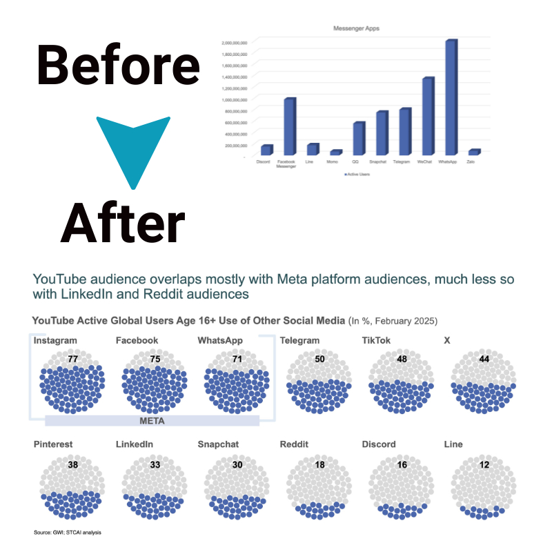
Strong data visuals help audiences understand and recall insights. In addition to annotated scatter plots:
- Heatmaps clearly show correlation matrix results on one page
- Side-by-side bar charts compare correlation strength across multiple variable pairings
- Small multiples show relationships for many groupings like regions or segments together
- Keep visuals simple yet impactful. Tell stories with data through a narrative flow. Practice presenting to catch any gaps before stakeholders. Adjust based on audience feedback to maximize impact.
The Bottom Line
Correlation analysis is a valuable starting point for uncovering relationships in data prior to determining causality. Effectively presenting the results of correlation studies by following best practices aids in informed decision-making. Continually improving techniques, clearly addressing limitations, and relating insights back to the enterprise help strengthen the impact of data on key business issues.

