6 Diagram Presentation Examples For Better Data Visualization
Data visualization is the act of transforming complex information into clear, actionable insights. There are many ways to effectively present data, such as modern diagram presentation examples. These tools help communicate trends, patterns, and relationships from basic charts to advanced visualizations.
Visualizing the data helps make decisions easier across organizations. In this guide, we explore some powerful diagram types that can boost understanding and engagement in a range of business settings. These visualization methods are relied on by teams around the world to drive impactful conversations.
1. Stacked column chart
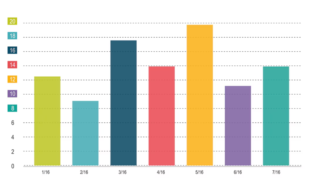
A stacked column chart shows the data parts as a whole across different categories. These are used by marketing teams to show revenue sources over time. It’s perfect for comparing totals, as each segment represents a different component. It also helps to spot trends and proportions instantly.
This format makes the sales data, the market share analysis, and the budget allocation clearer. Interactive exploration of individual segments is supported by advanced features. Avoid mistakes while combining color. Try color coding as it helps to see different categories and the link between them.
2. Power of treemap charts
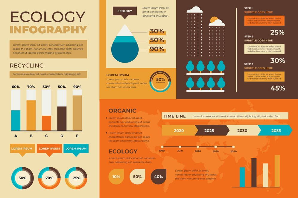
A treemap chart is a chart that transforms hierarchical data into nested rectangles. The size of each rectangle is determined by the importance of the data value. In this format, the product categories, website traffic sources, and department budgets all shine.
It also adds another dimension of colors so as to see deeper insights. It has a compact layout, which maximizes screen space despite its clarity. It also has interactive elements which allow users to drill down into specific segments. Dynamic updates of real time data visualization are supported by modern treemaps.
3. Waterfall diagrams
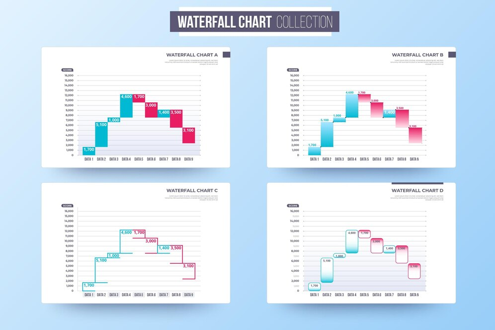
In the waterfall diagram, initial values change to the final values, which take the intermediate stages. This approach is useful for project budget analysis and financial statements. We see obvious increases and decreases in the floating blocks.
Viewers get the cumulative effects and pick out important changes quickly. Positive and negative impacts are color coded. Key turning points in the data flow are custom annotated. This type of diagram presentation example is often used by teams to do variance analysis and financial planning.
4. Choropleth maps for geographic insights
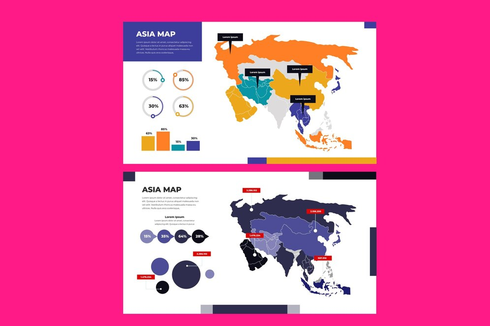
A choropleth map depicts data variability over regions by using color gradients. Instantly, we see the population density, sales distribution, and market penetration. The patterns are geographic and regional. Territories decision-makers effortlessly spot opportunities and challenges across territories.
Details of specific regions are allowed to be explored in detail. The brand color schemes used are aligned with brand guidelines and remain clear regarding data. They are placed in legend for easy interpretation.
5. Pyramid charts for demographics
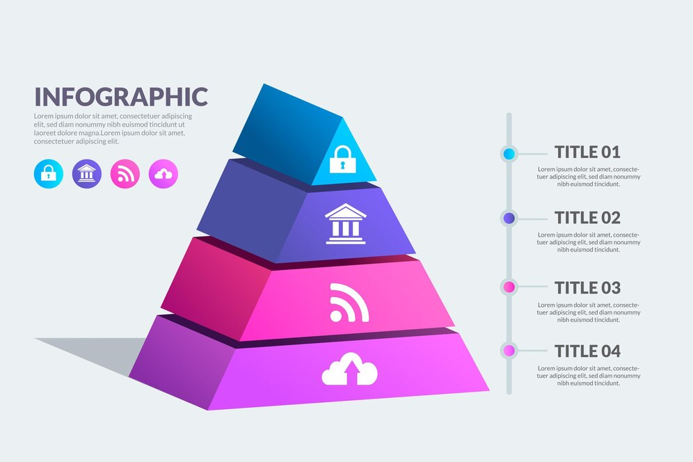
Population distribution across age groups and categories is best shown with pyramid charts. The presentation of comparative data is made straightforward by the symmetrical layout. These are used by Marketing teams to analyze target audiences. This format is very intuitive and helps the stakeholder to quickly understand the demographic patterns.
Detailed information about specific segments is revealed in interactive elements. Key demographic insights are highlighted in custom annotations. Visual appeal is enhanced, while professional appearance is kept with color schemes.
6. Radar charts for performance
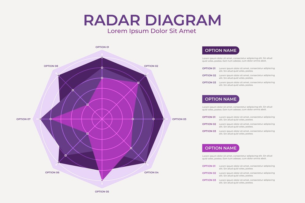
Radar charts are basically a circular display that compares multiple variables. Instantly clear are skills assessment, product features, and performance metrics. At a glance, the shape gives you an idea of strengths and weaknesses.
These are used by teams for balanced scorecards and competitive analysis. Individual metrics are explored through interactive features. Accurate representation of diverse data types is ensured by custom scales. Changes over time are highlighted by animation options.
STC AI: A data visualization partner
Modern diagram presentation tools often require technical expertise. By giving us intuitive data visualization right in PowerPoint, STC AI changes this landscape. Advanced charting capabilities combined with a user-friendly interface form this powerful solution.
Its enormous visual library and customization options are useful to teams across industries. It offers real-time collaboration and instant updates. The built-in templates also accelerate the creation of professional visualizations. New chart types and features are introduced with regular updates.
Transforming data with STC AI
Teams can create these engaging diagram presentation examples via STC AI, which is revolutionizing how teams create engaging diagrams and charts. Advanced visualizations can be accessed without leaving PowerPoint. Custom emojis maintain brand consistency through the use of colors and fonts.
It’s simple to create, while at the same time, it can handle complex data. It saves time for teams while creating professional quality visualizations. Data validation is automated, ensuring accuracy. There are built-in sharing features to facilitate collaboration. Regular training resources help teams get as much out of the platform as possible.
Frequently Asked Questions
1. How do diagram presentation examples enhance data understanding?
Visual representations of information help viewers process the information faster than raw numbers. Diagrams show the patterns and relationships that could otherwise be shadowed.
2. What is the best chart type for financial data?
Financial changes over time periods are best displayed with waterfall diagrams and stacked columns. It also provides custom annotations and color coding to help financial storytelling.
3. Can STC AI manage the complexity of the data set?
STC AI processes different data types yet maintains an easy to use interface in PowerPoint. Up to date data handling capabilities improves. Support resources help to make the implementation smooth.


