Data Storytelling for Beginners Through Graphs and Charts
In 2025, the overall data volume will be 181 zettabytes. With the number going up every year, you can no longer call data boring or confusing. In fact, professionals are now expected to tell stories through data. It becomes possible through the use of engaging charts and graphs. However, anyone new to the world of data storytelling might need clarification on graphs and charts. So, below, we’ll discuss some tips related to data storytelling for beginners.
Importance in Data Visualization for Storytelling
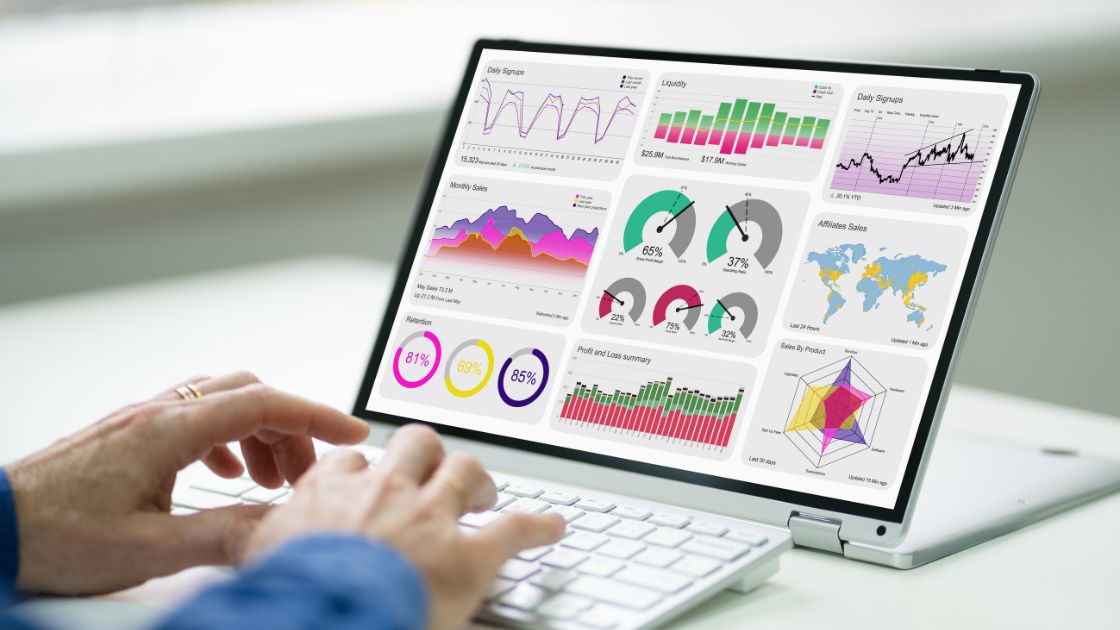
Crafting a killer story means making complex info easy to digest. That’s where data viz comes in handy! The right charts and graphs can level any narrative by turning dry data into captivating visuals. A snapshot says a thousand words, allowing readers to spot trends and “a-ha” moments simultaneously. Dataviz taps into our superpowered visual cortex, using our innate pattern-seeking skills to process insights faster. For storytellers, choosing the perfect visual style lends meaning and emotion to numbers that might otherwise be read as sterile. Well-designed infographics make stories more memorable and persuasive by bringing data to life intuitively. So, let visualizations do the heavy lifting next time you communicate complicated ideas. They’re the ultimate visual shortcut for conveying key takeaways with impact.
Tips to follow
- Pick the right chart or graph.
Choosing the perfect chart to convey your data and message effectively is the first crucial step. Each chart has its unique strengths and limitations, and it is essential to select one that matches your purpose and target audience.
For instance, pie charts are ideal for showcasing proportions. Meanwhile, line and bar charts are better for illustrating changes over time. A scatter plot or bubble chart may be more suitable for revealing relationships. Consider the key elements you want to highlight, compare, or uncover with your data, and opt for the Excel graph that best aligns with your objective.
- Use proper labels and titles.
Labeling all of your charts and graphs is essential in ensuring that your audience fully comprehends the significance of your data. It’s crucial to use concise labels that truly capture the essence of your data and message.
Additionally, it’s important to strike a balance between providing enough information and not overcrowding your visuals with too many words or too small fonts. Be mindful of using simple and consistent language and formatting. This will greatly enhance the readability and interpretability of your charts and graphs.
- Make wise use of colors and shapes.
The judicious use of colors and shapes can greatly elevate the impact of your visuals. However, haphazardly incorporating such elements can mislead your audience. Thus, it is crucial to select colors and shapes that are relevant and meaningful to your message.

Your chart maker might allow you to use an interesting combination of colors. But be mindful of using too many colors or shapes that may overwhelm your viewers. Additionally, avoid using colors or shapes that may suggest a certain bias, hierarchy, or correlation that is not supported by your data. Instead, opt for colors and shapes that are appropriate, appealing, and in line with your creative approach.
- Get rid of unwanted elements.
Your graph maker can add a variety of elements. However, proper data visualization is all about simplicity and focus. So, you should eliminate all redundant elements from your graphs and charts.
For instance, you can eliminate extra elements such as gridlines, borders, backgrounds, legends, or data labels from your charts and graphs. These features may need to be more vital and informative and can distract from your intended message.
Additionally, any irrelevant data can be removed to avoid diluting or obscuring your message. To truly capture your audience’s attention and effectively convey your message, it is crucial to focus on the most significant aspects of your data.
Utilizing filters can also help organize your data and present meaningful information. By decluttering them, you can simplify and concentrate your charts and graphs for maximum impact.
- Assess and refine
In order to ensure that your data visualization is accurate, compelling, and convincing, it is essential to test and refine them. This process involves thoroughly checking your data sources, calculations, and assumptions. Reviewing your visuals for errors, inconsistencies, or ambiguities that could undermine your credibility or clarity is also crucial.
Seeking feedback from your audience, colleagues, or experts is another valuable way to test and refine your charts and graphs. These individuals can provide valuable insight into understanding, preferences, and suggestions for improvement.
Additionally, asking for their input on specific questions or objectives you have for your visuals can be highly beneficial. Finally, validating your data and verifying the accuracy of your information is another important step in testing and refining your charts and graphs.
Common Mistakes in Data Visualization and How to Avoid Them
- Overlooking context – Failing to provide explanatory labels, titles, and captions that communicate what the data represents. Visuals should be self-explanatory.
- Using inappropriate graph types – Choosing visually appealing but inaccurate chart types that distort data relationships, like 3D pie charts instead of 2D bar/column charts.
- Excessive design elements – Using too many fancy effects, colors, illustrations, etc. that distract from the data itself. Clean and simple is best.
- Introducing bias – Carefully select metrics and scales that paint a complete, unbiased picture. Avoid cherry-picking data.
- Forgetting the audience – Design and complexity should match the audience’s knowledge. Simplify unfamiliar concepts.
- Lacking interactivity – Enable custom views, filtering, and drilling down into data details on demand.
- Omitting context – Provide text to explain the significance, implications, and limitations of the data.
- Ignoring accessibility – Use color palettes, fonts, and tools compatible with screen readers for the visually impaired.
The Future of Data Storytelling with Graphs and Charts
The future of data storytelling through graphs and charts holds great potential. As data increases in complexity, effective visualizations will become more critical for communicating insights. The key will be matching the right charts and graphs to the conveyed narrative. While static infographics have been widespread, expect more interactive and customizable data visualizations that bring numbers to life. New technologies like augmented reality could even project 3D data displays. However, more than fancy visuals are needed – good data storytelling will still rely on beautiful design clarity and context. If used thoughtfully, graphs and charts have barely begun to reveal the stories hidden within data. The possibilities to enlighten through compelling data visualization are endless.

Conclusion
If you want to ace data storytelling for beginners, you will have to utilize the best practices associated with graphs and charts. Get your copy of the Storytelling with Charts to get more tips related to using charts and graphs for creating narratives with data.
FAQs:
- What is the ideal graph for data visualization?
You should always consider the type of data to find the best graph.
- Is it important to label graphs and charts?
Adding labels to your graphs and charts can bring more clarity. However, you need to ensure that the labels and titles are manageable and manageable.


