Data Storytelling 101 – Essential Graphs and Charts for Beginners
In today’s world, where data is a crucial factor, being able to share information effectively is really essential. This is where ‘data storytelling’ comes into play. It combines looking closely at data and telling a narrative, which helps make complicated details easy for people to understand.
In the middle of this practice are different graphs and charts, which help to make clear the patterns, trends, and insights found in data collection. In our article here, we aim to deeply understand the basics of data storytelling by looking at key graphs and charts for beginners who want to learn how to present data effectively.
I. Understanding the basics
Before we start our journey into graphs and charts for beginners, it’s very important to grasp the basic ideas of data storytelling. Basically, this is about changing simple numbers into a narrative that different people can easily understand. This process needs a smooth combination of analytical understanding and the way we present it visually. Let’s look at the important types of graphs and charts that will assist you in presenting an interesting story with your data.
II. Line charts
Line graphs serve as a good beginning to see how things change with time. When you put data points on a continuous line, these graphs show the way something varies during certain times. Line charts are good for seeing patterns and changes when you look at sales numbers, the cost of stocks, or temperature fluctuations. Usually, the x-axis is for time, and the y-axis shows what we’re looking at.
You can spotlight trends clearly as the line rises and falls across the graph over time periods. Consider using dual axes if depicting multiple variables. And annotate key events in the graph lines to correlate data shifts to real-world happenings. Smooth lines aid pattern comprehension, but keep it real – don’t artificially straighten lines hiding zigzags signaling noteworthy volatility.
III. Bar charts
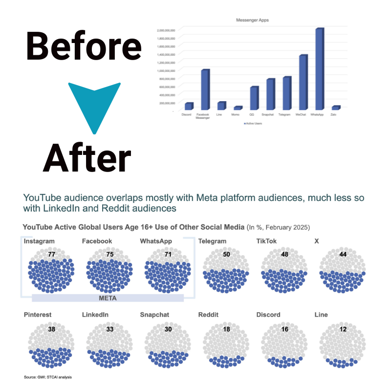
Bar graphs work well for showing differences in amounts between various groups. If you need to contrast how much sales happened in different areas or the marks students received across various courses, bar graphs make this data clear and have a strong visual effect. Each bar’s size matches the amount it shows, so people can understand and compare easily.
You can order the bars logically – alphabetically, sequentially, or by value size. Color coding bars aid pattern recognition, too. Include concise yet descriptive axis and data labels without overcrowding. While basic bar charts usually suffice, advanced options like stacked or grouped bars work for more complex categorical data stories. Remember, the goal is comprehension – embellish only if it improves visual communication.
IV. Pie charts
Regarding charts for beginners, pie charts are very good for showing the parts of a whole thing. When you split a circle into pieces, and each piece stands for a different group, pie charts make it clear how much each part adds to the total. Although there are people who believe pie charts can be misunderstood, they continue to be a useful way to display how different categories share out within a whole set.
Pie charts work best for simpler datasets with less than 8 categories – too many slices get hard to compare visually. Consider ordering slices from largest to smallest share. And use subtle color variances between slices to distinguish them. Pie charts simplify complex wholes into an intuitive snapshot – ideal for grasping compositions or visualized “before and after” comparisons.
V. Scatter plots
Scatter plots are very important for showing the connection between two different things. You put each piece of data on a graph with two axes, and this helps people see if there is a pattern, how the points relate to each other, or if some points don’t fit. Scatter plots are very helpful to look at when you want to understand if one thing causes another or to spot trends that might be hidden using different kinds of graphs.
Use colors and shapes to distinguish between variables, like company performance and market conditions. You can also plot lines and curves highlighting correlations. While scatter plots technically depict unstructured data, look for stories within the patterns. Do higher concentrations of dots suggest relationships of note? Let the viewer uncover insights from the data constellations they form.
VI. Histograms
Histograms help to see how a single variable is spread out. They split the data into sections or bins and show how often each section appears with a picture view of frequency. This kind of graph is very useful for seeing patterns outliers and knowing the basic form of a collection of data.
Histograms illuminate data distribution more intuitively than statistics like mean and variance. The visual slope shows skew and clustering of data spread. Customize bin sizes and ranges for the most relevant analysis. Compare histogram shapes across datasets to contrast distributions quickly. Histograms enable grasping complex variability through simple stacked bars. While they plot singular variables, the narrative lies in analyzing their visual shape variations.
VII. Heat maps
Heat maps are very good for seeing complicated sets of data. They use different colors to show different values, which helps you quickly understand how two groups of variables relate to each other. They are very helpful in areas like finance, biology, and marketing. These fields often have big datasets that can be hard to understand without using something visual to help.
VIII. Area charts
Area charts resemble line charts. However, they stress the total impact of value changes across time. Filling in underneath the line makes these charts show both the direction of change and how big the variable is overall. Area charts work well for showing how different parts add up to a whole across certain times.
IX. Radar charts
Radar charts stand out because they show many variables at once in a circular layout. Every variable has its line starting from the middle of the chart, with the length of this line showing how much or how little of that variable there is. Radar charts, although not as frequently used as other types of charts, are effective in displaying the strong points and weak spots across various categories.
X. Treemaps
Treemaps work well when you want to show data with levels in a way that saves space. They split up one big rectangle into little ones, and each small rectangle shows information about a smaller part of the whole category.
Conclusion
Data storytelling is a skill that goes beyond different areas of work, letting experts share their findings in a way that captures attention and is easy to understand. When beginners learn important graphs and charts well, they can improve how they tell narratives with data and leave a strong impression. If you want to learn more about graphs and charts, consider getting a copy of Storytelling with Charts without delay.


