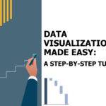
Take Data Presentations to Next Level With 7 Advanced Techniques From Visualization Tools
Data visualization is a crucial aspect of data analysis and business intelligence. With the right visualizations, data presentations can become more impactful, insightful, and actionable. Advanced visualization techniques take data presentations to the next level by turning complex data sets into intuitive dashboards, infographics, and reports.
In this blog, we’ll discuss the seven advanced visualization techniques that can help take your data presentation from boring to innovative and cutting-edge.
Importance of Data Presentation
Here are some reasons data presentation is crucial for businesses today:
- Helps identify patterns, trends, and insights from data that may otherwise go unseen in tabular or text-heavy reports.
- Allows data to be understood visually through simplicity, clarity, and focus.
- Engages audiences by tapping into visual learning preferences.
- Inspires data-driven decision-making across teams and the organization.
- Enhances explanation and storytelling with data-backed evidence.
- Evokes emotion and drives action through compelling narratives.
- Advanced Techniques From Visualization methods
Advanced Visualization Techniques

Technique 1: Interactive Dashboards
Interactive dashboards allow users to engage with data by selecting real-time parameters that update the displayed metrics and charts. This interactivity leads to on-demand insights without needing expertise in data analysis tools.
Dashboards connect multiple advanced chart types, geo maps, gauges, and more to a single-pane view. Decision-makers can spot trends, identify issues, and draw insights by interacting with the dashboard through drop-downs, sliders, and more.
Leading tools like Tableau, Microsoft Power BI, and Databox provide easy drag-and-drop interfaces to create interactive dashboards for effective data presentations.
Technique 2: Animated Visualizations
Adding motion to data visualizations through animated transitions or time series brings them to life and keeps audiences engaged. Animation is incredibly impactful when showing progressions and changes over time.
For example, animated maps can showcase how a virus spreads geographically over months or how election results evolve through vote counting. Such motion graphics can capture attention spans much longer than static snapshots.
Technique 3: Geospatial Mapping
Geospatial mapping takes data presentation to the next level by integrating location-based intelligence. This allows trends and metrics about geography to be viewed for richer insights into regional performances, characteristics, and more.
Maps can showcase sales figures, adoption rates, sentiment analysis, and countless other metrics across countries, states, regions, or other locations. Interactive features like zooming and panning allow users to explore granular geospatial data relationships.
Tools like Tableau, ArcGIS, Power BI and CARTO all offer advanced geospatial mapping capabilities to enhance data visualizations.
Technique 4: Custom Color Palettes
Using color in data visualizations enhances meaning, readability, and recall. Custom color palettes allow brands to handpick color schemes that align with their style guides to maintain visual consistency. But custom colors can go beyond branding. Color use can also optimize visual information hierarchy, direct attention to important chart elements, encode categorical differences, and more.
Tools like Adobe Color provide advanced features to customize palettes and accessibility check combinations to meet color contrast ratios for visibility-impaired audiences.
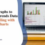
Technique 5: Advanced Chart Types
Don’t restrict your data presentations to the basic bar, pie, and line charts. Advanced chart types like histograms, heat maps, spider/radar plots, and box plots can broadly showcase niche data aspects.
Histograms for distribution analysis, heat maps for density mapping, radar plots for performance parameters, and box plots for statistical distribution visualizations allow for the creative presentation of data from unique perspectives.
Look beyond the default chart types in Excel or other basic tools. Data visualization software like Tableau, Highcharts, and D3.js support advanced charts to deliver insightful data presentations.
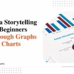
Technique 6: Data Storytelling
Data storytelling entails using data visualizations to build engaging narratives that inform, inspire, and compel audiences to take action. The key lies in moving beyond numbers to add context and meaning.
Compelling headlines, subheads, and captions set the stage for telling stories with data-backed evidence. Strategic use of different charts woven together can reveal step-by-step progressions to strengthen explanations of trends and patterns.
Infusing data presentations with storytelling elements increases information retention and drives organizational changes based on analyzed insights.
Technique 7: Real-Time Dashboards
Real-time dashboards allow teams to monitor live data feeds and current metrics instead of delayed snapshots. This fosters rapid, informed decisions without waiting for reports or updates.
From tracking website activity, sales performance, and system health to supply chain visibility, IoT metrics, and more, real-time insights can be visualized on auto-refreshing dashboards rather than static snapshots.
The Bottom Line
Data visualization mastery entails going beyond basic charts to advanced visualization techniques for impactful data presentations. As discussed, modern tools open doors to interactive dashboards, animated graphics, geospatial mapping, strategic use of color, innovative charts, data storytelling, and real-time visualization.
Implementing such cutting-edge yet intuitive features can improve audience engagement, information retention, and data-driven decision-making. The world of data presentation indeed holds abundant room for incorporating creativity beyond numbers and rows.