Foresight is 20/20: Data Prediction Through Visualization
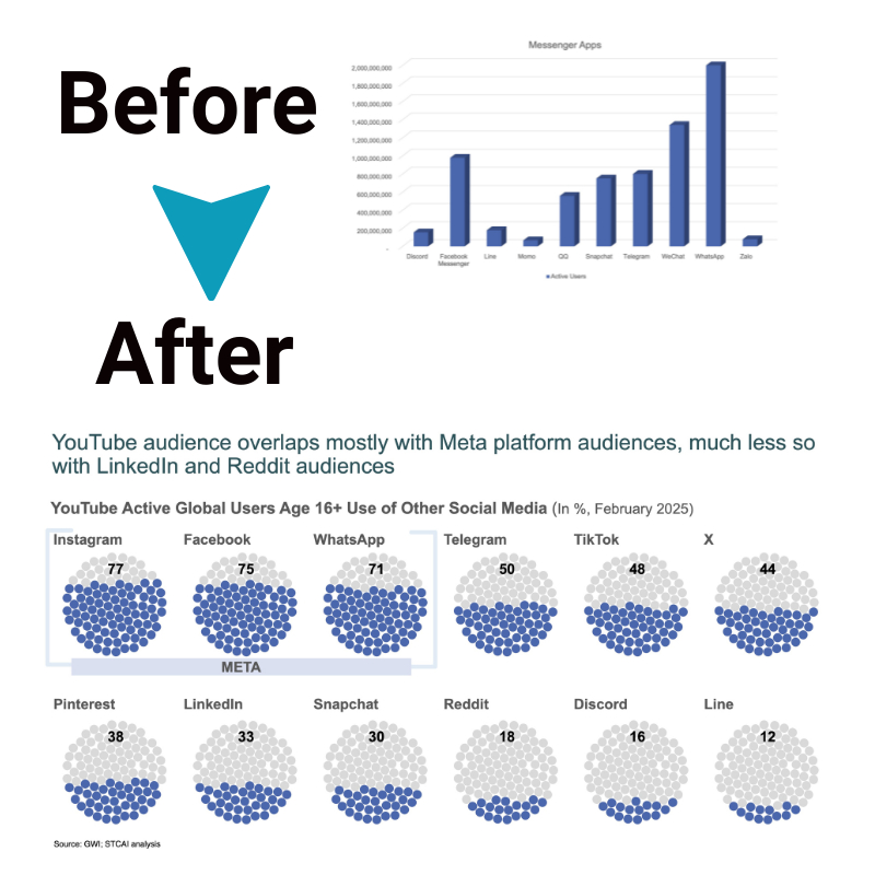
The ability to analyze data and identify patterns that allow us to make reasonable predictions about the future is an invaluable skill in today’s data-driven world. Visualizing data through graphs, charts, and other tools can provide crucial insights that text-based data analysis alone might miss.
When it comes to forecasting, predictive data visualization should be considered a fundamental component rather than an afterthought. Visualizations help simplify complex data sets, allowing us to see trends, correlations, outliers, and other factors impacting outcomes. Turning raw data into elegant visual representations makes identifying future opportunities and challenges much more easier.
Importance
Advanced data analytics focuses heavily on machine learning and statistical modeling to forecast future probabilities. However, human intuition and pattern recognition play a major role as well. Data visualization taps directly into these innate human strengths. Our eyes can quickly scan graphical displays and pick up on shapes, correlations and anomalies in a way that reviewing thousands of rows in a spreadsheet simply cannot.
Great data visualizations provide clarity, tell a story with data and allow anyone reviewing them to spot the signals amongst the noise quickly. We can observe how variables impact each other, identify leading indicators and see where unpredictable deviations from norms occur. All these insights fuel more accurate predictive modeling and planning.
Types of data visualizations for predictive analysis

Some types of data visualizations are quite easy and more straightforward, while others convey complexity in easier to decipher visual formats. Common predictive analytics visualization types include:
- Time Series Graphs– These show fluctuations in data points over consistent time intervals. They help reveal seasonal cycles, trends, and variability over time. Time series charts are excellent for data forecasting future cycles based on historical patterns.
- Pie Charts– Simple pie charts demonstrate proportional breakdowns clearly and concisely. Viewing expenses or sales by segment quickly shows where the biggest and smallest chunks are. Unexpected proportion shifts may indicate changes worth investigating further.
- Bar Graphs– Comparing metric values across different categories, bar charts help identify top and bottom performers. Comparing the height of revenue columns by region quickly shows which areas drive more sales. Cross-referencing this against cost bars exposes profitability differences.
- Line Graphs– Viewing trended metrics as a line shows the slope of improvement, decline, or consistency. Comparing multiple lines draws attention to cause-and-effect relationships between variables. The shapes of those lines offer clues into what future values might look like.
By combining different visualizations, cross-referencing, and correlating the same data points visualized in different ways, fascinating insights guide predictive analysis.
How to use predictive data visualization
The real power comes from actively analyzing visualizations to uncover the specific meaning toward making better predictions, not just creating them. Here are some best practices for leveraging predictive data visualization superpowers:
- Plot historical time series data to observe recurring cycles and detect leading indicators influencing cycles
- Compare viral line charts to expose predictor variables with correlated impacts
- Flag baseline metric value ranges and trigger investigation when deviations occur
- Identify patterns, associations, and sequence occurrences that tend to precede events
- Look for early anomaly detection compared to historical trends
- Review multivariate and geospatial maps for demographic and geographic insights
The process flows both ways. After hypotheses are formed from data visualization analyses, apply statistical modeling and machine learning algorithms to prove or disprove assumptions.
Benefits
Embedding interactive data visualization into analytics and planning processes lifts predictive capabilities to new levels, delivering these benefits:
- Quicker interpretation of complex data sets
- Clear communication of analytics insights
- Enhanced context, perspectives, and meaning
- Uncovering of non-intuitive relationships and findings
- Earlier detections of trend changes
- Makes collaboration and collective analysis easier
The clarity that predictive data visualization provides not only improves interpretations of what happened. It provides the missing link organizations need to turn vast data resources into predictive superpowers finally. The future is not a fixed endpoint but a probabilistic range of outcomes that data visualization helps model for more confidence and foresight.
Conclusion
Data visualization converts complex quantitative information into interpretable graphics. Visually representing huge data sets allows us to literally see valuable insights. The patterns, trends, correlations, and anomalies give reliable signals for extending insights about the past and present into reasonable assumptions about the future. Unlocking these predictive superpowers relies on choosing the right visualizations that help convert uncertainties into business foresight.

