Make Data Interactive With Data Storytelling Tool: 6 Ways to Engage Audiences
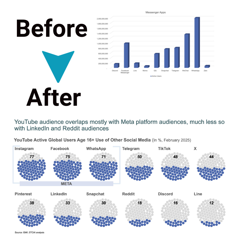
Data storytelling goes beyond basic data visualization by incorporating interactive elements that allow audiences to engage with the data hands-on. Instead of simply presenting stats, an interactive data narrative guides users through key findings, allows them to manipulate parameters, view data from different angles, and draws them to the desired conclusions.
This results in a memorable data experience that sticks with audiences much longer than static reports. In the section below, we’ll discuss interactive data visualization techniques to engage the audience.
An Overview of Data Storytelling
Data storytelling combines data science, visual design, and narrative elements to turn complex data sets into intuitive explanatory stories. The essential components of effective data storytelling include:
- Identifying the main message or insight within the data set that needs to be conveyed
- Structuring the narrative to guide audiences logically from questions to answers/conclusions
- Using compelling, descriptive language and titles to make the story relatable
- Choosing appropriate interactive data visualizations that allow in-depth exploration
- Incorporating annotations to highlight key data points and guide user attention
- Ensuring mobile responsiveness for access across devices
By following these principles, data storytelling makes complex data analysis accessible and interesting to non-technical audiences.
Factors to Consider when Selecting a Data Storytelling Tool
With data storytelling gaining immense popularity, several tools have emerged to help create interactive data stories without coding. When evaluating options, some important factors to consider are:
- Ease of use: The tool should have an intuitive drag-and-drop interface for creating stories without programming skills
- Visualization options: Ability to choose from a diverse library of interactive charts and graphs
- Customization and branding: Options to tailor the look, feel, fonts, colors, logos and themes
- Collaboration features: Allow teams to co-edit stories through mentions, comments or integrations with workspace tools like Slack/G-suite
- Security and permissions: Give selective access to authors vs. viewers
- Publishing and sharing: Enable publishing stories to the web and private dashboards along with social sharing options
- Mobile responsiveness: Ensure the data stories work seamlessly across mobile and desktop
- Data connectivity: Ability to connect to data sources like SQL, CSV, spreadsheets, etc.
6 Ways to Engage Audiences with Interactive Data Visualization

Here are six effective strategies to captivate audiences with interactive data stories:
1. Incorporating Interactive Visuals
Leverage user-driven interactions within the engaging visuals, such as zoom, pan, tooltip hovers, and cross-filtering across multiple charts. This exploration helps audiences actively engage with data to uncover insights.
2. Creating Narratives Around Data
Build story arcs and plot points using chapters, annotations and visually guided narratives. Descriptive text along with prominent key stat callouts make the story more memorable.
3. Utilizing Real-Time Data
Stream in live data from IoT devices or web APIs to showcase constantly updating metrics. The “live” aspect allows users to view the latest data contextually within historical comparisons.
4. Enabling Audience Participation
Let audiences directly manipulate parameters like date ranges or data filters to customize views and drive their own “what-if” analysis on the underlying data.
5. Leveraging Multimedia Elements
To make interactive data stories more immersive, incorporate images, videos, and audio clips. Overlaying data visuals on maps also boosts context.
6. Simplifying Complex Data with Dashboards
Use interactive dashboards with linked highlighting and drill-downs across multiple charts for extensive data sets to reveal deeper relationships within complex data.
The Bottom Line
Data storytelling is redefining how organizations communicate data, make it relatable, and encourage data-driven decision-making across teams. With intuitive cloud-based tools lowering barriers to entry, it is easier than ever for companies to experiment with data storytelling and engage users with interactive dashboards and data narratives.


