Dashboards: Making Sense of Complex Data for Business Leaders
In today’s data-rich business environment, executives often need help to stay on top of the sheer volume of metrics from sales, web traffic, social media, and other sources. While crucial for strategic decisions, disjointed spreadsheets and reports can be manageable.
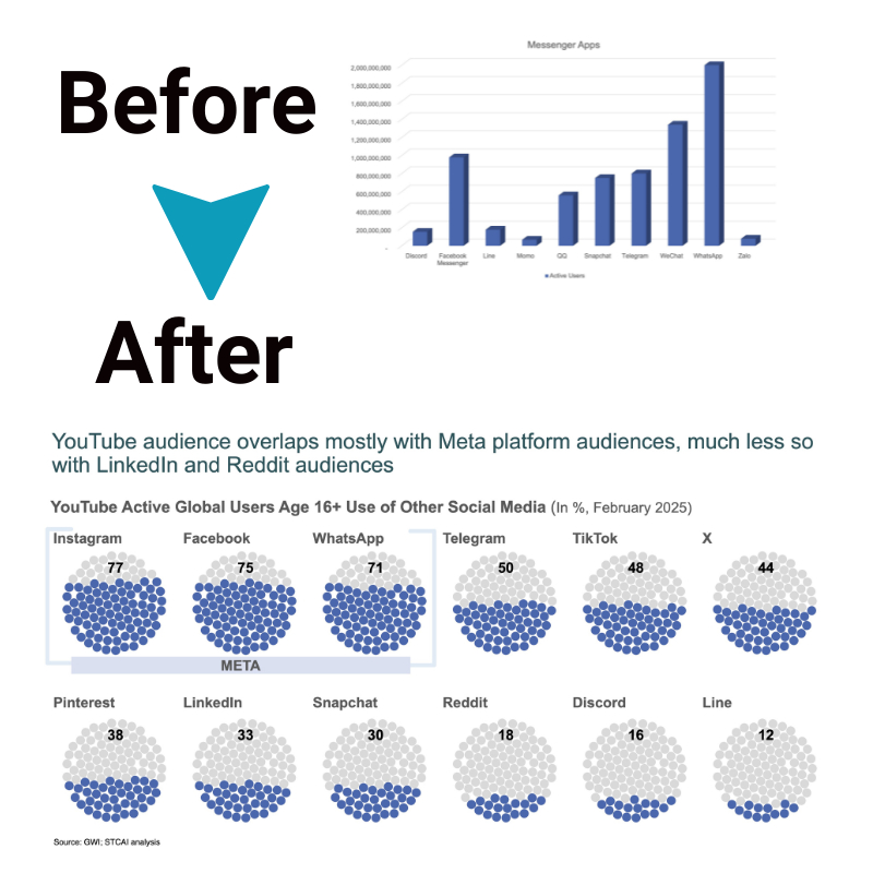
This is where intuitive dashboards come in – consolidating key performance indicators into a single, visually engaging interface. Well-designed dashboards enhance comprehension and allow leaders to easily spot vital trends, issues, and progress toward goals. Let’s explore how.
The vital role of dashboards for today’s leaders
Dashboards have evolved into essential analytical tools for time-crunched senior leaders across functions. Marketing relies on dashboards to monitor campaigns. Finance tracks KPIs like cash flow. Sales monitors deal pipelines. With data fragmented across Excel, databases, apps and more, dashboards integrate the most timely, useful numbers in one place.
Rather than trudging through mountains of reports, executives use personalized dashboards to focus precisely on the trends, metrics, and drill-downs that matter most in steering the organization toward objectives. The graphical presentation leverages visual perception to accelerate understanding. When designed well, dashboards become ubiquitous decision hubs – managers checking for quick insights on the go from their phones or in morning briefings.
Additionally, today’s business dashboards allow drilling down from the big picture into finer-grained views to uncover the root causes behind trends. A sales director could click from overall sales by region down to individual customer accounts to reveal where problems arise. This enables data-informed targeted intervention that is aligned tightly with priorities.
Key components of effective business dashboards
1. Thoughtful information design
Carefully choose easy-to-interpret charts suited to the data types- time series, geographic, comparison, etc. Less visual clutter sharpens focus. Highlight the most critical KPIs prominently using positioning color cues.
2. Logical information flow
Organize metrics in a natural, logical sequence that aligns with decision workflows. Group key numbers into categories like sales pipeline or digital marketing analytics. Use headings, spacing, and layout for clear information flow.
3. Interactivity
Enable ‘drill down’ filtering on charts to explore details on demand. Empower users to customize views for their priorities. Responsiveness across mobile devices aids access and real-time monitoring.
4. Freshness of data
Integrate real-time data feeds from databases and applications via APIs to enable decision-making based on the latest numbers rather than yesterday’s stale snapshots. Automated refresh drives truly live business dashboards.
Getting these facets right crafts an engaging dashboard perfectly aligned to business intelligence needs – easily converting data into insights.
Benefits of using business dashboards

a. See important patterns quickly
CEO dashboards visually display volumes of complex data in easy-to-digest charts, graphs, and other graphics. This lets leaders and managers grasp large amounts of information “at-a-glance”.
Key patterns like emerging trends, sudden spikes or dips, and changes over time pop out of dashboard presentations. The human brain processes visual data 60,000 times faster than text and instantly recognizes patterns.
Dashboard graphics highlight anomalies, opportunities, issues, and trajectories in numbers that would take much longer to identify, flipping through tabular reports and spreadsheets. Executives avoid data blindness from overload. Visual cues spark inquiry for deeper investigation. It’s a huge timesaver.
b. Get the big picture
Traditionally, departments, locations, and product lines use their systems to collect siloed data metrics. Marketing tracks web traffic; sales monitor revenue; HR follows headcount and retention figures; and so on across the business.
Business dashboards conveniently unify the most pertinent real-time streaming data feeds from across these fragmented tech systems into unified visual displays for consolidated analysis.
Leaders gain more rounded insights into organizational performance, seeing interconnections and broader “big picture” context impossible gleaning isolated spreadsheets. This joins up perspectives to aid decision making beyond just departmental views.
c. Easy access for all roles
In the past, creating dynamic reports took specialized expertise limiting access to data insights. Contemporary self-service dashboard software platforms enable virtually anyone to build interactive displays of business metrics tailored to their particular information needs.
Simple drag and drop and point and click features require minimal training for any staff or manager. Intuitive filtering switches displays to hone in on data cuts like region, office, team, manager, product line or KPIs on the fly.
Drill-down functionality allows deeper exploration into specifics at a click. Widespread accessibility makes data democracy a reality, driving fact-based decisions and accountability across the organization.
d. Monitor in near real-time
Legacy reporting depended on time-delayed static snapshots of dated operational data circulated intermittently from IT departments or BI analysts. Limited windows showing what already happened impairs agility in dealing with accelerating business conditions.
Modern business dashboards constantly ingest live data streams from transactional systems, sensors, apps and external feeds to illuminate the latest numbers. Monitoring actionable insights flowing continuously, rather than yesterday’s fixed snapshots, alerts leaders about responses needed to pressing opportunities or emergent problems much faster.
Real-time visibility aids organisations in dynamically aligning strategies and operations with changing realities revealed in frequently updated business intelligence dashboards for a competitive edge.
Conclusion
Dashboards have become the command centers for data-driven executive decision-making. Curating the most timely, relevant metrics and KPIs into visually intuitive, interactive interfaces and dashboards enables leaders to cut through complexity and see the signals within the noise. Rather than data paralysis, well-designed dashboards foster data democracy – putting actionable insights at every business professional’s fingertips.
As data volumes swell, organizations that leverage dashboards for clarity and focus will have a competitive edge. Yet dashboards should not override human judgment – the two must complement one another. Ultimately, dashboards make data’s value tangible so leaders can translate insights into wise strategy and vision.


