Create Stunning Time Series Charts for Data Storytelling with These Tips
In data analysis, using narratives is a good way to share complicated information in a clear way. Time series charts are very important for these stories because they give a picture of how things change as time passes. In this article, we are going to look at advice and methods for making impressive time series charts with Excel. We will concentrate on design rules that improve the skill of telling stories through data.
Understanding time series charts
A time series chart, or a time series graph, showcases data points at successive intervals. They play a key role in showing patterns, trends, and differences within data collections. No matter, if it’s stock market prices, climate changes, or sales numbers, time series graphs, present a visual representation of how figures change through time.
Excel as a time series chart tool
Microsoft Excel is a widely accessible and user-friendly tool for creating time series charts. Its versatile charting features allow users to visualize and analyze time-dependent data effortlessly. Let’s delve into some practical tips to elevate your time series charts in Excel for impactful data storytelling.
1. Data preparation
Before creating your time series chart, ensure your data is well-organized. Arrange it in columns with clear headers, and include a timestamp or date column. This facilitates smooth integration with Excel chart tools.
2. Choosing the right chart type
Excel provides various chart types, but for time series data, line charts are most effective. They emphasize the continuity of data points over time, making trends and patterns easily discernible. Additional viable options like stacked area or column charts may suit multivariate time comparisons. But single-line visualizations optimize clear trend recognition, unencumbered by visual clutter.
3. Consistent time intervals
Maintain uniform time intervals between data points to ensure accuracy and coherence. Irregular intervals can distort the visual representation and mislead the audience. Date fields driving time series axis progression should feature reliably consistent periodicity. Fluctuating durations between data capture risks chart distortions incorrectly, signaling growth surges or directional shifts where none exist.
Design principles for time series charts
1. Color palette selection
Opt for a coherent color palette to enhance readability. Consistent use of colors for similar data points across charts aids in better comprehension. Strategic color scheme decisions optimize clarity within time series charts and maintain visual coherence across broader presentations. Intuitively linking certain hue saturation to fixed indicators—whether regional sales figures or product line metrics—builds audience recognition. As additional trends and longitudinal patterns layer in, viewers rapidly correlate colors to meaning, processing insights faster.
2. Simplify labels and titles
Craft concise and informative titles for your time series charts. Use clear labels for axes, and consider adding a subtitle to provide context. Avoid clutter, as simplicity fosters understanding. Effective labeling within time series visualizations requires balancing adequate explanatory details against unnecessary complexity. Chart titles must impart core themes at a glance while succinct subtitles clarify context, framing interpreted meaning for audiences. Let cleaned and focused time series charts speak volumes.
3. Annotations for context
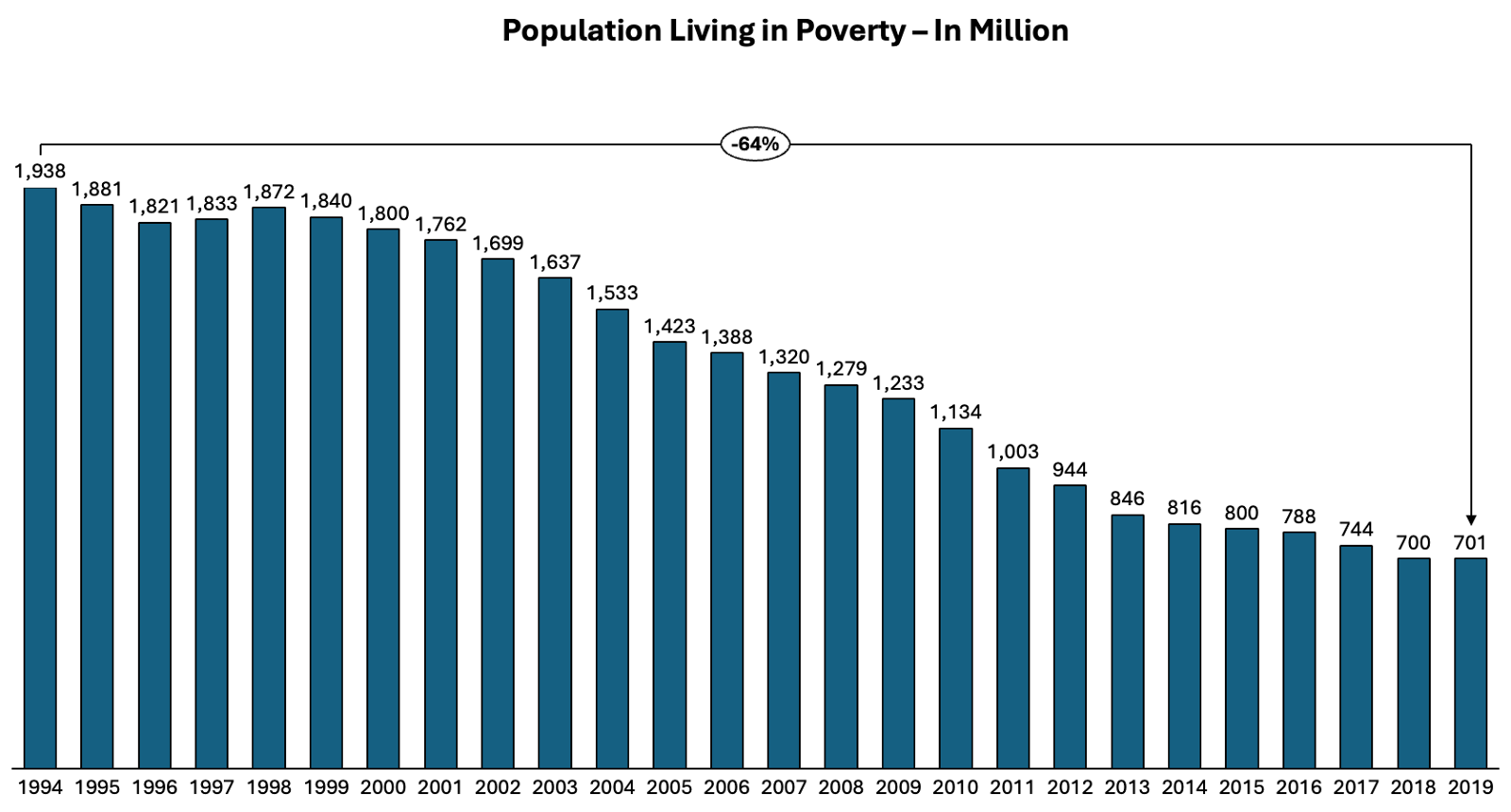
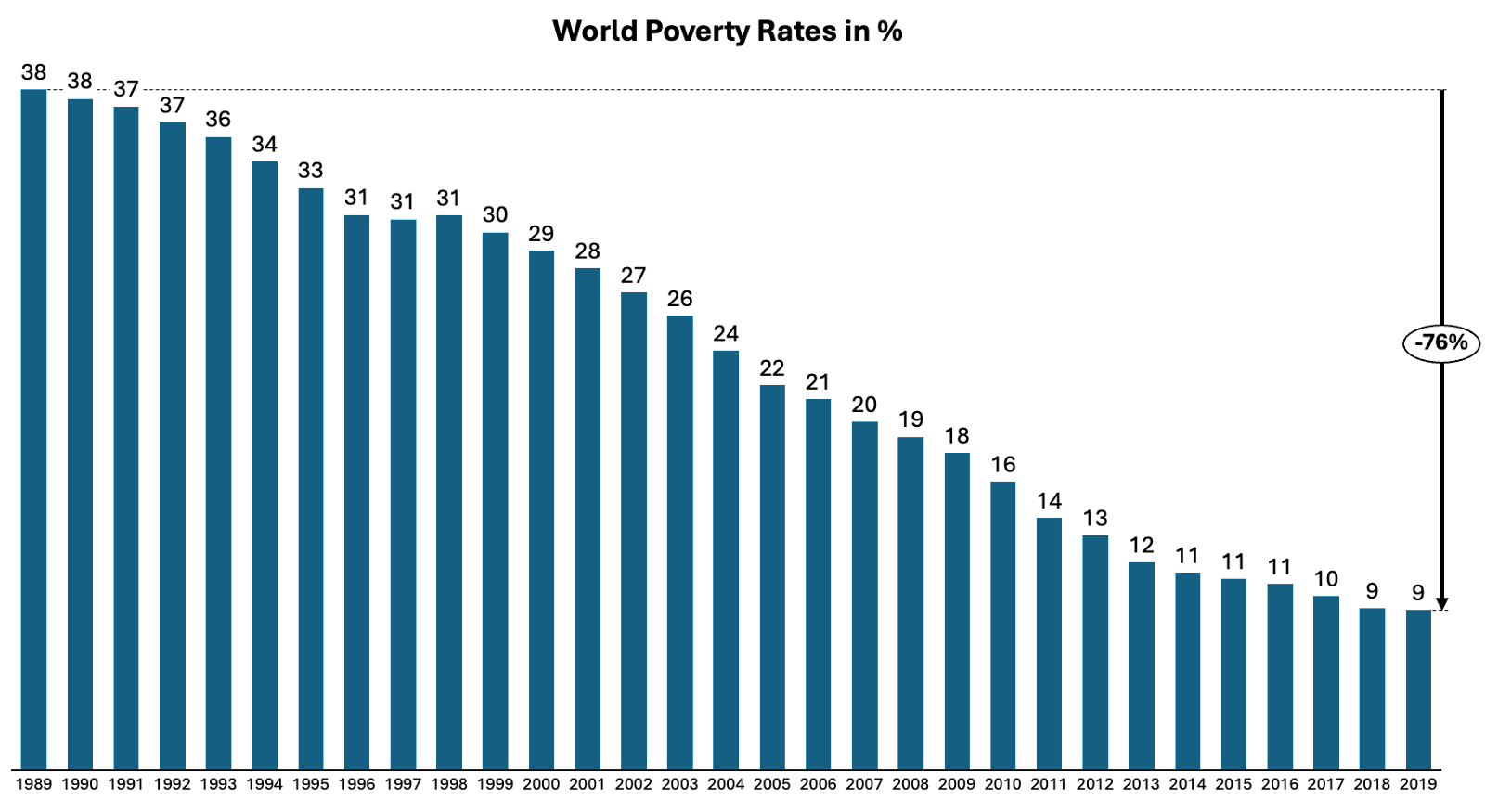
Use annotations strategically to highlight significant events or trends. This helps your audience connect with the data on a deeper level, adding context to the story. Annotations applied judiciously to time series charts provide explanatory context regarding visible data patterns, inflection points, or discontinuities. Calling out the timing and implications of past process improvements, product launches, economic shifts, or other external events allows audiences to correlate operational outcomes with pivotal causes.
4. Gridlines and axes scaling

Adjust gridlines and axes scaling to present data in an easily understandable manner. Scaling should be intuitive, avoiding unnecessary complexity that may confuse the audience. Strategic configuration of gridline spacing and axis calibrations for time series charts frames the data stories being told, guiding viewer interpretation. Default linear scales may inadequately portray the nuances within exponential, logarithmic or seasonal trends. Tailor axis settings like date intervals, value prefixes, and maximum/minimum boundaries to naturally spotlight patterns.
5. Incorporate trendlines

Excel allows you to include trend lines in your time series charts, aiding in identifying patterns and making predictions. These trendlines can add a layer of depth to your data storytelling. Overlaying thoughtfully constructed trend lines onto time series visualizations provides explanatory narratives around historical behaviors, causational correlations, and hypothetical trajectories. Different trend line constructs match respective serial progressions, from linear to polynomial fits.
Advanced design techniques
1. Dynamic charts with data filters
Create dynamic time series charts by incorporating data filters. This enables users to interactively explore specific time ranges or data subsets, enhancing the versatility of your visualizations. Incorporating adjustable data filters within dynamic time series charts empowers self-driven audience exploration, surfacing granular insights hidden inside aggregated trends. Custom date selectors allow isolating precise cycles to the spotlight, for instance, how campaign effectiveness evolves across fiscal quarters.
2. Multiple series for comparison
When comparing multiple datasets, consider using multiple series on the same chart. This simplifies the visual comparison of trends and patterns over time. Overlaying multiple time series onto shared visualizations enables effortless contrast of longitudinal behaviors between discrete metrics. Viewers intuitively process comparative growth trajectories, seasonal shifts, and volatility by analyzing aligned time charts. Stacked flows plainly spotlight outperformers and underperformers over temporal ranges. Overlayed flows reveal whether metrics follow correlated or divergent progressions.
3. Customized data labels
Excel allows for the customization of data labels. Use this feature to highlight key data points, making it easier for the audience to focus on critical information within the time series chart. Strategic annotation of customized data labels upon selected plot points directs audience focus towards critical events within time series charts, reducing cognitive load. Judiciously call out pivotal record highs concerning lows, moments of volatility, or fluctuation milestones using succinct descriptors.
Use the formatting options
To enhance your time series charts, consider leveraging Excel’s formatting options. Utilize axis labels and data point markers judiciously to aid interpretation. Experiment with line styles and thickness to emphasize specific series within your chart. Additionally, explores the power of conditional formatting for dynamic visual cues based on data thresholds.
Furthermore, ensure your time series charts are mobile-friendly by optimizing sizing and aspect ratios. This guarantees accessibility across various devices, promoting a seamless experience for a diverse audience.
Conclusion
In the field of data storytelling, time series charts are very important for sharing complicated details in an attractive way. Excel has strong features for making charts and helps people to make beautiful visuals that grab attention and give information. By following good practices for preparing data and using careful design ideas, you can improve your time series charts to tell powerful stories that make a strong impact on the people who see them.
So, use the power of time series charts and allow your data to narrate a tale that makes a memorable mark. Storytelling with Charts can offer you the best advice to create captivating time series charts for data storytelling.


