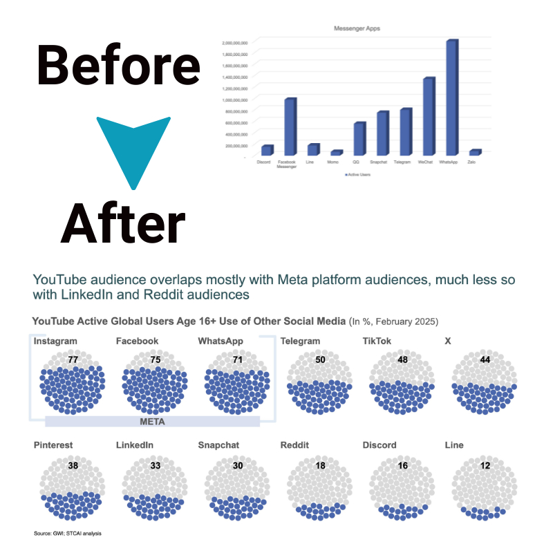
Data Comparison Chart: How To Visually Present Similarities and Differences
Effectively highlighting similarities and differences is crucial for insightful data analysis. Data comparison charts provide simplified and authoritative visual formats that condense complex information into easily graspable presentations. Thoughtfully designed data visualizations instantly communicate essential insights, patterns, and trends that may be difficult to convey through raw statistics alone. This article explores best practices for choosing the ideal data comparison chart to showcase your key research takeaways.
So, let’s get started.
Importance of making a data comparison chart
Comparison charts are effective data visualization tools that allow you to clearly present similarities and differences between data sets. Using charts and graphical comparison makes it easier for readers to grasp the essential information and findings. Visual formats simplify complex data and highlight trends, patterns, and relationships. Data Comparison chart are especially useful for representing large data sets with multiple variables.
They condense the data into a format easier for audiences to digest and interpret. Moreover, creating a comparison chart in Excel allows users to visually contrast and analyze different data sets within a familiar spreadsheet environment.
Best data comparison charts for effective data visualization
There are various chart types to choose from when creating comparison visualizations. Selecting the right one depends on the nature of your data and what you want to highlight. Here are some top options:
1. Pie chart
Pie charts display relative percentages that make up a whole. They illustrate numerical proportions and let you contrast the size of different categories. Pie charts work well for uncomplicated data with just a few categories.
2. Bar chart
Bar charts use rectangular bars to show comparisons between categories of data. The length of each bar represents the quantitative value, allowing you to contrast magnitudes across the categories. Bar charts are simple and visually appealing for many kinds of data comparisons.
3. Column chart
Column charts are highly similar to bar charts, with vertical rectangles rather than horizontal ones. They work for the same kinds of quantitative comparisons. The choice comes down to whether you want to present your data vertically or horizontally.
4. Line chart
A line chart displays quantitative values over a continuous interval or period, connected by straight line segments. Line charts visualize overall patterns and trends very effectively. Use them to track changes over time and spot increases or decreases.
5. Dot chart
Dot charts, or dot plots, position dots along an axis to denote values for different variables. Space is left between dots to differentiate between categories visually. Dot charts give you an at-a-glance sense of clustering and outliers.
How to choose the right comparison diagram

Picking the ideal comparison visualization involves understanding your data type and objectives. It also depends on data size and complexity.
I. Understanding data type
First, determine whether your data is categorical or quantitative. Categorical data places each value into a category, like product type or region. Quantitative data expresses a measurable numerical amount. Ensure the chart matches this data type. Plots like dot charts and line graphs suit quantitative, numeric data. Divided bar charts work for categorical.
You’ll also need to decide if you want to look at changes over time, in which case a line plot with a time axis makes the most sense. Or if you wish to contrast magnitudes, for which bars and columns excel.
II. Objectives of comparison
Be clear on what you want viewers to notice from the comparison. Find a chart type optimized for those aims. For example, pie charts best showcase part-to-whole relationships. Column arrangements readily display rankings from high to low.
III. Data size and complexity
The number of categories and data points impacts the preferred visual. More complex, multi-variable data sets often require chart types like grouped or stacked bars to avoid overcrowding. While the simplest is best for 5 or less precise variables.
IV. Prioritizing clarity
Above all, the chart should instantaneously communicate key insights without confusion. So, choose the style that portrays the message clearly for quick comprehension. Only move to multifaceted chart types if the simpler ones fail to achieve an informative, uncluttered comparison for the variables at hand.
Benefits of using a data comparison chart
Some key advantages that an effective data comparison chart can provide are:
- Distill complex data sets down to visually graspable formats
- Allow faster interpretation of similarities, differences, patterns, and trends
- Highlight essential insights rather than presenting just raw data
- Enhance rememberability and knowledge retention for key learning
- Provide authoritative credibility when demonstrating research findings
- Captivate audiences when included in presentations, reports, and more
In essence, deliberately designed comparison charts increase understanding, sharpen focus on key takeaways, and aid better decision-making for comparative data analysis.
Conclusion
Choosing the right data visualization solution clarifies rather than obscures. Well-executed comparison charts showcase meaningful relationships between variables across categories, periods, or options by simplifying the most insightful quantitative or qualitative data points. Consider presentation objectives, data specifics, audience, and key takeaways when selecting between comparison plot alternatives to build highly informative visual data stories.


