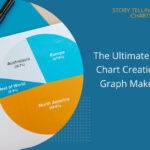
Combining Data Analytics and Engaging Visuals for Impactful Insights
In today’s data-driven world, organizations are inundated with vast amounts of information from various sources. However, more than raw data is needed for driving meaningful decisions and strategies. To truly unlock the potential of their data, companies must leverage the combination of advanced data analysis and visualization techniques. By harnessing the power of data analytics and visualization, businesses can gain deeper insights, communicate findings more effectively, and ultimately make better-informed decisions.
The importance of data analytics and visualization
Data analytics and visualization together enable deeper insights for better decision-making. Analytics rigorously processes data to uncover meaningful patterns and trends, while visualizations communicate these discoveries effectively to diverse audiences through intuitive graphical interfaces. Their integrated use fosters a collective understanding across teams to drive informed planning and evidence-based action towards positive outcomes. Moreover, organizations using data effectively could increase their operating margins by up to 60%.
Key strategies for effective data analytics and visualization
1. Crafting impactful data narratives
An impactful data narrative goes beyond just displaying facts and figures. It combines analytical rigor with the power of visual engagement to drive understanding and provoke action. Here are some key elements to weave together analytics and visuals into an insightful story:
Clarifying goals and audience
Having a clear purpose and intended consumer is vital. Communicate insights tailored to your audience’s knowledge level and interests. Use appropriate visual encodings based on what needs to be highlighted or compared. For example, highlight variations over time through line charts instead of bar charts.
Structuring for flow and sequences
Structure your narrative to simplify the data’s complexity before highlighting key takeaways. Use visual sequencing techniques like small multiples to demonstrate patterns. Guide readers through different levels of detail with drill-down capabilities to keep them manageable.
Blending analysis and visuals
Fluidly integrate compelling visuals with contextual analysis instead of merely decorating text with charts. Use call-outs, annotations, and transitions across visuals to connect the dots for your audience.
Choosing optimal graphical formats
Choosing the right type of chart or graphic to encode data visually is critical. Consider aspects like composition, color patterns, layouts, and functionality to depict findings effectively for the intended consumer.
Directing towards outcomes
Shape storytelling using analytics and visuals to direct audiences towards desired outcomes, whether it is convincing leadership to fund initiatives or changing customer behaviors. This could involve diagnosing problems, benchmarking progress, or demonstrating opportunities through data.
2. Pair rigorous analysis with striking visuals
Supporting compelling data stories requires rigorously analyzing data and choosing the best visual representations. Here are some tips:
Maintain Data Integrity: Ensure quality, consistency, and accuracy in data collection and analysis methods. Data defects undermine the credibility of visualizations built on top, no matter how beautiful they look.
Know Your Options: With so many options for visualizing data, it is important to be aware of the most effective chart types based on use cases and data properties:
- Time-series: Line charts, Stream graphs
- Ranking: Bar charts, Dot plots
- Parts of a whole: Pie charts, Treemaps
- Statistical distributions: Histograms, Box plots
- Correlations: Scatter plots, Bubble charts
- Spatial data: Maps, Heat maps
This allows consciously selecting graphical formats aligned to data insights being conveyed.
3. Guide with annotations
Annotations contextualize key data analytics and visualization discoveries through callouts, arrows, reference lines, etc. They can highlight outliers, guide comparison, or indicate trends. Annotations act like a narrator, ensuring users interpret the data accurately.
4. Maintain visual consistency
Using consistent fonts, sizes, colors, and styles across visualizations aids in the processing of information for readers. Format visuals to use similar layout principles. Visual uniformity signals cohesion, improving intuitiveness.
5. Design for accessibility
Enable broad access to data insights through good visual hygiene. Test different screen sizes, use color blind-friendly palettes, and assign alt text to visuals. Formatting data analytics and visualization like HTML content with tags makes information readable for the visually impaired.
Blending modes: connecting analysis and visuals

While static infographics effectively communicate end insights, interactive dashboards bring together complex analytics and engaging visuals. Here are some effective strategies for blending:
a. Direct filtering and selection
Connect visualized metrics with analytical models to enable intuitive filtering and cross-highlighting capabilities. As users select data points or segments in a chart, the dashboard can automatically re-run computations and update all linked visuals. This allows fluid data exploration through visual interfaces.
b. Guided analytics
Incorporate step-by-step question interfaces, structured analysis templates, and AI-powered analytics assistants. These guide users through analytical workflows using intuitive inputs like natural language and selections on related data analytics and visualization . Users can derive powerful insights without coding expertise.
c. Annotated forecasting
Integrate statistical and machine learning models to overlay projected trends, forecasts, and predictive insights directly on relevant visualizations. Expert-defined annotations contextualize and explain model outputs to aid decision-making.
d. Insight-driven recommendations
Leverage decision rules, optimization models, and machine intelligence underneath visual interfaces to drive automated analysis and intelligent recommendations tailored to visualized insights. This enables taking immediate data-backed actions.
Driving impact and outcomes
Crafting an impactful blend of data analytics and visualization leads to wide-ranging organizational outcomes like:
- Informed Strategizing: Executive leaders can accurately assess market landscapes, diagnose operational issues, benchmark progress, and identify emerging opportunities to define winning strategies.
- Improved Products and Services: User behavior analytics and preference insights inform the development and optimization of customer offerings for maximum delight and retention.
- Efficient Processes: Operational analytics identifies bottlenecks and areas for improvement to streamline workflows, reduce costs, and boost productivity.
- Enhanced Resource Planning: Estimating future demand by leveraging historical patterns allows for optimal inventory, staff, and financial planning.
- Risk Mitigation: Early data analytics and visualization signals enable proactive intervention against threats in real-time before losses accumulate.
- Transparent Reporting: Telling data stories with analytics and visuals fosters transparency both within organizations and externally with shareholders, customers, and public bodies.
The bottom line
The permutations are vast when organizations analyze and visualize data effectively to tap into its wealth of insights for positive transformation. However, deriving impact requires going beyond basic business intelligence and static charts. It is vital to continuously foster a data-driven culture with the right tools, governance, and talent to blend analytics, visuals, and actionable insights. This creates an intelligent enterprise where data permeates every operation, interaction, and strategy for staying competitive.