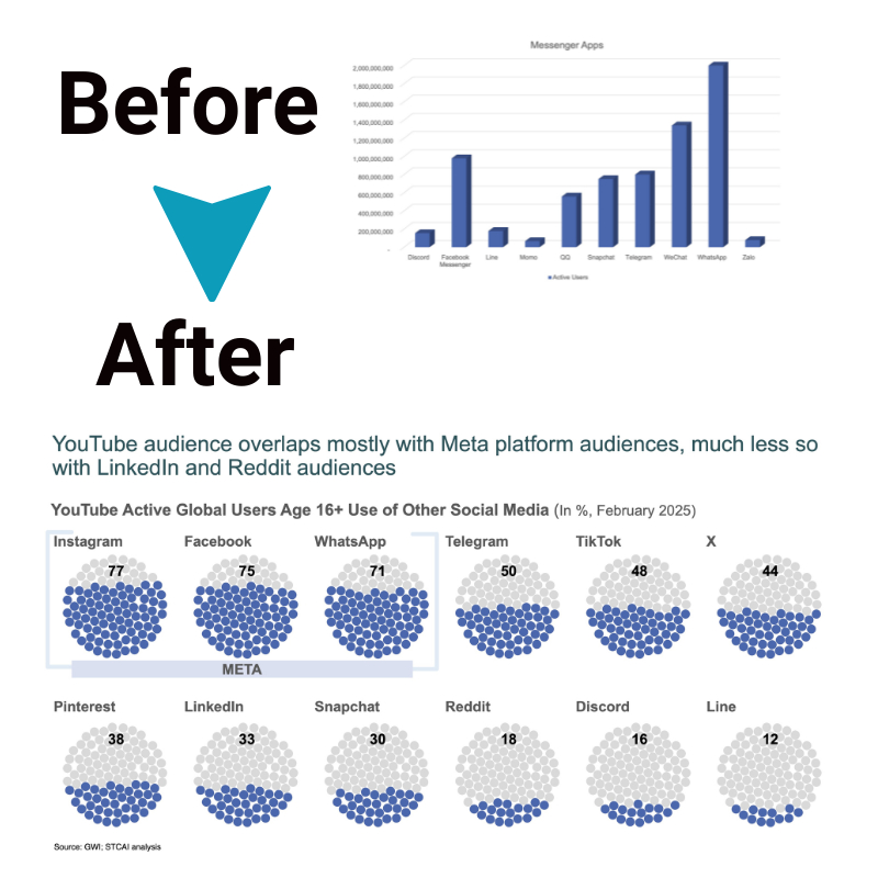
Cluttered to Concise: Simplifying Complex Data Visualizations
Data charts don’t have to be confusing eyesores that spin your head. Even the most complex datasets can be turned into clear, understandable visuals if you know some basic simplification strategies. In this article, we’ll examine why some charts get so messy, break down the elements that add visual clutter, and explore proven techniques to declutter your data visualization.
Why do some data charts get so complicated?
There are three main reasons why data charts sometimes turn into confusing messes:
1. Packing in too much raw data
We often try to stuff too many detailed data points onto a single chart. We think “more data is better,” – but a chart with billions of tiny data bits all squeezed together hides the big picture trends instead of showing them clearly.
2. Comparing too many things at once
Some charts try to compare too many different metrics simultaneously – profits over 5 years, market share, sales targets, etc. Our eyes and brains can only track a small number of changing items at once before things get fuzzy. A complex chart overwhelms our visual processing abilities.
3. Using overly fancy chart layouts
Sometimes, people choose intricate, multidimensional charts, 3D images, and unusual shapes because they seem “cool.” But these charts add a layer of work for the viewer to decode the meaning. Fancy charts should enhance, not detract from, understanding of the data store.
The key is to simplify what data goes on the chart and choose a clear visual display to let the information shine clearly. We can create clean and intuitive data visualizations by avoiding these three common complexity pitfalls for better data insights.
Key causes of clutter in data charts

A few of the top clutter culprits are:
a. Excessive colors
Using every color in the crayon box might seem like a fun design, but it adds unnecessary noise and clutter. Our eyes get overwhelmed trying to follow too many colored elements. Instead, colors should have intentional meaning attached. For example, use red only to highlight high-priority data points, green for positive metrics, and blue for geographic regions. Limit the palette and implement color deliberately to draw attention to message-critical parts of the chart. Don’t color it just for decoration if it’s not adding meaning.
b. Too much detail
Granular data is good, but focusing on detail variation too much can make the bigger picture trend clearer. Trying to plot every minute fluctuation in the data points across time can generate a fuzzy hairball. Sometimes, clustering data into summary batches or showing top-level averages rather than endlessly drilling down conveys the pattern better. Other times, allowing user-controlled interactive filtering to dive into detail layers works nicely. Find the right balance of top-line patterns and detailed inspection on demand. Don’t overly clutter the main chart view with finely-grained data for its own sake.
c. Complex chart types
Some complex chart varieties like radial plots, dendrogram trees, 3D area charts seem elaborate and high-tech. We might be tempted to choose them to impress an audience. However, simpler is often better when it comes to visualizing data accurately. Fancy multidimensional chart types tend to privilege form over function, prioritizing aesthetics over comprehension. A basic bar or line chart in 2D may communicate the insight effectively and intuitively. Reserve visually complex charts only for data well-suited to their structure and when simpler chart forms fail to do the job.
4 Real-world simplification strategies
Here’s some real-world techniques:
- Cut down the dataset to focus only on the most relevant metrics. Combine data points into summary categories instead of endlessly drilling down to granular detail.
- Use color strategically and minimally to highlight only message-critical chart elements rather than coloring everything.
- Pick the clearest and simplest chart type suited for the data structure and comparison goal. Use a line chart instead of each fractal tree for time series data. For geography-related data, use a map. Leverage the intuitive capabilities of simple tried & true chart types.
- Make the chart explorable for the user by adding interactive elements like filtering, zooming, pop-up tooltips, etc, to provide details on demand. This engages the audience while containing inherent chart complexity.
We can make even the most complicated data charts easier to understand by following these simple steps.
The bottom line
Messy data charts can confuse more than clarify. However, we can create understandable visuals by following some basic rules. Limit the data points to the most important. Compare only one or two key metrics per chart. Use simple chart types suited for the data rather than elaborate graphics. Clear focus, restrained design, and intuitive displays put comprehension first. Simplification allows the data to tell its story visually so everyone can follow.


