Mastering PowerPoint Infographics: Unleash Your Visual Storytelling Potential
PowerPoint presentations can be one of two things: extremely engaging and interesting, or downright boring. Of course, you don’t want your presentations to fall into the latter category. So, what can you do? Infographics are your friend. In fact, studies have shown that written posts that have images and different types of graphics have greater engagement, up to 650%. That’s a huge amount. Add to that the fact that people are 30 times more likely to read an infographic than a written article. It makes you think, doesn’t it?
Of course, using infographics in the right way is also important. At Storytelling With Charts, we understand exactly how to engage your audience and keep them hooked, be it through adding graphs to your PowerPoint presentations or other images. So, to help you out, this guide will cover everything you need to know about PowerPoint infographics, giving you the power to level up your presentations beyond measure.

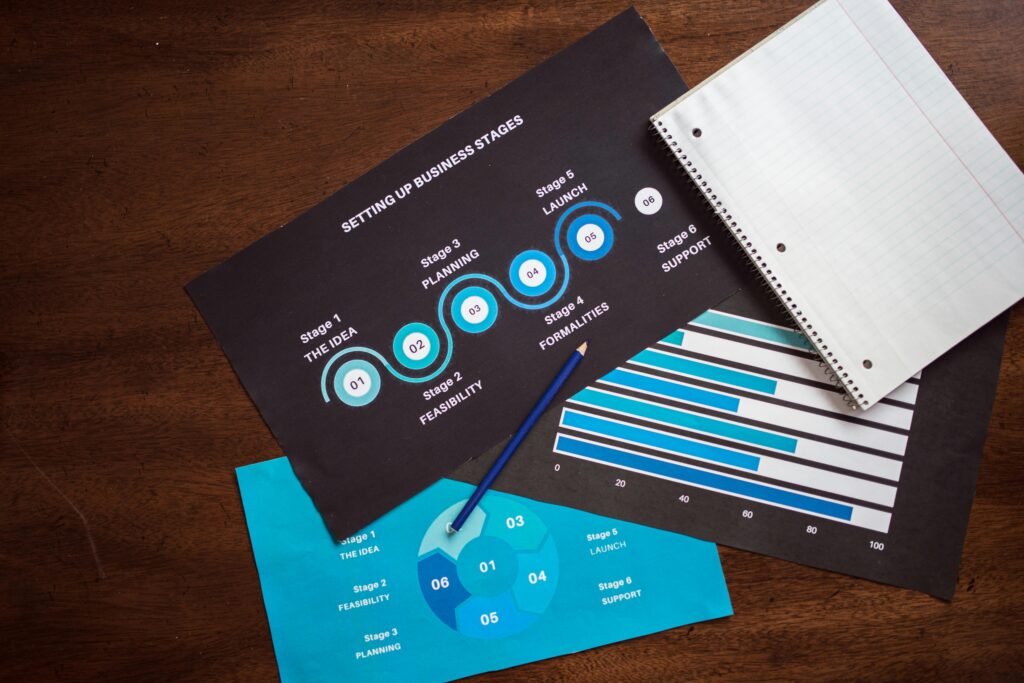
Source: pexels.com
TL;DR
- There are pros and cons to using infographics in your PowerPoint presentations. Adding too much is one of the biggest issues.
- Color, layout, and design influence how your audience engages with your infographics.
- Presenting data in a narrative form adds greater impact.
- It’s vital to be honest and transparent when using infographics in PowerPoint presentations.
- Storytelling With Charts can help you create engaging presentations to wow your audience.
Infographic Templates: Friend or Foe?
In general, an infographic template gives you a clear starting point on which to continue. However, it’s wrong to think that a template covers all bases; it’s vital to use it only as a foundation and then build on it with your own points and data. By simply relying upon a template in this way, you run the risk of becoming generic, as many other people will use the same base. For that reason, being aware of overlying on a template is key. That way, you can ensure that your presentation doesn’t move into uninspiring territory. In fact, our article on creating an infographic that stands out gives you some great tips to get started.
Template Fatigue
Another common sticking point is template fatigue. This happens when you spot a familiar template and your mind automatically zones out. Of course, the more people that spot these common points, the more disengaged they become, leading to a poor outcome for your presentation. Learning how to avoid this means looking for innovative features to add to your presentation, such as interactive elements, encouraging audience participation, and using a range of different charts to keep their attention where it needs to be. Put simply, it comes down to customization to add something new and interesting to your presentation. For instance, our Storytelling With Charts Plug-in is designed to help you customize by adding graphs to your PowerPoint presentations, along with a number of other charts.
Template as a Starting Point
Creating an infographic, either from scratch or by using a template comes down to understanding the steps that create the full process. In terms of a template, this is about the building blocks. The start is the header, which needs to grab attention. You can do that through brand fonts and colors. Data visualization is the main point, and this is where you communicate your statistics and information to your audience. Again, this needs to be attention-grabbing, and you can do that by presenting the most pertinent statistics, customizing chart types, and again, using colors to make information stand-out. Icons are another point, as these help to illustrate concepts, with a final call to action at the end. This is designed to drive engagement and you must tailor it to your specific audience needs.
We’ve mentioned colors a few times and it’s important not to go overboard. Choose colors that fit in with your brand and use them in a consistent way throughout your infographic.

Source: pexels.com
Hybrid Approach
There are many infographic templates you can use, but why stick to just one? A hybrid approach allows you to mix and match and find the specific points that suit your needs. Remember, there are no solid rules here, and this approach allows you to choose specific points from different infographic templates and create a fresh, personalized version.
The Psychology of Infographic Design
To help you create an infographic, it’s useful to first understand how your audience processes visual information. From there, you can design your infographic in the most impactful way.
While you’re here, read our article on engaging chart and graph design for some extra tips.
Visual Hierarchy and Attention Flow
Some infographics hit the high notes, while others don’t have any impact whatsoever. Why do you think that is? Basically, it comes down to two terms – visual hierarchy and attention flow. Let’s explore these in more detail.
F-Pattern & Z-Reading
In the Western world, most readers follow a F or Z pattern when reading. So, when you’re creating infographics, aligning with these natural eye movements can help significantly in terms of engagement.
To explain this further, F and Z pattern reading is rooted in how the brain processes visual information. It then prioritizes certain areas of a page based on how familiar it is. Most unconsciously follow the F-pattern, which means scanning from the top to the left side of the page. The next step is the Z-pattern, which moves from diagonal left to right and then right to left scan. This helps the reader engage in more structured content. So, when you create infographic content, place text heavy sections at the top and left, with images or headings in a diagonal or vertical pattern.
Cognitive Load Management
Complicated infographics can be overwhelming to a reader, creating a greater cognitive load in order to read and understand it. In most cases, they’ll simply give up and not read until the end. In this case, when designing an infographic, balance the density of information carefully. Don’t have sections that are packed with text; add graphics in-between to break it up. Also, be mindful of the language you use; make sure it’s appropriate for your audience and doesn’t contain unnecessary jargon or complicated wording.
Color Psychology in Infographics
If you thought that colors just looked good on a page, there is some surprising news coming your way. Colors can affect how we think, feel, and communicate. This is called color psychology and it’s a powerful tool to incorporate into your infographic template.
However, it’s important to remember that colors can mean different things in specific cultures, so always be mindful of your audience. For instance, the color red in South African culture is often linked to grief or mourning, whereas it represents action and excitement in western cultures. By learning about specific differences across cultures, you can avoid any unintentional problems during your presentation.
Color for Data Clarity
Despite the cultural aspects to be aware of, there’s no doubt that color in data visualization can be a strong ally. When strategically placed, color can enhance your message and draw attention to the main points. In this case, it’s not about making your infographic attractive (although it helps), it’s about showing complex information in a way that is far more understandable to your audience.
Remember to use color palettes that are suitable for color blind individuals, along with advanced techniques such as using different colors for categories, and varying saturation effects for intensity.
Data-Driven Storytelling Techniques
Infographics don’t just give information and statistics, they can also be a powerful tool in storytelling. When you structure your infographic to tell a story, it should have a beginning, middle and end. By doing this, you engage your reader’s attention, and you don’t just tell them something, you take them on a journey through the entire data picture.
For instance, consider your data as your main characters. This will help your readers identify with the data, so don’t be afraid to let the numbers become their own characters. This process is called anthropomorphism, and it is defined by giving human traits to something that is non-human. The resulting emotional connection can take your infographic to another level entirely, while also boosting information retention.
So, how can you do this? Some useful techniques involve incorporating emotions, personalities or actions into a specific data point. For example, you could show an increasing sales figure as an exciting character who celebrates their success. However, if you want to show a decline in sales, this could be a tired person. These visual cues help your audience understand the story by impacting them on a deeper level, while also creating an overall more engaging infographic in general.
Interactive Storytelling Elements
Choosing a static infographic template is fine, but why not make it more interactive? As long as you design your infographic in an engaging way, it doesn’t necessarily need to be interactive, but choosing this avenue does add a little something extra to your overall presentation. Within this, you can add dynamic elements which allow your audience to explore your data in their own way, at their own pace. In general, interactivity takes a passive audience member and engages them in a deeper way.
Micro-interactions
When we talk about interactive elements, this doesn’t need to be a huge thing. Small animations can be very impactful and in many cases, they’re a better option because they don’t take the focus away from your infographics information and data. These small animations slowly reveal additional pieces of information or they can also place extra emphasis on key points. Your infographic literally comes to life and holds the attention of your audience. Not only that, but they’ll be much more interested in what you have to say, rather than just watching or reading and not absorbing the information.

Source: pexels.com
Choose Your Own Adventure Infographic
A really engaging type of infographic example is a choose your own adventure version. You might remember similar books from when you were younger, which allowed you to design your own story, choosing the ending that you wanted to see. This type of infographic is a similar choice. It allows you to add narratives to your data, creating an interactive experience that allows your audience to explore different scenarios. By giving your audience control over the general narrative, they’re far more likely to stick around and follow the overall story.
You can use decision tree algorithms here, which are useful in helping you to structure each branch and its connected path. Once you’ve created this type of infographic, it’s important to understand its performance, and you can do that by using analytics and tracking. This information will help you design an even more engaging infographic next time, helping you to spot common mistakes and problems and improve upon them.
Ethical Considerations in Infographic Design
Creating your own data visualization doesn’t just come down to choosing an infographic template, it’s about understanding the underlying ethics. When presenting information in this way, you have a strong responsibility to display accurate, non-biased data, while also balancing the concepts to help you bring your information to life in the most compelling way. Let’s explore some of the key points to bear in mind.
Data Integrity vs. Visual Appeal
The balance between accurate data and a visually appealing presentation is a tricky one. While it’s always tempting to exaggerate a little, as this will grab even more attention and create a really striking effect, it will only land you in hot water later down the line. It’s vital to maintain data integrity at all times. Not only is this important in terms of ethics generally, but it will help you build a strong bond of trust with your audience, and they will see you as a credible source they can return to in the future.
Avoiding Data Distortion
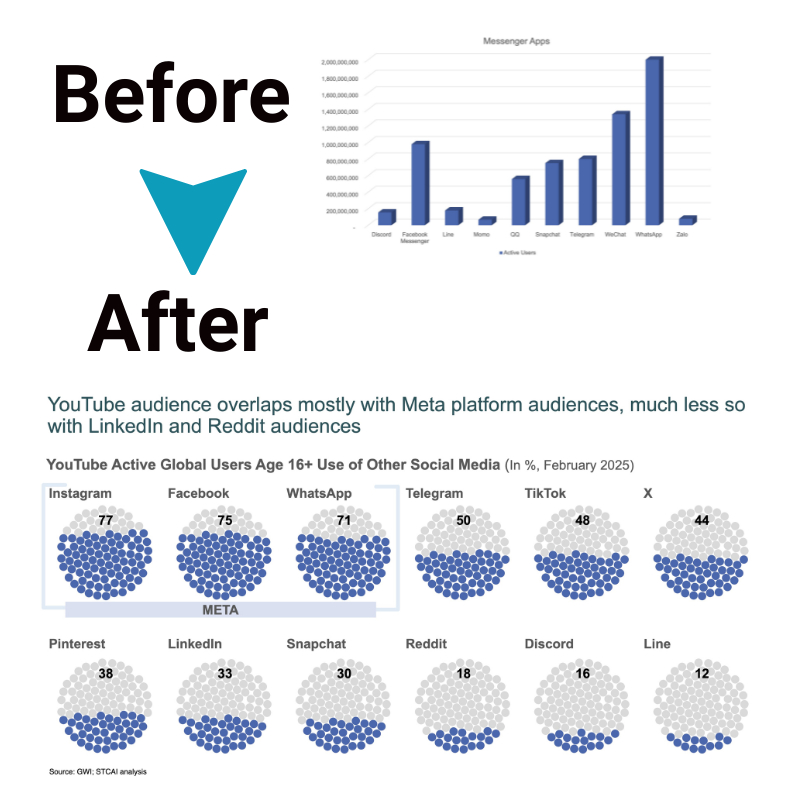
When you have complex information that you need to present to your audience in the form of an infographic, it’s important to break it down into easily understandable sections. However, when you do this, ensuring that you don’t accidentally affect its accuracy or misrepresent it in some way can be complicated. However, using color coding, simplified chart types, and size variations are simple options that can help you overcome this issue. Additionally, understanding what each chart is best for is a good option.
For instance, bar charts are excellent at helping you compare quantities, while pie charts can help you show composition, and line graphs illustrate trends over time. Scatter plots are excellent at correlating between variables, and heat maps can easily show data density.
Transparency in Data Sources
Earlier, we mentioned that it’s important for your audience to deem you a credible source, so how can you do that?
Source citations are a must in this case, including placing your references in clear and easily accessible places. The bottom is a good spot, or in a separate section for your sources together. Of course, this should also be designed in a way that is easily readable. However, there is nothing wrong with using footnotes or smaller text to help you add sources without adding extra bulk to the visuals on the page.
The truth is, when your audience can easily see and understand where the data has come from, they’re far more likely to trust you and therefore engage with the information you’re presenting to them.
Leveraging Storytelling With Charts for PowerPoint Infographics
Now that you know how to create an infographic in general, let’s talk about a tool that will make everything that much easier. Storytelling With Charts offers a free PowerPoint plug-in that can help you create attractive, attention-grabbing, and engaging presentations, charts, and infographics. The secret? It’s free. Literally – no purchasing fee, no set-up costs, and no hidden amounts. We simply want to help you master data visualization in the easiest and best way possible.
We’ve talked about the fact that choosing generic free infographic templates might be the easiest option, but that it contributes to template fatigue and doesn’t exactly capture the imagination of your audience. Instead, our plug-in helps you create unique and professional infographics that communicate your data in a clear way. If you’re worried about the entire process being difficult to navigate – don’t. The interface is designed with ease of use in mind, while customization is just as simple.
Telling a Story With Your Data
The main difference with our plug-in is that it allows you to tell a story with your data, as our name suggests. This option takes your audience on a journey from the start, the middle, to the end, giving them a clear view of the message you’re trying to communicate. As a result, your infographics are memorable, accessible, and credible.
So, if your graphics leave a lot to be desired and you’re struggling to find a narrative, download our plug-in today. You’ll quickly see how easy it is, and you’ll wonder how you ever did without it! Our website also features a range of articles and blogs to help you get the most out of the tool, including how to craft an impactful executive summary slide and five techniques for engaging data using data points.
Key Learnings Recap
Customizing an infographic design template is a powerful way to grab your audience’s attention and deliver the information you want to communicate in the clearest way possible. Choosing a free infographic template means you can use it as a foundation on which to build, adding images, charts, and even animations to engage your audience.
Additionally, visual hierarchy plays a crucial role in guiding the viewer’s attention. By strategically arranging the elements—such as headlines, subheadings, and data points—you can lead the audience’s eyes through the content in a logical, easy-to-follow sequence. The placement of key information and the use of size, font style, and color all contribute to the effectiveness of this approach. For instance, using different colors can change how your audience feels about certain pieces of data, with red inspiring action. However, always be mindful of cultural connections with colors, and ensure that you keep your designs accessible to all. Ultimately, telling a story through your data presentation takes simple numbers and turns them into a narrative that allows your audience to connect with the meaning. As long as you can convince your audience that you’re credible, through careful source citation, your infographic will be a success.
Of course, downloading Storytelling With Charts‘ free PowerPoint plug in gives you a world of customizable options, taking the hard work out of the overall design.


