Mastering Percentage Breakdown: From Basics to Advanced Techniques
Math is not everyone’s strong point, and that’s okay. It’s actually quite common to struggle with even basic calculations, and percentages are one of the most troublesome. Yet, percentages are vitally important calculations not only to understand but to be able to show them in the right way. From business settings to school, and even to your personal, percentages are everywhere.
So, if you’re struggling with calculating percentages, don’t worry. This guide will cover everything you need to know about percentage breakdowns, giving you the power to feel confident in your new-found abilities. In the end, you’ll also discover how Storytelling With Charts can help you weave your percentages into data visualization narratives that have the best impact on your audience.

Deconstructing Percentages: Beyond the Basics
One of the first steps to understanding how to calculate percentages is to know what they are and where they come from. So, let’s go back to basics and explore the relationship with fractions and why the number 100 is so important.
The Anatomy of a Percentage
Percentages and fractions go together like salt and pepper, which means you need to understand fractions a little to be able to understand percentages. But don’t worry; it’s not as hard as it sounds.
The most important thing to know is that when you say ‘percent,’ what you actually mean is ‘per hundred.’ A whole is 100, or 100%. From there, we can say that 50/100 is half of a hundred, so 50%. Of course, these are simple examples, but it’s the basic rule that you need to build on. For instance, if you want to find 75% of something, what you need is 3/4 of it. By seeing percentages and fractions in such close proximity, it can shift your mindset to understand the whole situation much better. In fact, if you want to delve deeper, you can read more about the close relationship between these two in our data storytelling for beginners guide.
The Power of 100
We’ve briefly mentioned that percent means ‘per hundred,’ and that 100 is the whole number, but we need to dig deeper because the number 100 is the backbone of all percentage calculations. If you’re struggling, going back to 100 will help you out. For instance, if you need to find 20% of 300, you can change your mindset to ask what number can be divided by 100 and then multiplied by 300 to give you the correct answer.
Percentage Algebra: Manipulating the Parts
Let’s talk about percentage equations, as these are key parts of the percentage breakdown story and can help you solve problems in real life. In fact, these equations also help you to set up relationships between quantities that are both known and unknown.
For instance, let’s say you know that 45 is 30% of a particular number. A simple equation could be 0.30x equals 45. Therefore, solving x gives you the original number you’re looking for. It sounds complicated but in practice it’s very simple and can be used in different areas, including science and finance.
Logarithmic Percentages
For sure, the name sounds challenging, but logarithmic percentages can be very helpful in everyday life once you get used to them. They’re also very useful in financial situations. These types of percentages are often used in situations when talking about decay or huge growth. For instance, logarithmic percentages could be used when talking about the growth of the populations or compound interest.
The positive thing here is that these types of percentages help you work with large numbers or long periods of time in an easier way. We can give an example of a financial field; you could use logarithmic percentages to calculate how long it will take for your investment to double in value.
While you’re here, check out our article on best practices for data-driven storytelling with charts and graphs, for more detailed insights into how percentages can be used in real life.
Compound Percentages
You’ll come across compound percentages quite often, especially in population studies and also in finance. In fact, these can be extremely beneficial in many different fields. When a change in percentage happens many times, a compound percentage appears. Basically, this creates a new starting point for the next percentage to build upon, effectively showing how a number (or data) compounds over a set amount of time.
If compound interest is something that interests you and you want to learn more, compound percentages are your starting point. In this case, interest isn’t just earned and that’s where the story ends; it earns on the previous amount, building over time like a snowball rolling down a hill. Of course, this leads to a large amount of growth over time; the longer it goes on for, the larger the gains.
Innovative Calculation Techniques
When learning how to calculate a percentage, it’s a good idea to look at innovative approaches. These aren’t always more complicated; in fact, they can often make your life easier. In many cases, technology can also be used to boost your ability to accurately calculate a percentage, either manually or via a percent-calculator.
Mental Math Shortcut
The 1% Method
Let’s start with the 1% Method, a technique that, when mastered, can help you master percentage calculations at break-neck speed. To use this method, you simply identify 1% of a number and then take that number to build the rest of your calculations. These can then be as complex as you want, but you start with the most basic option as a foundation to build.
Let’s look at an example:
First, you need to find 1% of your choice number. To do that, move the decimal point to the left by two places. So, if you wanted to find 1% of 350, it would be 3.5. From that, you can calculate other percentages of 350. So, if you want to find 10%, you just multiply by 10; if you want to find 65%, you multiply by 65.
The idea here is to approach a percentage breakdown in a simple way first, building up to more complicated calculations. If you’re interested in learning more mental math techniques, read our guide on how to communicate quantitative analysis effectively.
Complementary Percentages
Another way to simplify complex calculations is by using complementary percentages. Again, the name sounds complicated, but it’s much simpler than it seems. Complementary percentages add up to 100% at all times. So, we can say that 70% and 30% are complementary.
You might wonder when these types of percentages may be useful. If you need to calculate the remaining amount after a percentage has been taken away, a complementary percentage is the way to go.
Visual Percentage Technique
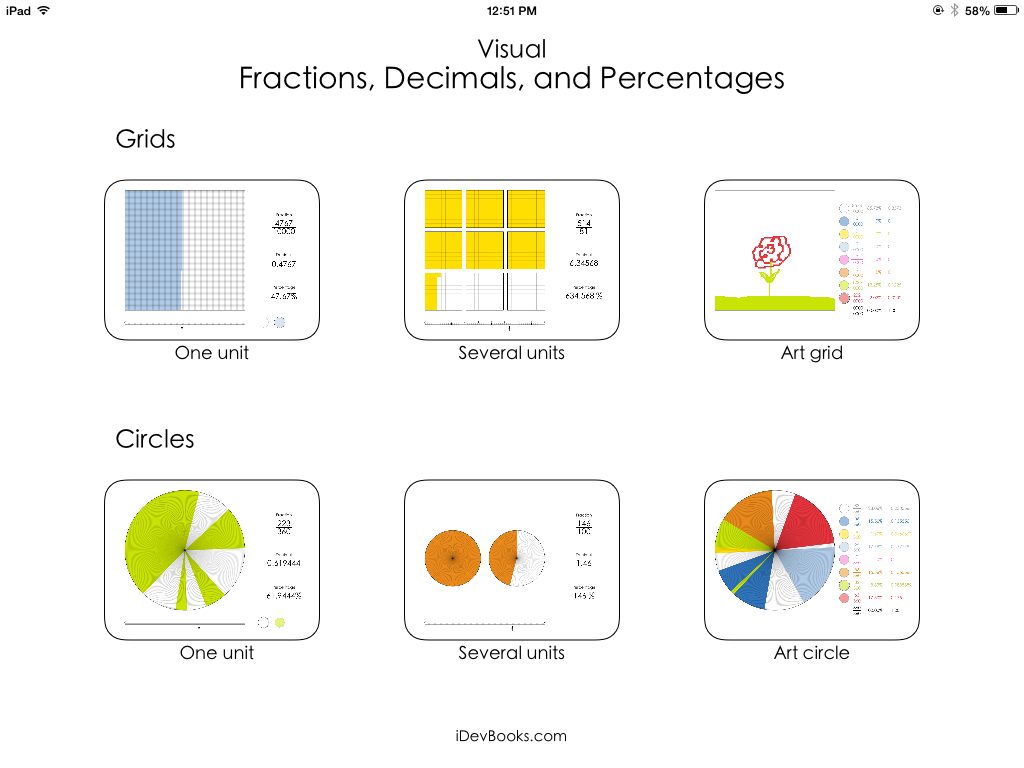
A good technique to visualize a percentage is a percentage wheel.This is a good option to use in data visualization when you want to clearly show your audience a calculation without any doubt. In this case, the circle’s whole is 100, and it is divided into 100 pieces that are totally equal. Each of these pieces represents 1%.
Percentage wheels can be used as part of a presentation or any time when you want to quickly visualize an issue and see how much of a whole is taken or left over. Let’s say you need to quickly calculate 40% of something. By using a percentage wheel, you can easily see that it’s one quarter of the surface area. If you’re a visual learner, this technique will be especially useful to you, and if you’re presenting data to a large audience, it’s a good and clear option to get your point across.

Grid Method
Another way to visually show percentages, either as part of a presentation or as a simple way to calculate, is a grid method. Again, this is a useful option for visual learners, just like the percentage wheels. In this case, you would use grid paper to show the whole and then color or shade how many squares it takes to show the specific percentage. So, if you want to show 45%, you’d shade in 45 squares.
The grid method is a useful option if you want to compare separate percentages, particularly in data visualization if you want to show the increase or decrease of a particular value.
Sometimes, the simplest ways work best, particularly when you’re giving information to visual learners. These types of techniques make the number and value literally jump off the page, leaving no room for confusion or misinterpretation. You can learn more about this in our guide on tips for engaging chart and graph design.
Technology-Aided Calculations
Technology helps us in many different parts of our lives, both in personal situations and at work. So, it comes as no surprise that it’s also very beneficial when it comes to learning how to calculate percentage amounts. Here, we’ll talk about spreadsheet formulas in particular.
You don’t have to be an Excel expert to be able to use the program, but familiarizing yourself with the basic commands and functions will help you use it to the best of its ability. It’s a very valuable tool in data visualization and can be used to create many charts, including waterfall charts to name just one. In this case, Excel or even Google Sheets can be used to help you when calculating percentages. Not only is the usability extremely easy, but there are many functions that can handle basic to advanced situations.
In particular, Excel’s PERCENTAGE function is one to learn. This can convert a number into a percentage very easily, with no extra calculations required. This is one of the most basic functions, but they increase in complexity, such as the PERCENTILE function. This can calculate percentiles in any dataset, whether large or small.
It’s certainly worthwhile spending some time exploring the different functions on both Excel and Google Sheets. These take away the manual element of calculations, especially if this isn’t your strongest suit.
Percentage Calculator Apps
The percentage calculator really is a gift from the math gods if you don’t find it easy to manually arrive at these numbers. In this case, the hard work is done for you by an app. There really is an app for everything these days! There are many different types of these apps, including a percentage difference calculator and a percentage increase calculator. The list goes on.
However, the one thing they all have in common is that they take the confusion out of calculating percentages. Some of these apps are specifically designed for certain situations, such as calculating compound interest or creating visual representations of a percentage. Again, just like Excel and Google Sheets, it’s a good idea to experiment and perhaps download a few different ones to find the best fit for you. When using a percent calculator, trial and error may be required at first, but once you get used to the features, it will end up being a very useful tool for all your percentage-related tasks. Do these apps completely replace the need to manually calculate from time to time? No, but they’re a great companion in other times.
Real-World Applications and Analysis
We’ve talked a lot so far about how to calculate percentage amounts; in this section, let’s talk about how percentage breakdowns might be used in specific industries, particularly finance.
Financial Percentage Analysis
In any business, profit margins and markups are vital pieces of information. Not only do they give you an idea of whether your business is going well or not, but they can help you make stronger decisions based on realistic data. For instance, if you’re considering opening another retail store, you’ll need to know whether your financial situation is good enough to cover the cost and whether you’ll have enough business to make the second store viable. Profit margins can help you with this.
However, it’s important to know the difference between profit margins and markups as a first step.
First, let’s talk about profit margins. This is the percentage of your revenue that represents your overall profits. To calculate your profit margin, divide your profit by your revenue and multiply by 100. Let’s say a product costs $50 to create and you sell it for $70. In this case, your profit is $20, and your profit margin is 20%.
Now, let’s talk about markup. This is the percentage increase from the cost to how much you sell it for. To calculate the markup, you take the profit and divide it by the cost, then multiply by 100. So, using the same example as above, the markup would be 28%.
While these two concepts are often confused, it’s important to know the difference. When used properly, they can be invaluable in terms of financial planning and decision making.
While you’re here, read our article on building high-impact data narratives with visualization tools.
Tax Calculations
Tax is always a complicated subject and calculating anything to do with it is even more complex. In this case, there are often in-depth percentage calculations that need to be done, especially if we’re talking about things like progressive tax rates. In this type of system, different chunks of income are taxed at different rates. As income increases, the tax increases in line with it.
As an example, the first $40,000 of income might be taxed at 20%, with the next chunk at 25%. Anything over that level may be taxed at 30$. .These amounts are just here for illustration, but this type of tax calculation involves using different percentages for the right chunk of income. It’s also important to know about deductions and how they work in percentage terms. This can help with tax planning and ensure that you have the correct amount of tax ready to pay at the end of the tax year.
Statistical Percentage Interpretation
Statistics are extremely important pieces of data that tell a story and give the full picture of a situation to your audience. Within this, confidence intervals are a crucial part of the puzzle. This gives extra credibility to your data, expressing the overall reliability of an estimate by using a percentage. For example, if you use a 85% confidence interval, that means that if the sample were repeated several times over, 85% of the calculated intervals would also contain the population parameter.

Percentage Point Differences
When you’re using statistics, it’s important to separate between percentage changes and point differences. Both include percentage amounts, but they reflect different aspects, and if confused, can create can completely wrong interpretation. Let’s distinguish between the two.
A percentage point difference is the mathematical difference between two separate percentages. So let’s say that support for a political candidate increases from 30% to 40%. In this case, the percentage point difference is 10%. However, a percentage change shows the difference between the old and new values. Understanding this difference is key to accurately reading and digesting statistics, and comprehending them in the way they’re intended.
To learn more about how to interpret statistics in data visualization, read our article on crafting impactful data narratives with charts.
Storytelling with Percentage Data
It’s one thing being able to use a calculator to find percentage values, but how can you display your data in a compelling and interesting way to your audience? In this section, we’ll explore exactly that.
Data Visualization Techniques
There are many different chart types out there, so it’s important to spend some time exploring them and finding the right one for your needs. By using the Storytelling With Charts plugin, you’ll access a huge number of chart types, many of which can display your percentages in a way your audience will appreciate. Let’s explore some of the main ones.
Pie Charts and Donut Charts
Both pie charts and donut charts are true classics. These are basic but highly impactful and can showcase your calculations in the clearest way possible. The pie or donut represents the whole and the ‘slices’ correspond to a percentage of it. Pie charts are circular and divided into clear sections, and they’re particularly good at showing composition or comparing parts to the entire whole. On the other hand, donut charts are circular with a hole in the middle, as the name suggests. These charts are useful when comparing slices across several charts, or when you want to show several percentage breakdowns side-by-side.
Stacked Bar Charts
Another basic yet powerful type of chart is the stacked bar chart. These can show several percentage breakdowns at the same time. They use rectangular bars that are separated into segments and each represents a percentage of the whole. The plus point here is the visibility this type of chart has; it’s very easy to show your audience of different categories make up the total or to compare different groups.
Narrative Structures for Percentage Data
Creating a compelling and attention-grabbing stories involving percentages is often about comparisons. The first step is to identify where the biggest contrasts in your data sit. You can then use them as the main thread that runs throughout your narrative. Additionally, trends are also important, so also identify the biggest trends within your data and look for consistent increases and decreases that indicate a pattern, or sudden changes that could indicate a new one beginning.
Advanced Percentage Applications
Calculating percentage values in a basic way is the first rung on the ladder before you graduate to advanced options. These applications play a key role in analysis and decision-making. Within this, we can talk about compound annual growth rate, or CAGR, weighted percentages, and percentiles in statistics.
Compound Annual Growth (CAGR)
Compound annual growth is a strong metric used in investment analysis and it can represent the mean annual growth rate of any investments over a set amount of time, as long as it is more than one year. It’s not just finances though; CAGR can also be used in population growth studies to show trends and the rate at which a population would grow if it remained constant.
Weighted Percentages
Another advanced option is weighted percentages. These are important in calculating GPAs (Grade Point Averages), particularly in systems that involve different values or levels of difficulty. In financial portfolio management, these percentages are key in understanding and managing risk and return. To do this, each portfolio asset is assigned a weight based on its value, and this is done in relation to the total value of the portfolio itself.
Percentiles and Quartiles
You’ll see percentiles used quite often in standardized test scoring, and they provide a relative measure of performance. Both percentiles and quartiles are powerful options to analyze income distribution and wealth inequality too. In this case, policymakers and economists need to understand how a population’s income is distributed.
Learnings Recap
Tax is always a complicated subject and calculating anything to do with it is even more complex. In this case, there are often in-depth percentage calculations that need to be done, especially if we’re talking about things like progressive tax rates. In this type of system, different chunks of income are taxed at different rates. As income increases, the tax increases in line with it.
As an example, the first $40,000 of income might be taxed at 20%, with the next chunk at 25%. Anything over that level may be taxed at 30$. These amounts are just here for illustration, but this type of tax calculation involves using different percentages for the right chunk of income. It’s also important to know about deductions and how they work in percentage terms. This can help with tax planning and ensure that you have the correct amount of tax ready to pay at the end of the tax year.
Of course, how you display your percentages is as important as how you calculate them. That’s where Storytelling With Charts comes in useful. We offer a free PowerPoint plugin that helps with your data visualization needs. Choose from a huge range of chart templates and showcase your data for your audience to fully understand. With no hidden fees and an easy-to-use approach, your data will go from zero to hero with just a few clicks.
More From Storytelling With Charts
Utilizing Pie Charts: Best Practices for Educational Presentations
Should You Use a Bar Graph or Choose Another Chart Type?
An Overview of Common Line Chart Types and When to Use Them
Data Comparison Chart: How To Visually Present Similarities and Differences


